
 This online help page offers detailed guidance on the SurgeONE.ai Onboarding Items interface and its capabilities.
The Onboarding Items page in SurgeONE.ai serves as a flexible space where essential elements of the onboarding process come together. It provides visibility into employee onboarding activities, allowing users to navigate and manage it efficiently. Whether reviewing assigned package items, monitoring completion trends of assigned package items, or accessing related entries, this page is designed to adapt to varying onboarding workflows and organizational needs, ensuring a smooth and consistent experience for all involved.
All Onboarding Items displayed on this page are fetched from the Onboarding Packages page.
The accessibility and functionalities of the different sections of this Onboarding Items page are dependent on the assigned onboarding packages and the pool based access set for the logged-in user. For more details refer to the Onboarding Packages online help and Users Pool online help.
1. Navigating to the Onboarding Items page
To begin working with Onboarding Items, permitted users must first access the Onboarding module. The Onboarding Items page acts as the central hub for all employee onboarding activities within the SurgeONE system. From this single interface, users can work on assigned onboarding items and depending on their role can review, approve, or reject onboarding package items' submissions.
Click on the Onboarding menu group of the left panel and then on the expanded Onboarding Items menu label.
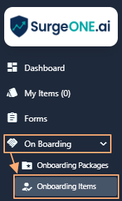 Fig: 1 - Onboarding Items menu option
Clicking on this menu option loads the Onboarding Items page, showing a blank grid view if no package items are yet assigned to the logged-in user, or no such onboarding package is yet created in the system.
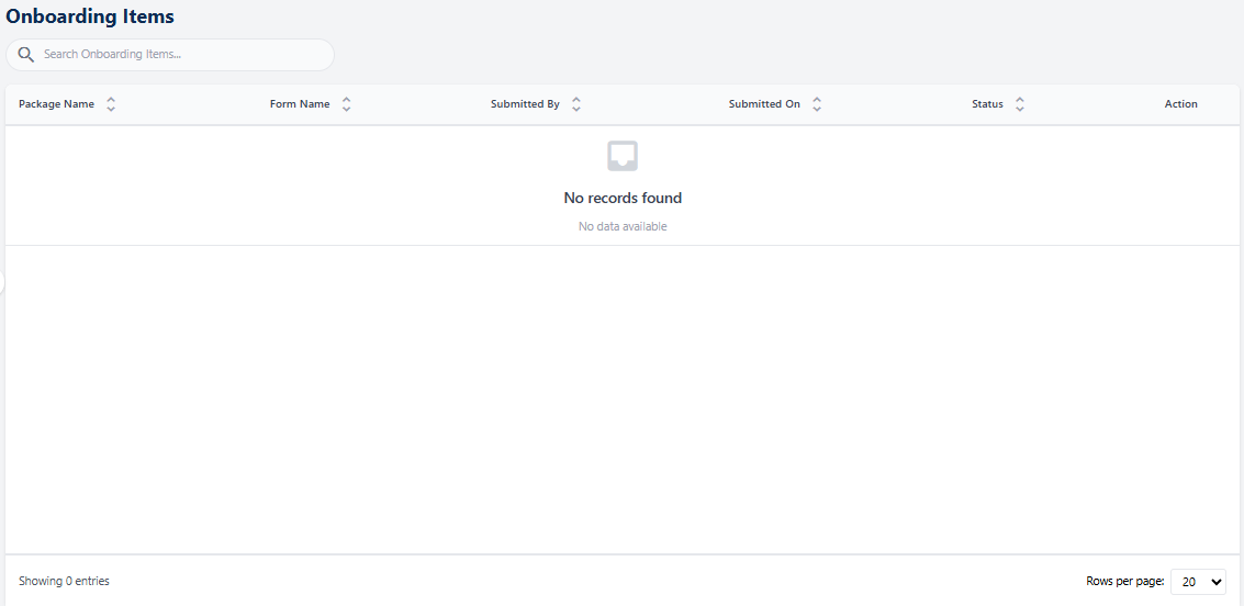 Fig: 2 - Grid view blank by default
All the listed Onboarding Items which are assigned to the logged-in user are displayed here. Here is the view of one such entry populating the grid view. These custom Onboarding Items can be responded to, commented upon and submitted for review, and subsequently approved and reviewed, or rejected, by the assigned personnel.
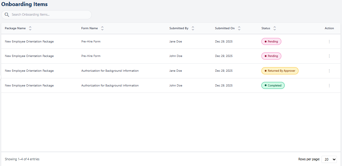 Fig: 3 - Onboarding Items page with added custom Onboarding Item
Key features of this Onboarding Items page
- Granular Control – Each package item includes defined stages for its entire flow, such as form submission, reviewing, approval and finally completion.
- User Assignment – Assigned packages are visibile to targeted employees only.
- Progress Tracking – Monitor completion rates and status across assigned items.
2. Understanding the Onboarding Items page elements
The Onboarding Items page brings together essential tools for managing package items with clarity and ease. A search bar enables quick access to specific items, while the grid view organizes key details in a clean, structured format. Action menus streamline task execution by providing direct links to relevant activities, and pagination ensures smooth navigation through larger datasets. Collectively, these components create an intuitive interface that simplifies interaction and supports confident onboarding workflow management within SurgeONE.
Refer to the following screenshot which is marked with numerical values that correspond to the below stated points.
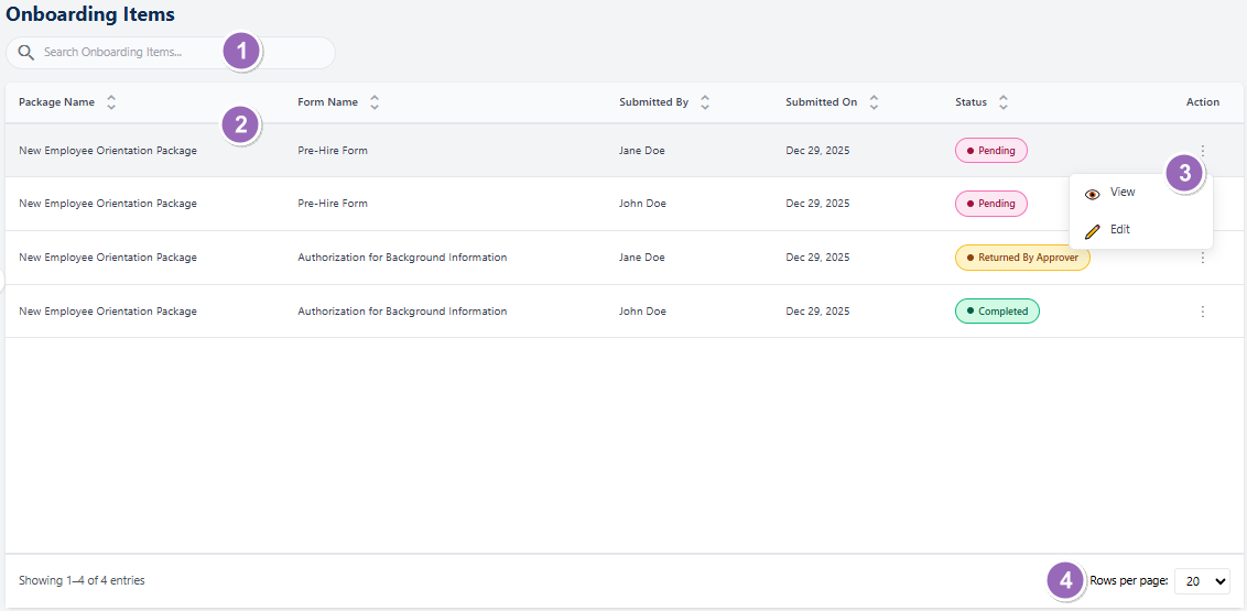 Fig: 4 - Understanding the various elements of the Onboarding Items page
-
1Search barThe search bar allows users to quickly locate assigned / submitted onboarding item entries using keywords.
-
2Grid viewDisplays loaded or filtered results in a structured tabular format.
-
3Action columnContains a vertical ellipsis
 icon to toggle row-context menu options.
 -
4Pagination optionsControls page item limits and enables navigation across multiple pages of onboarding item entries.
-
5Filter iconOpens the filter panel area where you can utilize various options to view specific grid view results.
 NOTE: The following sub-sections elaborate further the associated functionalities of the above-stated points.
2.1. Searching for Onboarding Items
The search feature enables users to quickly find specific onboarding entries by entering relevant keywords. This functionality is especially valuable when working with extensive lists, as it minimizes time spent scrolling and ensures precise retrieval of the required records.
You can use the search bar to enter text and find matching results.
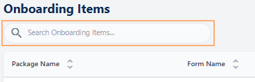 Fig: 5 - Search bar to quickly find added Onboarding Items
The search operation gets executed on the Package Name, Form Name, Submitted By, Submitted On and Status columns' data. Based on the text entered, matching results are listed out.
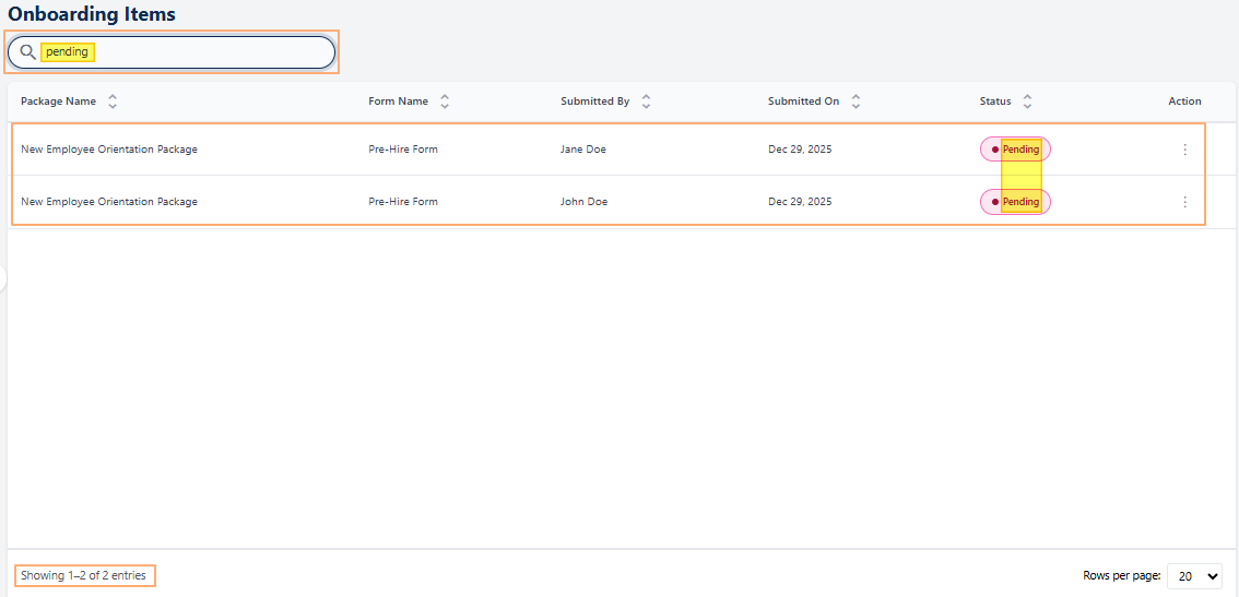 Fig: 6 - Filtered results
If no results are fetched by the executed search query, a No records found label in the grid view and a Showing 0 Records label is displayed below the grid view.
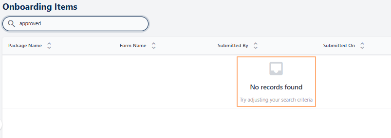 Fig: 7 - No matching records found
2.2. Understanding the grid view
The grid view organizes onboarding item entries into a clear, tabular format that makes information easy to scan and interpret. Each row corresponds to an individual package, while the columns display key attributes such as ID, name, submitted date, status, and more. Users can also sort column data in ascending or descending order, enabling quick prioritization and comparison based on specific criteria. This structured layout not only provides a comprehensive overview of all onboarding items at a glance but also supports efficient monitoring and management of submissions within the SurgeONE system.
The grid view displays all onboarding item entries which are assigned or finished by the logged-in user. The following columns are present:
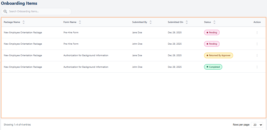 Fig: 8 - Onboarding Items grid view
-
1Package NameDisplays the official name of the package as defined during its creation. This helps users identify which onboarding item or process the entry belongs to.
-
2Form NameDisplays the official title of the form included in the onboarding package during its creation. Helps users instantly recognize which process or requirement the form relates to.
-
3Submitted ByShows the name of the individual who submitted the onboarding package, ensuring accountability and easy traceability.
-
4Submitted OnDisplays the exact date when the entry was submitted, supporting timely reviews and compliance monitoring.
-
5StatusReflects the current state of the item (for example Pending, Completed, etc.), enabling users to monitor progress across items.
-
6ActionContains a vertical ellipsis icon to toggle row-context menu options for performing actions.
2.3. Using the Action column menu options
Each onboarding item entry in the grid view includes an Action column that provides quick access to package items' management options. This design ensures that users can perform relevant actions directly from the grid without navigating away from the page.
Click on the vertical ellipsis icon against any displayed row entry of the grid view to toggle the row-context menu options.
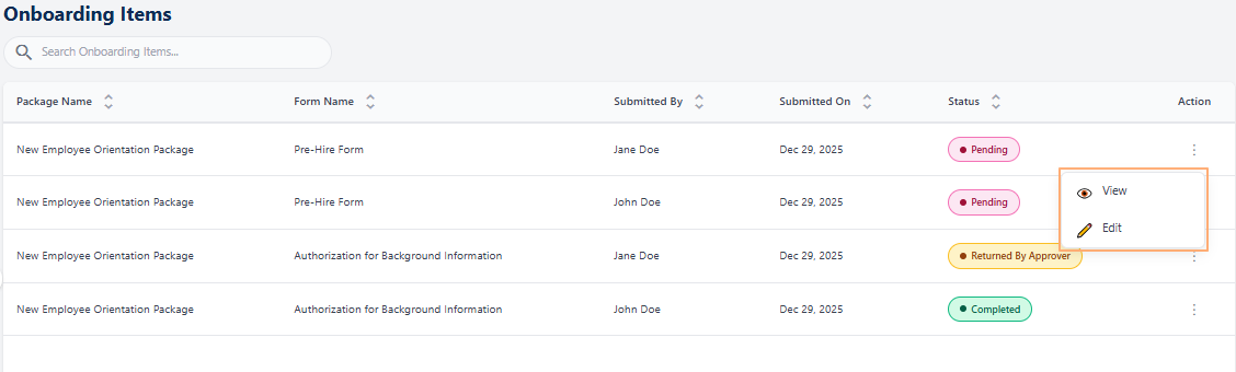 Fig: 9 - Action menu option
The following menu option is present:
-
1
 ViewUsed to view the package item without the ability to make any modifications to the responses.
 -
2
 EditUsed to modify a package item field responses or the current status which is not yet submitted.
NOTE: The following sub-sections elaborate on the functionalities associated with these options.
2.3.1. Using the View menu option
Selecting the View option enables users to open and review a listed package item in its entirety. This feature is particularly valuable when users need to understand the structure of the form and purpose of the package item, revisit the information it contains, or examine the responses that have already been submitted. By providing full visibility into both the package item content and the recorded inputs, this option supports better decision‑making.
- Click on the vertical ellipsis icon under the Action column, against any displayed row entry of the Onboarding Items grid view to toggle the row-context menu option labeled as View.
- After clicking on it, the following page loads to display the form as per its layout and questions structure.
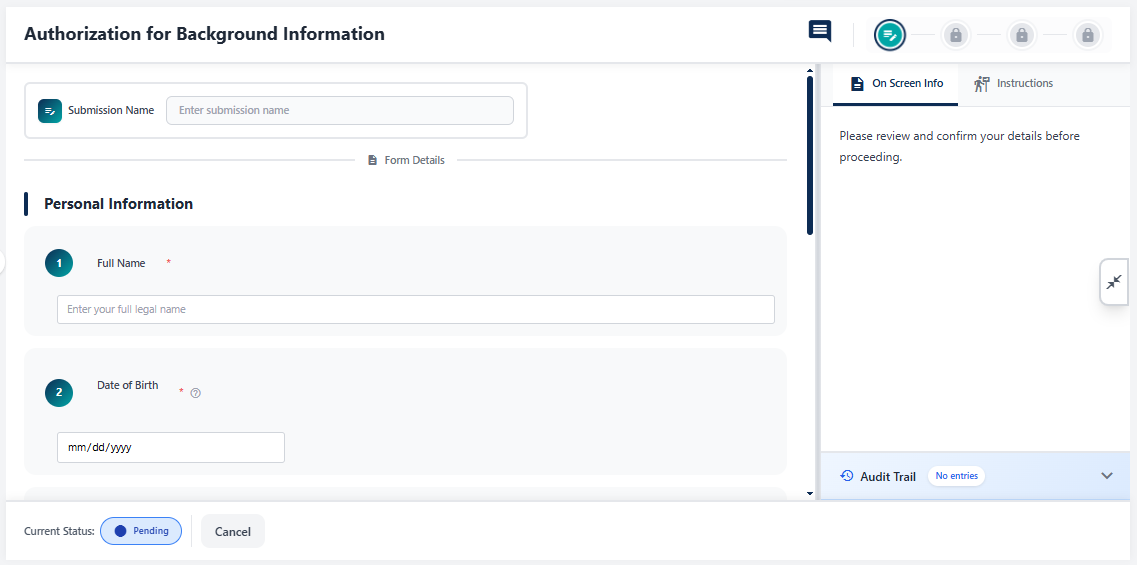 Fig: 11 - Viewing the form page
- You cannot choose the next action in view mode, but you can close the page using the Cancel button.
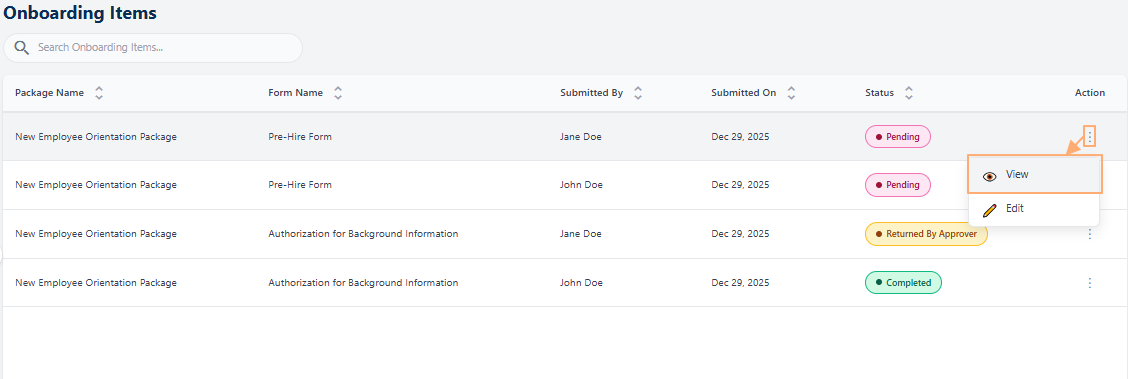 Fig: 10 - Clicking on the View menu option
Refer to the following screenshot which is marked with numerical values that correspond to the below stated points about the various UI elements. All fields are displayed in read-only state.
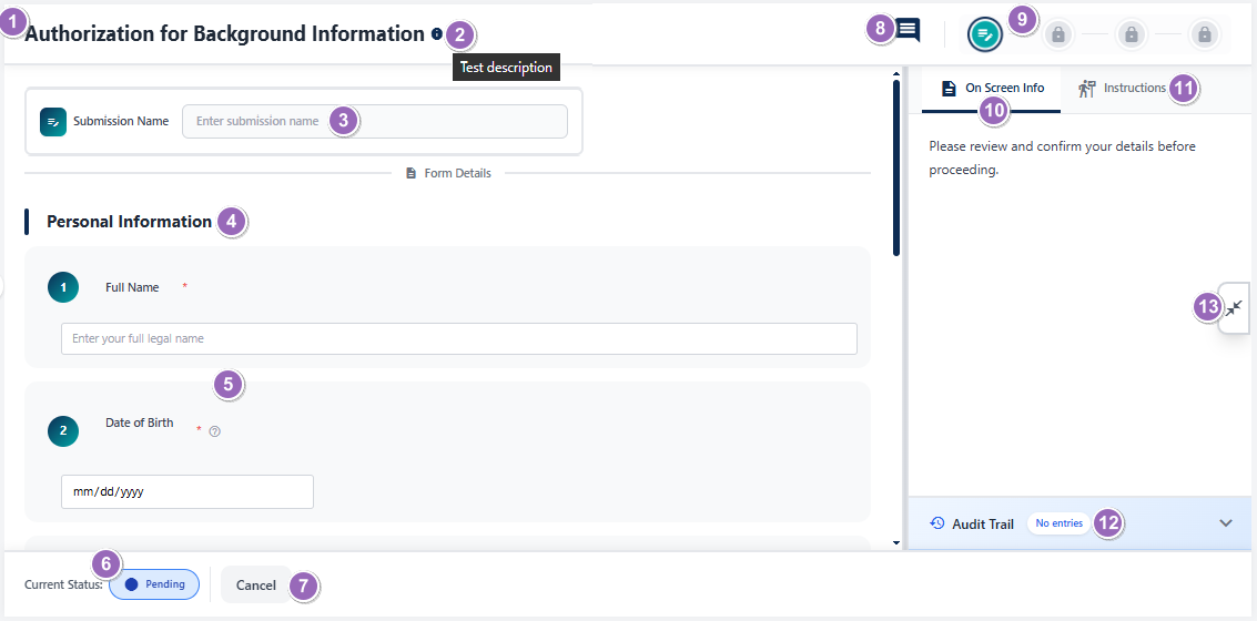 Fig: 12 - Onboarding Items view page elements
-
1Onboarding Items Title
- What it is: The name of the form (e.g., Political Contribution Onboarding Items).
- Why it matters: Helps you check which form you're viewing or working on.
- Typical actions: Used for orientation and reference in usage.
-
2Info Icon (Tooltip on Hover)
- What it is: A small tooltip displayed on mouse pointer hover on the info icon. If present, the icon is adjacent to the displayed title.
- Why it matters: Enables a quick glance at the description of the form.
- Typical actions: Reveal a tooltip which displays the entire form description.
-
3Submission Name Field
- What it is: A text input to enter the full name of the user who is submitting.
- Why it matters: The Submission Name field gets added at the top of form when Submission Name Required? slider was enabled in the form. If it was not enabled, then this field is not present in the rendered form.
- Typical actions: Entering the submitter's name helps to understand who had submitted the form.
-
4Section Header
- What it is: Displays the form structure, sections and questions of each for user to view the entire form content.
- Why it matters: Organizes the page into meaningful sections (as designed) and improves readability.
- Typical actions: Scroll to view multiple form sections (if present) and questions present in a section, as well as understand the form layout.
-
5Generic Form Fields
- What it is: Standard input elements present in the section to capture user data such as text, numbers, dates, or selections in non-view mode.
- Why it matters: Collects essential information required for processing the form and completing the workflow.
- Typical actions: Enter the requested value, select from options, or confirm consent before submission.
-
6Current Status Tag
- What it is: A color-coded status indicator (e.g., Pending).
- Why it matters: Helps you plan your course of action by referencing to the current status.
- Typical actions: View it to check the current status of the form.
-
7Cancel Button
- What it is: A button to exit without committing changes.
- Why it matters: Prevents unintended edits or submissions.
- Typical actions: Click to close or return to the Onboarding Items page. In some instances, a confirmation modal window gets prompted by the system to obtain your confirmation of exiting this page, since unsaved changes get discarded on exit.
-
8Comment Icon
- What it is: An icon which allows users to post or view comments related to the form or onboarding workflow.
- Why it matters: Facilitates communication and collaboration of involved users to provide context, clarifications, or feedback, without leaving this page.
- Typical actions: Click the icon to open the comment panel, type your message, and submit. Use it to share notes or respond to queries without leaving the form.
-
9Workflow Stage Indicator
- What it is: Current stage label and other stage icons displayed as per the configuration.
- Why it matters: Shows the current review stage and other stages when configured to various workflows, which may require a reviewer or approver participation in the custom item's lifecycle.
- Typical actions: Read-only labels displayed on mouse hover over present icons as per the configured stages and indicates the current one.
-
10On Screen Info Tab
- What it is: A tab that reveals guidance or instructions related to the form.
- Why it matters: Provides in context help as configured during item creation.
- Typical actions: Click to read tips while filling the form as it ensures entries meet policy.
-
11Instructions Tab
- What it is: A tab showing detailed instructions and rules (e.g., compliance, legal notes).
- Why it matters: Clarifies mandatory information, acceptable inputs, and constraints as configured.
- Typical actions: Review before submitting to avoid rework or rejection.
-
12Audit Trail Panel
- What it is: A chronological log or timestamp which is by default present as a collapsed section.
- Why it matters: Enables traceability as it reveals who did what and when.
- Typical actions: Expand panel area to see entry details as per activity performed, for compliance checks, auditing and reporting.
-
13Close Information Panel
- What it is: A control that collapses the right-side information panel containing the On-Screen Info tab (#10), the Instructions tab (#11), and the Audit Trail section (#12) when they are in open or expanded view.
- Why it matters: Frees up workspace by hiding guidance and history panels, reducing visual clutter. It also prevents accidental interactions with auxiliary content while performing tasks.
- Typical actions: Click to collapse the panel. Reopen as needed by clicking on the collapsed panel for contextual help, instructions, or to review audit logs when needed.
2.3.2. Using the Edit menu option
The Edit option allows users to modify existing Onboarding Items to meet specific requirements. This feature is beneficial for updating outdated information, correcting errors, or customizing fields to align with organizational needs. By enabling edits, users can maintain accuracy and relevance, ensuring that the form collects the right data for its intended purpose. It also reduces the need to create new Onboarding Items from scratch, saving time and effort.
Edit menu option is visible ONLY against certification package (items) which were submitted by logged-in user and having Pending Status.
- Click on the vertical ellipsis icon under the Action column, against row entry of the Onboarding Items grid view to toggle the row-context menu option labeled as Edit.
- After clicking on it, the following page loads to display the form as per its layout and questions structure. You can provide responses to the form fields wherever applicable and update the status by choosing Submit or Cancel of the Select next action dropdown at the bottom-right.
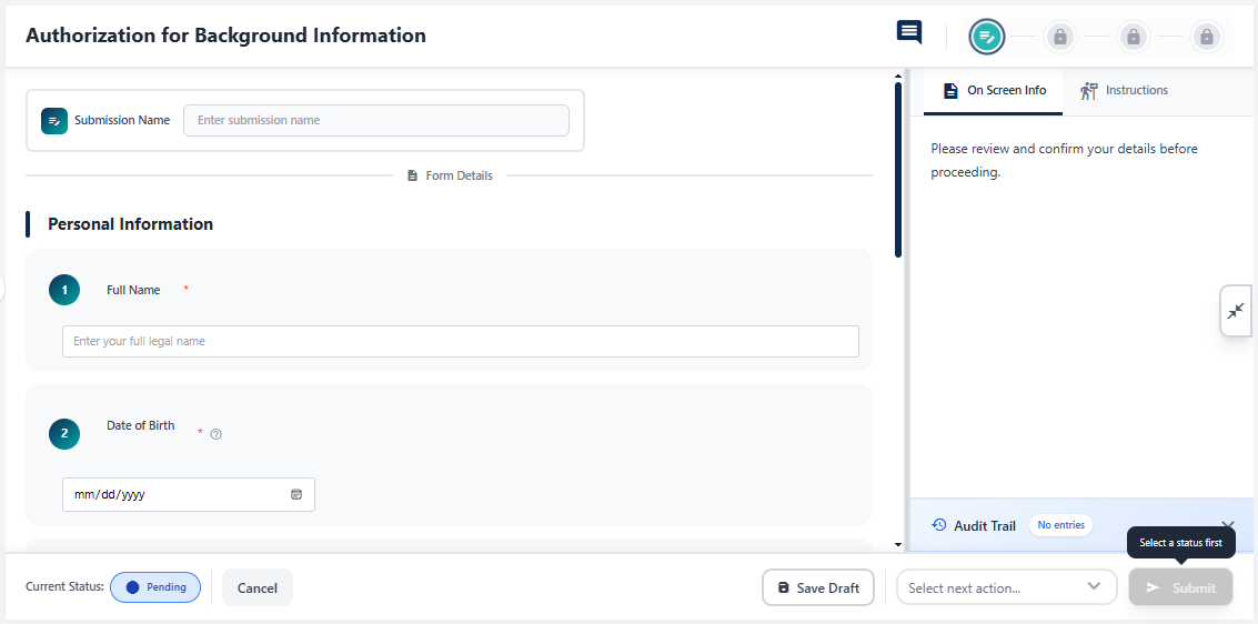 Fig: 14 - Onboarding Items edit page
- Choose Submit to set the form status to Pending Review or Cancel to set the form status to Cancelled. Get redicted to the Onboarding Items page where you can find this form with its status updated in the grid view.
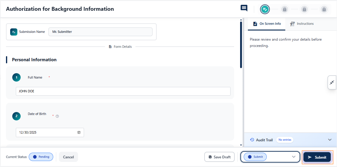 Fig: 15 - Submitting a Onboarding Items from the edit page
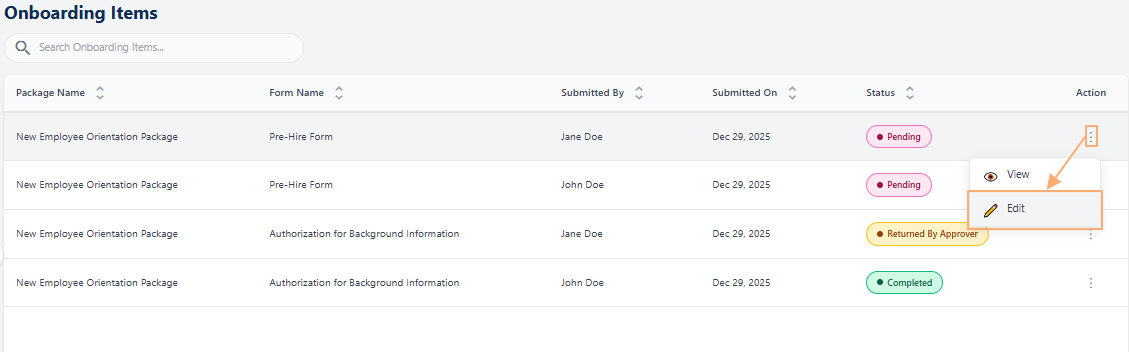 Fig: 13 - Clicking on the Edit menu option
NOTE: You cannot modify the form structure, section or question fields configuration in edit mode. You also cannot make changes to the on-screen information or form instructions. All these actions can be performed in Forms Library page, only if the form is having In Progress status.
However, if you click on the button without responding to all of the mandatory fields of the form then the following validation gets prompted.
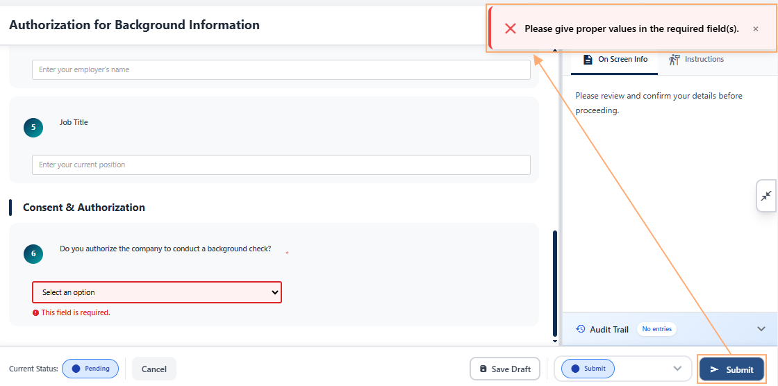 Fig: 16 - Validation on submitting an Onboarding Item
2.4. Pagination
Pagination controls allow users to navigate through multiple pages of onboarding item entries in a structured and efficient manner. Instead of displaying all records at once, which can impact performance and clutter the interface, the system organizes entries into manageable pages. This approach improves loading speed, enhances usability, and makes browsing large datasets more intuitive. By using pagination options, users can quickly move to the exact set of records they need without excessive scrolling, ensuring a smooth and focused experience when managing onboarding items.
Pagination options are provided at the bottom-right, to navigate through multiple pages of entries, which populate the grid view as per the selected count of items per page. Selectable options are 10, 20, 50 and 100. By default, 20 is set.
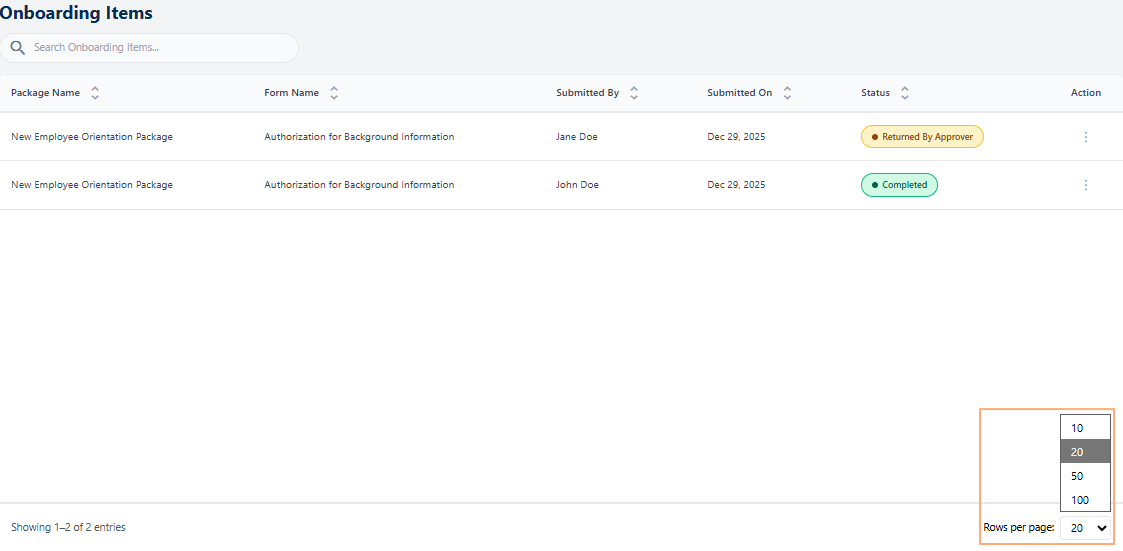 Fig: 17 - Pagination options
2.5. Using the filters
The Onboarding Items Filter allows users to narrow down the grid view results by applying multiple criteria. This filter helps users quickly locate specific onboarding records by package, form, submitter, or status, improving efficiency when working with large datasets.
The filter panel opens from the right side of the screen when the filter  icon is clicked upon. It contains a set of dropdown fields and action buttons that control how onboarding items are displayed in the grid.
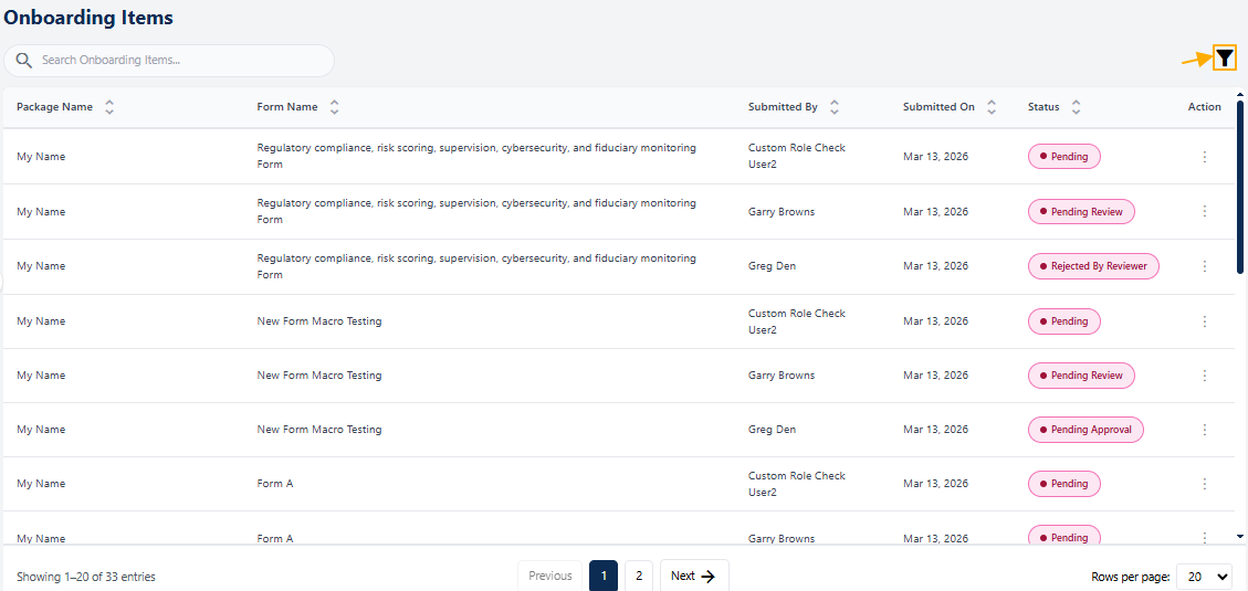 Fig: 18 - Filter icon
The Onboarding Items filter is commonly used to:
- Focus on onboarding items in a specific status (e.g., Pending or Completed)
- Review submissions from a particular user
- Isolate records related to a specific package or form
- Reduce clutter and improve visibility in the grid view
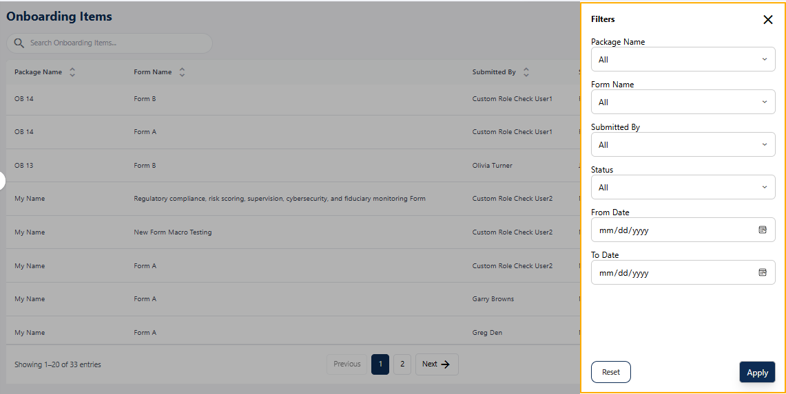 Fig: 19 - Filter panel expanded view
-
1Package Name
- What it is: A dropdown list showing all available onboarding packages. A numeric value is present within parenthesis against each listed label to indicate the count of each onboarding package.
- Why it matters: Helps narrow grid results to items related to a specific onboarding package.
- Typical actions: Select All to view every package or choose a specific package to filter the grid.
-
2Form Name
- What it is: A dropdown that lists onboarding forms available within the system. A numeric value is present within parenthesis against each listed label to indicate the count of each form.
- Why it matters: Useful when multiple forms exist under the same onboarding process.
- Typical actions: Select All to view all forms or choose a specific form to refine results.
-
3Submitted By
- What it is: A filter that displays onboarding items based on the submitting user. A numeric value is present within parenthesis against each listed label to indicate the count of each user's submission.
- Why it matters: Helps identify records submitted by a specific individual or group.
- Typical actions: Select All to include all submitters or choose a specific user.
-
4Status
- What it is: A dropdown showing onboarding workflow statuses along with record counts. A numeric value is present within parenthesis against each listed label to indicate the count of each status.
- Why it matters: Allows users to focus on items at a specific stage such as Pending, In Progress, or Completed.
- Typical actions: Select a status like Pending Approval or Rejected by Reviewer to update the grid view.
-
5From Date
- What it is: A date selection field used to define the start date of the filter range. Selecting a date opens a calendar picker showing a monthly view.
- Why it matters: Ensures that only records created or updated on or after the selected start date are included in the grid results.
- Typical actions: Click the calendar icon, navigate between months if needed, select a date, or use the Today option for quick selection.
-
6To Date
- What it is: A date selection field used to define the end date of the filter range, working in conjunction with the From Date.
- Why it matters: Limits grid results to records created or updated on or before the selected end date, completing the date range filter.
- Typical actions: Select an end date from the calendar picker, clear the selection using Clear, or adjust the range before applying the filter.
-
7Apply and Reset
- What it is: Action buttons used to apply or clear selected filter criteria.
- Why it matters: Ensures users can easily control when filters take effect or return to the default view.
- Typical actions: Click Apply to refresh the grid with filtered results or Reset to restore all filters to All.
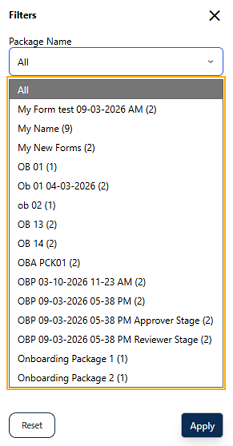 Fig: 20 - Package Name filter dropdown showing onboarding packages with count
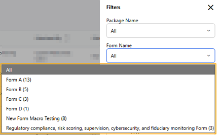 Fig: 21 - Form Name filter dropdown listing available onboarding forms with count
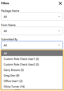 Fig: 22 - Submitted By filter dropdown displaying user-wise submission counts
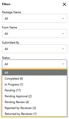 Fig: 23 - Status filter dropdown showing workflow statuses with record counts
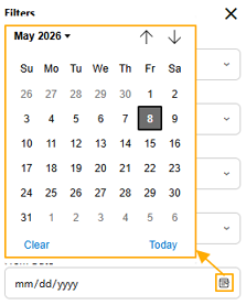 Fig: 24 - From Date field with calendar picker for start-date selection
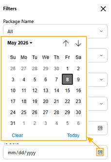 Fig: 25 - To Date field with calendar picker for end-date selection
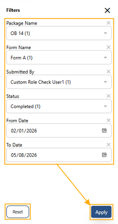 Fig: 26 - Apply and Reset buttons used to apply or clear filter criteria
Based on the filters applied, grid view results appear. The applied filters can be seen above the grid view. A cross icon is present against each applied filter to remove it individually. The count of filter criterion applied are indicated beside the filter icon. The filter  icon color changes to light blue color.
A reset filters  icon also appears next the filter icon. Click on it to remove all applied filters at one go.
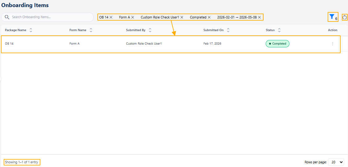 Fig: 27 - UI changes after filter condition application and grid view result fetched based on filters
A No records found label appears in the grid view when applied filter conditions do not fetch any matching onboarding items.
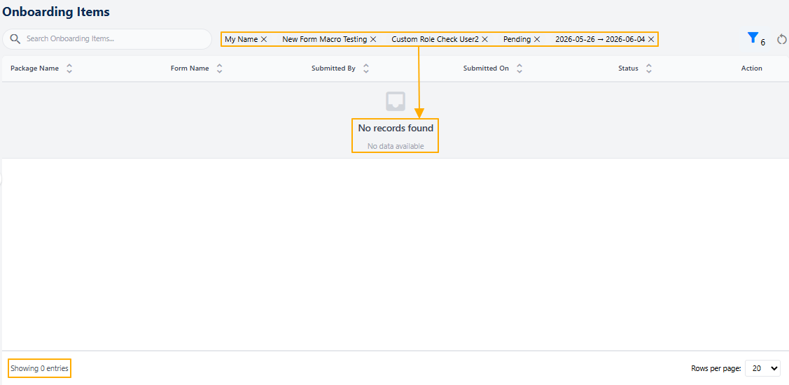 Fig: 28 - No results fetched based on filters
2.6. Onboarding Package Item Lifecycle
Forms of the onboarding package items move through a lifecycle that starts from (Pending → Pending Review → Pending Approval statuses) and continues through on-screen actions performed by specific pool users (Submitter, Reviewer, Approver) towards its completion (Completed status).
Depending on how the workflow is configured for a package item' form, different designated users can act at different stages. The workflow configuration determines which roles act at which stage. The final endpoint is Completed status. The review process allows designated users to carefully examine a submitted item before it moves forward in the workflow. For example, submitted onboarding package item needing review appear in the Onboarding Items module of all users in the selected Reviewers' Pool.
2.6.1. Onboarding Item (Form) Lifecycle Stages
The workflow users belong to the following pools: Submitter → Reviewer → Approver. Multi-level governance ensures accuracy and compliance. Item (form) data moves through review and approval stages.
1st Stage of Onboarding Item Lifecycle → Submitter Step
- Onboarding Package Creation: Submitter navigates to the Onboarding Packages page and creates the package by selecting the form(s) and employee(s).
- Form Fill-up: Submitter navigates to the Onboarding Items page, clicks on the Edit option of the Action column, and fills up the form by providing responses to all the mandatory fields of the chosen form. Submitter can save draft, cancel, or submit the form.
- Submitter submits: Let us consider the Submitter chooses the Submit action from the Select next action dropdown of the form page and clicks on Submit button. The form status updates to Pending Review and the Reviewer workflow begins. If notification triggering was enabled during the form creation process, email gets triggered to the next stage user.
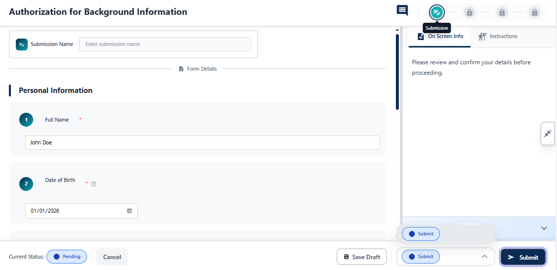 Fig: 29 - Submitter step
An email gets triggered to the reviewer (if configured for the form).
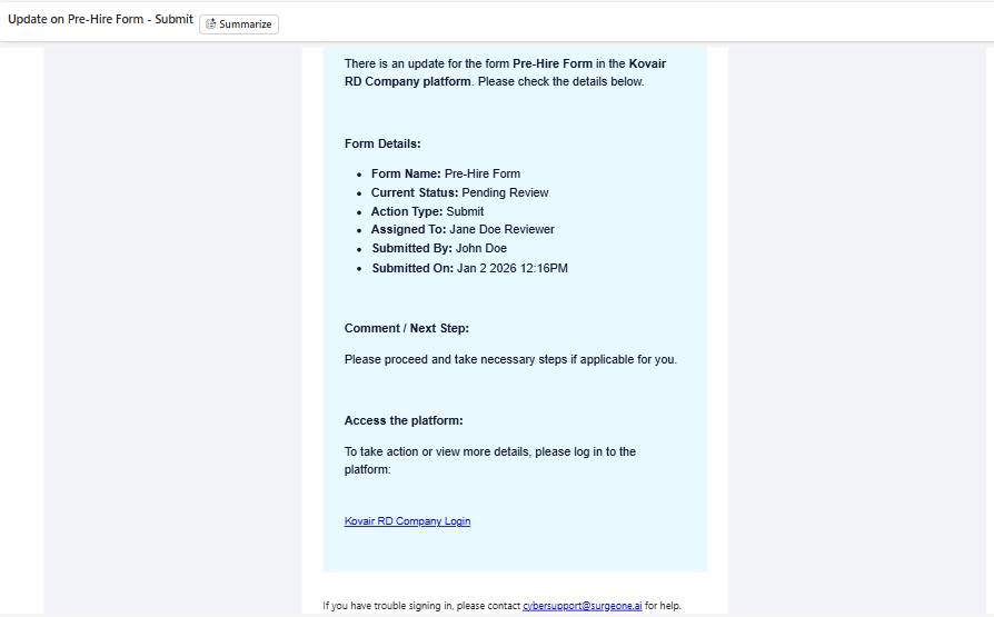 Fig: 30 - Triggered email for review action
2nd Stage of Onboarding Item Lifecycle → Reviewer Step
When reviewing and approval workflow is configured, the supported actions of the assigned Reviewer (belonging to the chosen user pool) are as follows:
- Return: Back to Submitter
- Reject: Ends workflow
- Reviewed: Routes to Approver
Reviewer opens this package item (form) with Pending Review status by clicking on the View option of the Action column, chooses Reviewed action from the Select next action dropdown and clicks on Submit button in the form for approval, after providing relevant information / notes via comments, to initiate the Approver workflow. If notification triggering was enabled during the form creation process, email gets triggered to the next stage user. The form status updates to Pending Approval and the Approver workflow begins.
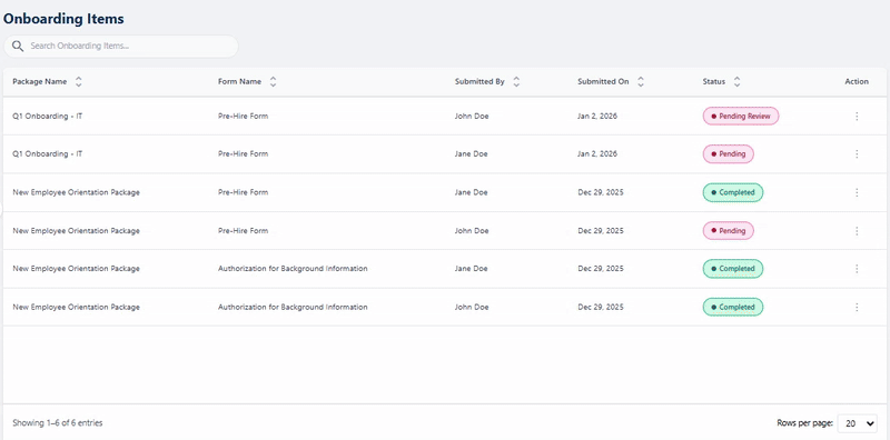 Fig: 31- Reviewer step
An email gets triggered to the approver (if configured for the form).
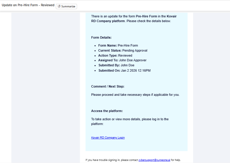 Fig: 32 - Triggered email for approval action
3rd Stage of Onboarding Item Lifecycle → Approver Step
When reviewing and approval workflow is configured, the supported actions of the assigned Approver (belonging to the chosen user pool) are as follows:
- Return: Back to Reviewer
- Reject: Ends the workflow
- Approver: Completes the workflow
Approver opens this package item (form) with Pending Approval status by clicking on the View option of the Action column,, chooses Approved action from the Select next action dropdown and clicks on Submit button, after providing relevant information / notes via comments, to complete the workflow. If notification triggering was enabled during the form creation process, email gets triggered.
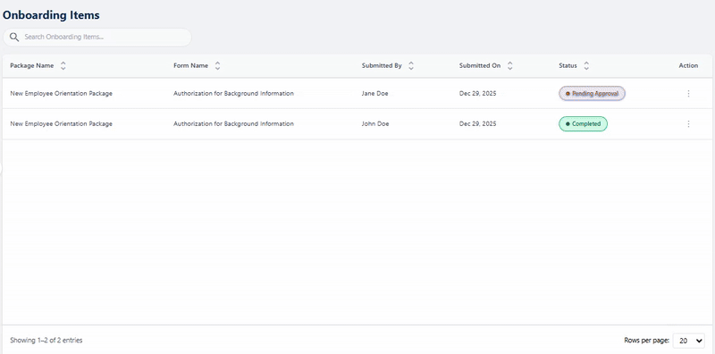 Fig: 33 - Approver step
Here is the view of the completed form.
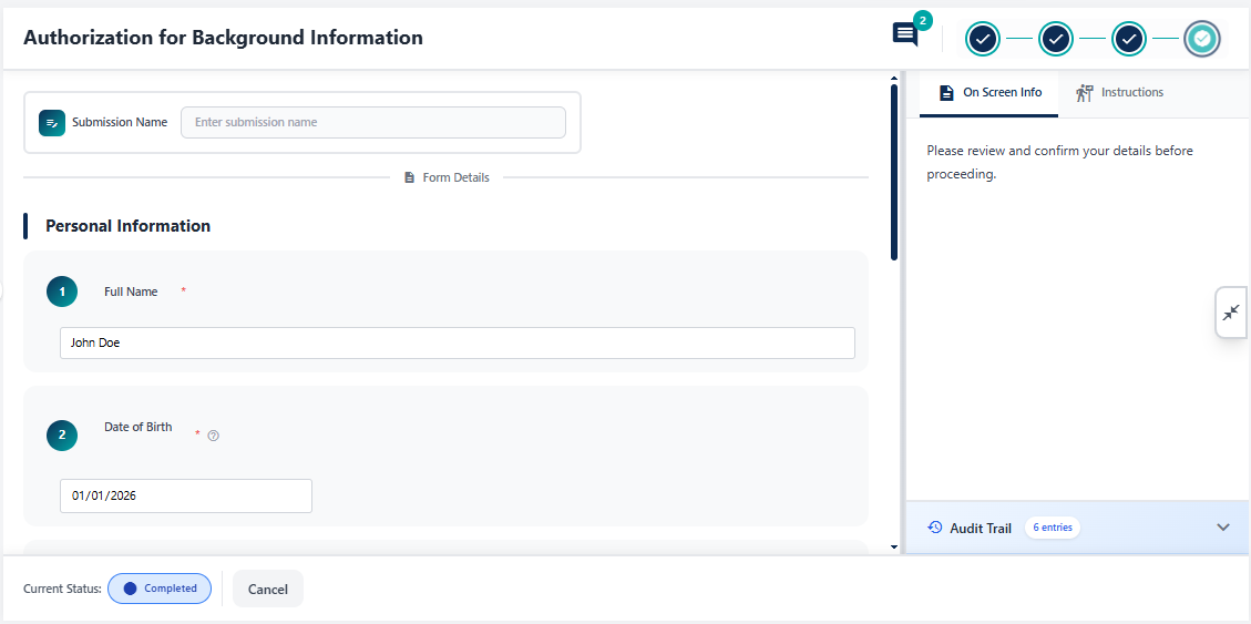 Fig: 34 - Completed form view with no further action button / option