
 This online help page is dedicated to the SurgeONE.ai Unified Dashboard screen and its associated functionalities.
Consolidated dashboard view with real time compliance and activity tracking. It transforms your firm's compliance management from a fragmented process into a streamlined, proactive workflow.
1. SurgeONE.ai Dashboard
Unified Dashboard delivers a centralized interface that consolidates compliance data, task statuses and user-specific actions across core modules. Designed to eliminate data silos and enhance operational clarity, it empowers users to identify modular items, monitor progress and act decisively.
Let us assume that you have already set up your organization. You get redirected to the Dashboard after your firm / organization details are provided. You can also click on the left panel menu option labeled as Dashboard.
Alternatively, whenever you login to the SurgeONE Platform, you will view this Dashboard, as this is the default application landing page (unless changed from the Settings > Customize Menu page).
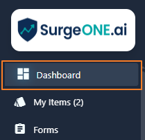 Fig: 1 - Dashboard menu option on left panel bar
Here is the view of the Dashboard. The dashboard integrates critical modules – Attestation, Audit, Code of Ethics, Forms, Onboarding, Certification and Vendor Management – into one unified view. Each module displays its completion status, allowing users to instantly gauge progress.
Benefit: It offers data visualization with real-time analytics and facilitates better decision making with the ready visibility of core modules.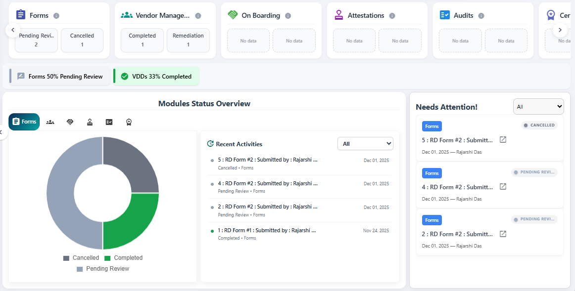 Fig: 2 - View of the Unified Dashboard
Key features of SurgeONE Unified Dashboard
- Holistic View – Centralized interface displaying information pertaining to all key compliance modules (Attestation, Audit, Code of Ethics, Form, Onboarding, Certification and Vendor Management).
- Module Status Overview – Real-time progress indicators (Completed, Not Started, Not Approved and In Progress counts).
- Recent Activity Tracker – Chronological log of completed, in-progress, and overdue items with datestamps.
- Visual Indicators – Color-coded tags as status markers for quick recognition.
2. Understanding the Dashboard elements
The Dashboard consists of multiple sections, offering a structured view for monitoring progress and taking timely actions.
Refer to the following screenshot which is marked with numerical values that correspond to the below stated points.
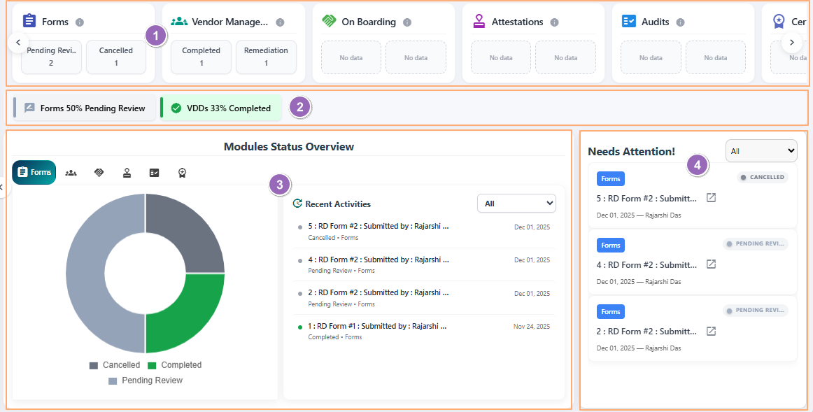 Fig: 3 - Understanding the various elements of the Unified Dashboard
-
1Top barDisplays module-wise cards.
-
2Middle barDisplays key pointers related to active modules.
-
3Modules Status Overview and Recent Activity sectionsProvides serrated donut charts and recent activities for selected modules.
-
4Needs Attention sectionLists items that need user attention.
 NOTE: The following sub-sections elaborate further the associated functionalities of the above-stated points.
2.1. Top bar
Displaying module summary cards as a carousel provides users with an immediate, high-level snapshot of compliance progress across all modules. This design eliminates the need to navigate multiple pages, enabling quick recognition of critical states. By surfacing the most relevant metrics upfront, users can prioritize actions, monitor trends and make informed decisions faster, improving efficiency and reducing the risk of overlooked responsibilities.
It displays module summary cards as a carousel, with top-two key statuses (e.g., Approved, In Progress, Pending Review, etc.) and respective counts of items of both these within each card.
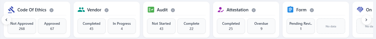 Fig: 4 - View of the Unified Dashboard top bar
1. Top bar cards
The top bar provides a quick snapshot of key statuses for each module in a scrollable view, helping users instantly identify progress and focus areas without navigating deeper into the system. The following modular cards are displayed:
| Sl. No. | Card Header Label |
|---|---|
| Form | |
| On Boarding | |
| Vendor | |
| Attestation | |
| Audit | |
| Certification | |
| Code Of Ethics |
An info icon is present on each card after the card header label. Hover your mouse pointer to reveal the associated tooltip.
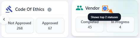
Fig: 5 - Card tooltip reveal on mouse hover
2. Cards carousel
You can click on the arrow icons at the left and right side of the bar to move in the appropriate direction and view items which are not visible by default, but are components of the bar.
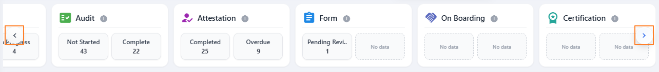
Fig: 6 - Using the arrows to view the entire top bar section
Here is an animated view of the above-mentioned movement.

Fig: 7 - Demo of the movement
NOTE: If no appropriate data is present for the module, then the boxes within the card will display a No data label.
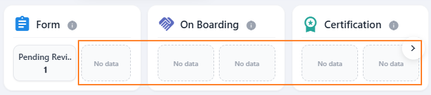
Fig: 8 - No data label in blank box
2.2. Middle bar
Showing quick progress indicators as a carousel gives users an instant, high-level view of compliance performance across core modules without navigating multiple screens. This visual summary enhances decision-making, saves time, and ensures proactive management of compliance tasks by highlighting critical metrics in a single glance.
1. Middle bar items
The middle bar shows quick progress indicators or information (in varous percentages) related to core modules as a carousel and offers percentage-based progress indicators in one place, enabling users to quickly gauge overall performance and spot areas that need attention.
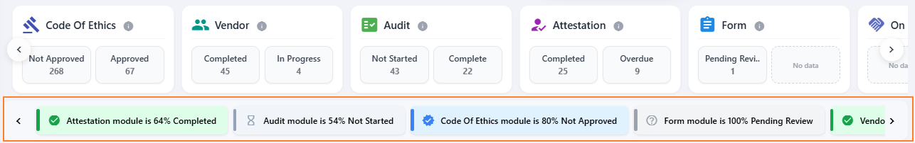
Fig: 9 - View of the middle bar
2. Items carousel
You can click on the arrow icons at the left and right side of the bar to move in the appropriate direction and view items which are not visible by default, but are components of the bar.

Fig: 10 - Arrows to navigate through multiple panel items spanning across the page
Here is a nice animated view of the above-mentioned movement.
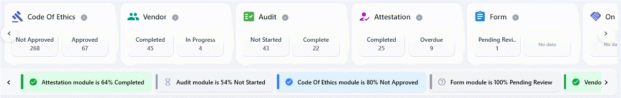
Fig: 11 - Demo of the movement
NOTE: If no appropriate data is present for the modules, then the panel area is rendered as blank. Consider the following screenshot where no item is displayed.
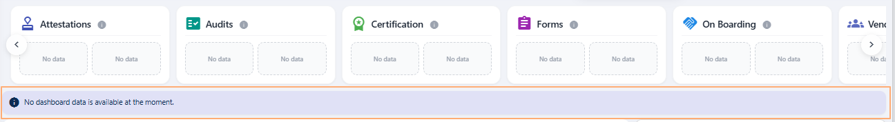
Fig: 12 - Blank area of middle bar
2.3. Modules Status Overview and Recent Activities sections
These sections give users a clear snapshot of progress and recent actions in one place. Visual charts make it easy to understand overall trends at a glance, while the activity list shows what has happened most recently. This helps users stay informed, spot delays quickly, and focus on what matters without digging through multiple screens.
Let us understand the various elements of these two sections with the help of the below list. Refer to the following screenshot which is marked with numerical values that correspond to the below stated points.
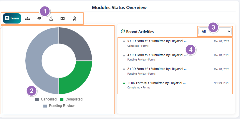
Fig: 13 - Module-wise tab selection options
-
1Tabs for module selectionAllows users to switch between different supported modules to view their respective status overview. This ensures quick navigation and focused insights for the selected module.
-
2Visualization of the selected module's itemsDisplays a serrated donut chart representing the distribution of statuses such as Completed, In Progress, and Pending Review in the form of graphical legends for the chosen module visualization, where both the graphical statuses and legends are color-coded. This visual summary helps users instantly understand progress and identify bottlenecks.
-
3Filter dropdownProvides a dropdown to filter activities based on status (e.g., Completed, Pending Review). This enables users to focus on specific items and streamline their review process.
-
4Recent Activities listShows a chronological list of recent actions related to the selected module and applied filter. Each entry includes timestamps and status tags for quick tracking and accountability.
NOTE: The following sub-sections elaborate further the associated functionalities of the above-stated points.
2.3.1. Tabs for module selection
Tabs for module selection allow users to switch between different areas of focus quickly, without leaving the dashboard. This simple navigation feature saves time and reduces complexity by presenting relevant information for the chosen module in one click. It helps users stay organized, concentrate on specific tasks, and avoid unnecessary scrolling or searching, making the overall experience more efficient and intuitive.
The following tabs can be selected:
- Code of Ethics
- Vendor
- Audit
- Attestation
- Form
- On Boarding
- Certification
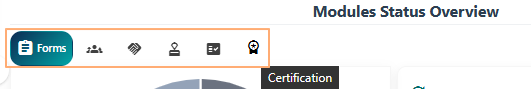
Fig: 14 - Tab options
Here is an animated view of the tab selection process.

Fig: 15 - Demo of the tab selections
2.3.2. Visualization of selected module's items
Visualization of the selected module's items provides an instant, clear picture of progress and distribution without requiring detailed reports or manual checks. By using intuitive charts and visual cues, users can quickly interpret complex data, identify trends, and spot areas needing attention.
1. Visualization tooltip
Hover your mouse pointer over any displayed donut chart, to view the related tooltip on the trend view. Below the trend depiction, (at the bottom) you can find the status wise breakdown of chart items.
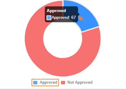
Fig: 16 - Tooltip on hover and color-coded legend
2. Visualization status removal
Click on any legend once to remove that section from the visualization. You can click again to remove it.
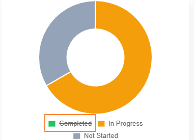
Fig: 17 - Removing a particular status from the visualization
3. Visualization click updates dropdown
Clicking once on any color-coded section of the donut chart changes the status selection dropdown and items listing of the Needs Attention panel. Here is a view of the functionality.
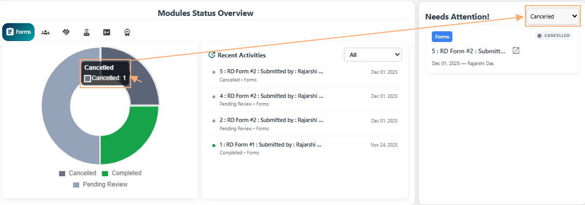
Fig: 18 - Chart section click updates the Needs Attention panel
2.3.3. Filter dropdown
The filter dropdown helps users focus on what matters most by allowing them to select specific statuses for the items displayed. Instead of scanning through all activities, users can quickly narrow down the view to relevant entries, making it easier to prioritize tasks and take timely action.
The filter dropdown enables the selection of the applicable statuses of the modular items which are listed here. Consider the following item which shows the applicable statuses for the Vendor module.
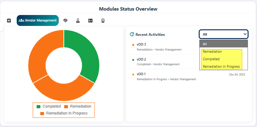
Fig: 19 - Appropriate dropdown options visible
It is independant on the graphical visualization and depends on the items present in the module.
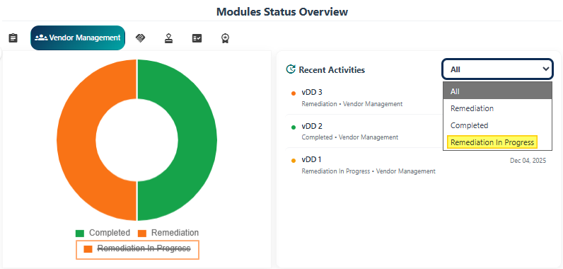
Fig: 20 - Striking off a legend of visualization removes it from the graph but the option is present in dropdown
Here is an animated view of the dropdown option changes after subsequent tab selections.
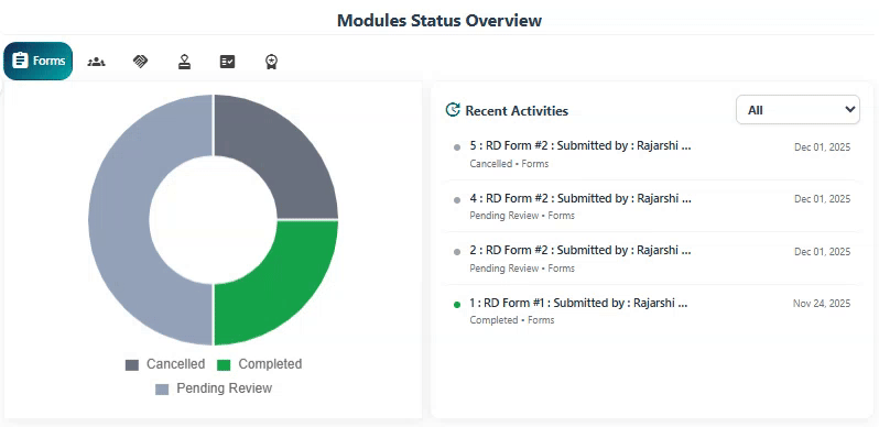
Fig: 21 - Demo of the dropdown option selections along with tab changes
NOTE: The filter dropdown contains only the All option if no appropriate item records are present in the module.
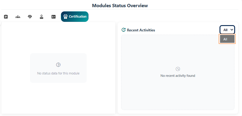
Fig: 22 - Only All option present
2.3.4. Recent Activities list
The Recent Activities list helps users stay informed about the latest updates without searching through multiple screens.
Let us now try to understand the various elements of the Recent Activities list. Refer to the following screenshot which is marked with numerical values that correspond to the below stated points.
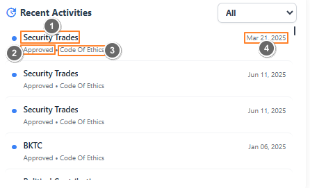
Fig: 23 - Elements of Recent Activities list
Each entry in this Recent Activities list includes:
-
1Item NameDisplays the name of the specific activity or record, such as a submitted form, attestation, or audit entry. This helps users quickly identify what action was performed.
-
2StatusDisplays the current status of the listed item, such as Completed, In Progress, or Pending Review, etc. enabling quick recognition of progress.
-
3Module NameIndicates the module to which the activity belongs (e.g., Attestation, Audit, Form, etc). This provides context for the type of compliance process involved.
-
4DateShows the date when the activity occurred, helping users track the sequence of actions and identify recent updates.
NOTE: The list can be rendered blank (with a No recent activity found label displayed) if no items are present in the module.
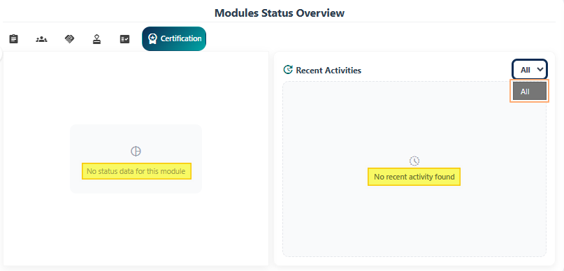
Fig: 24 - Blank list area
2.4. Needs Attention section
Highlights the items that require immediate attention, ensuring users can prioritize critical actions and maintain compliance without searching through multiple screens.
Here is the view of the Needs Attention section.
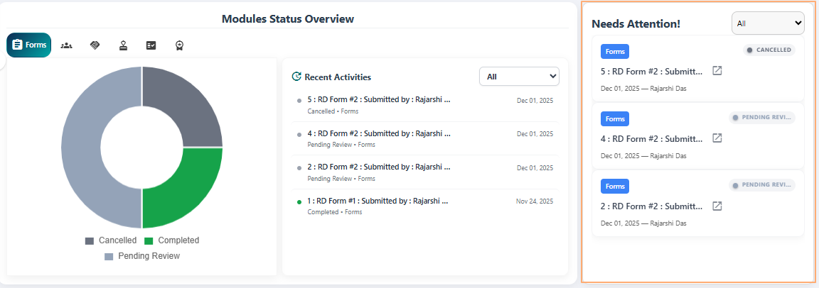
Fig: 25 - Needs Attention section
1. Understanding the display structure
Each entry in this section includes:
-
1Module NameIndicates the module where the action is required (e.g., Attestation, Forms). This module is fetched from the Modules Status Overview panel. For example, if Form tab is selected in the visualization section, then forms are present here in this listing. This helps users quickly identify the context of the pending item.
-
2List Item TitleDisplays the specific item or submission name, providing clarity on what needs to be completed or reviewed. The titles are linked, meaning that you can click on them to navigate directly to the associated module from here. This ensures users can navigate to the relevant module without confusion and avoid delays. The title may also be followed by the sumbitter name.
-
3Status TagColor-coded labels such as IN PROGRESS, PENDING REVIEW, or CANCELLED for quick recognition. These visual indicators allow users to instantly understand the current state of each task and take appropriate action.
-
4DateShows the date when the activity occurred, helping users track the sequence of actions and identify recent updates.
-
5User nameShows ownership for accountability by displaying the name of the responsible user. This promotes transparency and ensures timely follow-up for pending actions.
2. Using the linked title
You can hover over any item title to view the tooltip showing the full title. Click on the displayed title to navigate directly to the related module / page.
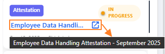
Fig: 26 - Pending item title as link
After clicking on it, you get redirected to the associated module / page and can find the exact item listed there.
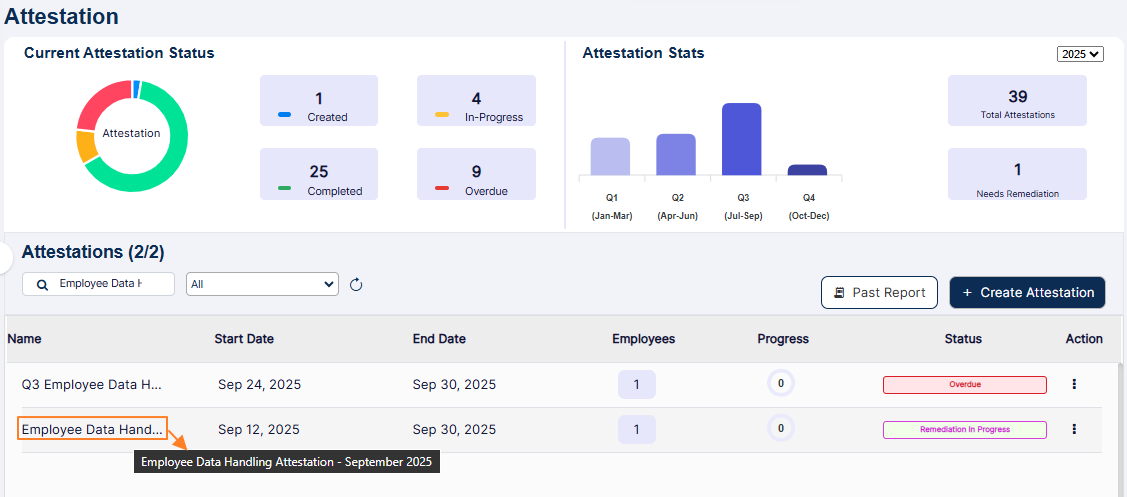
Fig: 27 - Redirected module showing the same item
3. Using the dropdown
The status selection dropdown at the top-right can be used to display only modular items here (selected from the Modules Status Overview). Refer to the following image which shows the difference in the options depending on the module selected. The All option is by default set in the dropdown.
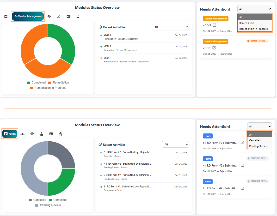
Fig: 28 - Dropdown options can differ based on pending items module-wise
Here is an animated view showing different items which need attention populating the list area depending on the selection of the various dropdown options that are available.
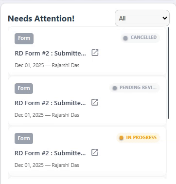
Fig: 29 - Demo of the dropdown selection options loading different items
Here is an animated view of the dropdown options selection on the basis of the chart section clicks.
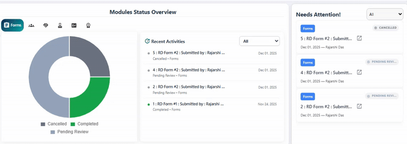
Fig: 30 - Demo of the dropdown selection change