
 This online help page is dedicated to the SurgeONE.ai Reports page and its associated functionalities. The SurgeONE.ai reports help firms adhere to all applicable laws and regulations, reducing the likelihood of fines and penalties. They promote a culture of transparency, accountability, and ethical conduct, which is crucial for earning and maintaining the trust of clients and stakeholders. Additionally, these reports enhance the firm's operational efficiency and effectiveness, supporting its long-term success.
1. Navigating to the Reports page
Click on the Reports menu option of the left panel menu to get redirected to the Reports page.
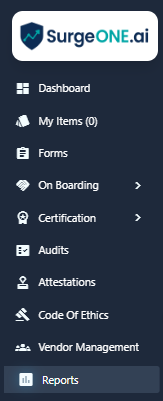 Fig: 1 - Reports menu
Here is the view of the Reports page. There are twelve reports provided currently.
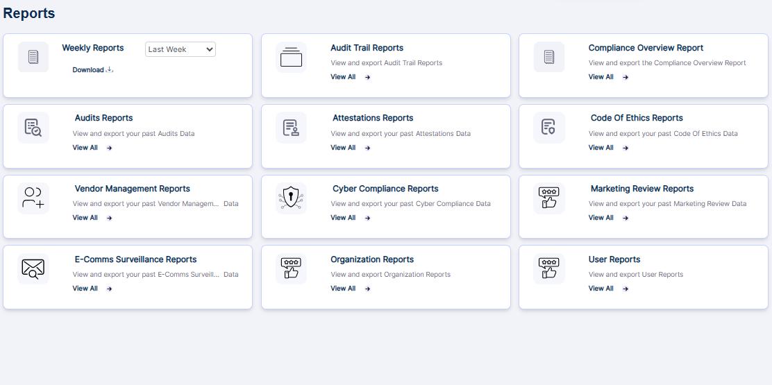 Fig: 2 - Reports page
2. Using the Weekly Reports
This dedicated Weekly Summary Report provides quick access via a card on the Reports page for streamlined reporting. It is built entirely from SurgeOne data, ensuring accuracy and consistency without manual input. This streamlines the reporting process by reducing the time users spend searching for relevant data, making it easier to stay updated on weekly performance and activities. You can also export the generated report results.
Here is the view the card related to the Weekly Reports. The following screenshot is indicated with numerical values which correspond with the following two points:
- Date range selection filter - This dropdown lets you choose any one option from the listed ones or lets you set a custom date range.
- Download option lets you obtain a local copy of the generated report based on the selected date range.
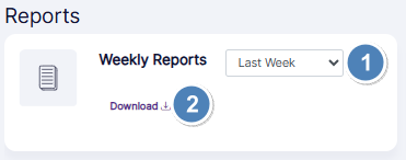 Fig: 3 - Elements of the Weekly Reports card
Here is the expanded view of the date selection dropdown options. Choosing the Last Week option gathers information of the activities pertaining to the previous week, while choosing the This Week option gathers information of the activities pertaining to the current week. This feature ensures consistency in weekly reporting and speeds up the process of generating reports.
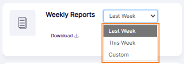 Fig: 4 - Expanded view of the date selection dropdown options
The following image displays the visibility of the Start Date and End Date fields which loads after you select the Custom option. The End Date field is disabled and is only enabled after you select a date on the Start Date field.
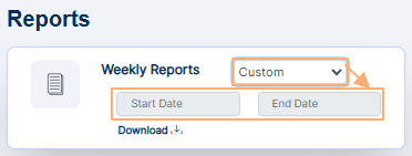 Fig: 5 - Date Range fields loads on Custom option selection
The following image displays the visibility of the calendar which loads after you click on the Start Date field.
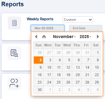 Fig: 6 - Calendar to set start date
After choosing a default dropdown option, or setting a custom date range, you can click on the Download option to proceed to get a local copy of the generated report. The system analyzes weekly activity and highlights the most critical items that need attention. This includes:
- Flagging anomalies or unusual trends.
- Identifying underperforming areas.
- Surfacing urgent tasks or issues. This helps users focus on what matters most without sifting through all the data.
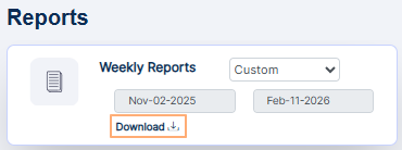 Fig: 7 - Download option
AI generates a concise, concise summary of key actions and trends from the past week. The report is crafted with simplicity in mind to ensure that users of all technical backgrounds can understand the insights. With access to data, your team members are now empowered to make informed decisions. After you click on the Download option, a pdf copy of the generated report gets downloaded.
Here is the view of the sample contents of a generated Weekly Reports PDF file. The file is titled as 'Weekly Compliance Summary Report' if the current or last week date range is chosen for report generation.
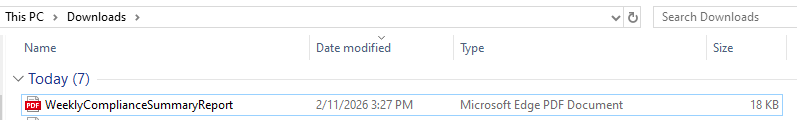 Fig: 8 - View of the generated Weekly Report
Otherwise the file is titled as 'Compliance Summary Report' when a custom date range is chosen for report generation.
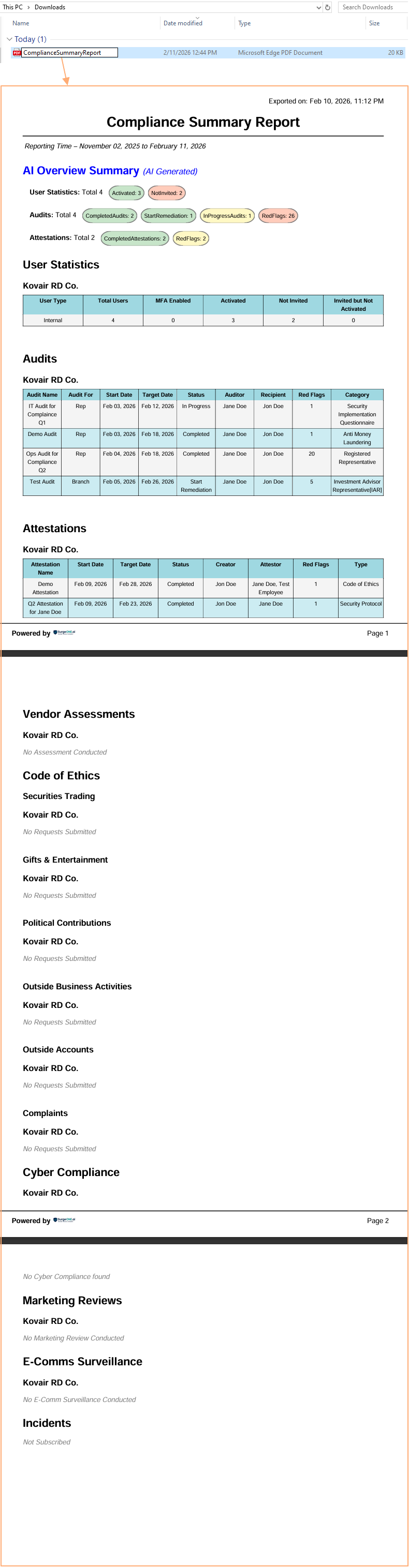 Fig: 9 - View of the contents of the generated custom date range Report
3. Navigating to the Audit Trail Report page
The Audit Trail Report page is essential for ensuring transparency, accountability and compliance, as it allows organizations to trace data modifications, detect unauthorized activities and maintain the integrity of critical information.
To access this page, click on the Reports menu of the left panel area and then on View All option within the Audit Trail Reports card of the Reports page.
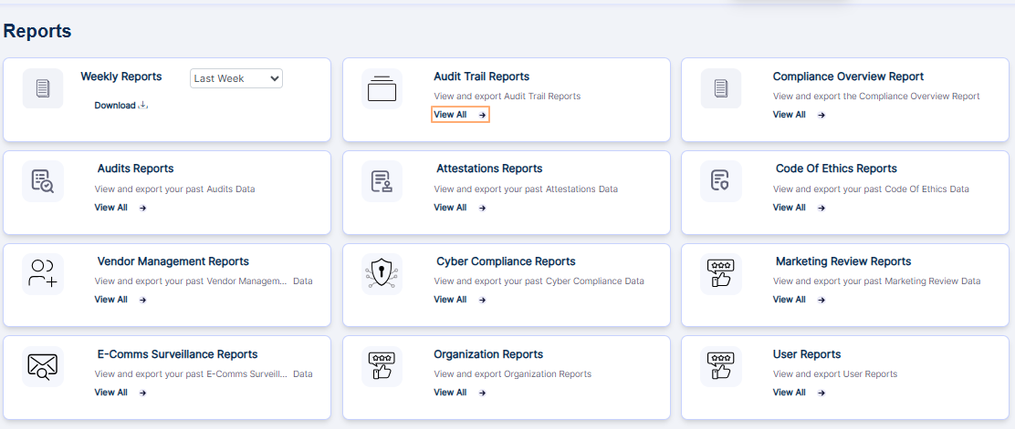 Fig: 10 - Audit Trail Reports of Reports page
Clicking this option loads the Audit Trail Report page.
Benefit: Get a centralized view of all system activities to monitor additions, edits and deletions across modules, ensuring transparency, accountability and easier compliance tracking.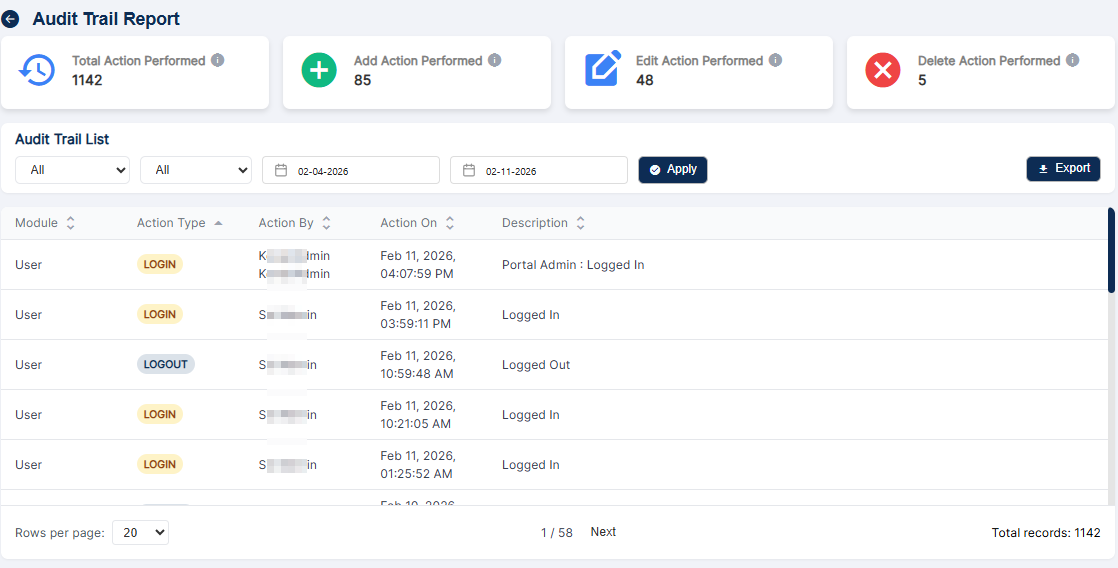 Fig: 11 - Audit Trail Report card loads the Audit Trail Report page
 NOTE: You can click on the back
  icon at the top-left to navigate back to the Reports page.
When there are no items, the page displays a blank view.
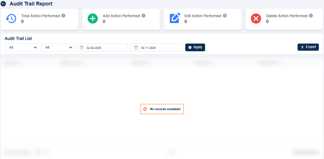 Fig: 12 - Audit Trail Report blank view
Key benefits of Audit Trail Report page:
- Transparency – Every action is logged and visible, eliminating the possibility of hidden changes and ensuring stakeholders can trust the data accuracy.
- Accountability – Each activity is tied to a specific user along with the date, creating a clear record of responsibility and discouraging misuse.
- Compliance – The report provides verifiable evidence of system activity, supporting audits, certifications, and regulatory requirements.
- Data Integrity – The report safeguards against tampering or accidental loss by recording edits and deletions, preserving the reliability of information.
- Efficiency – Filters and export options allow users to quickly locate, analyze, and share relevant data without unnecessary effort.
- Risk Management – Unusual patterns, such as unexpected deletions or spikes in activity, can be detected early, helping organizations respond to potential threats before they escalate.
3.1. Understanding the Audit Trail Report elements
The Audit Trail Report is a monitoring tool that records every action performed in the system. It ensures visibility, accountability and compliance by capturing details of all user activities across modules like Audit, User, Vendor Assessment, Attestation, etc.
The page displays a dashboard view along with a grid view below the visualizations. At the top of the report, you will see a snapshot of activity counts.
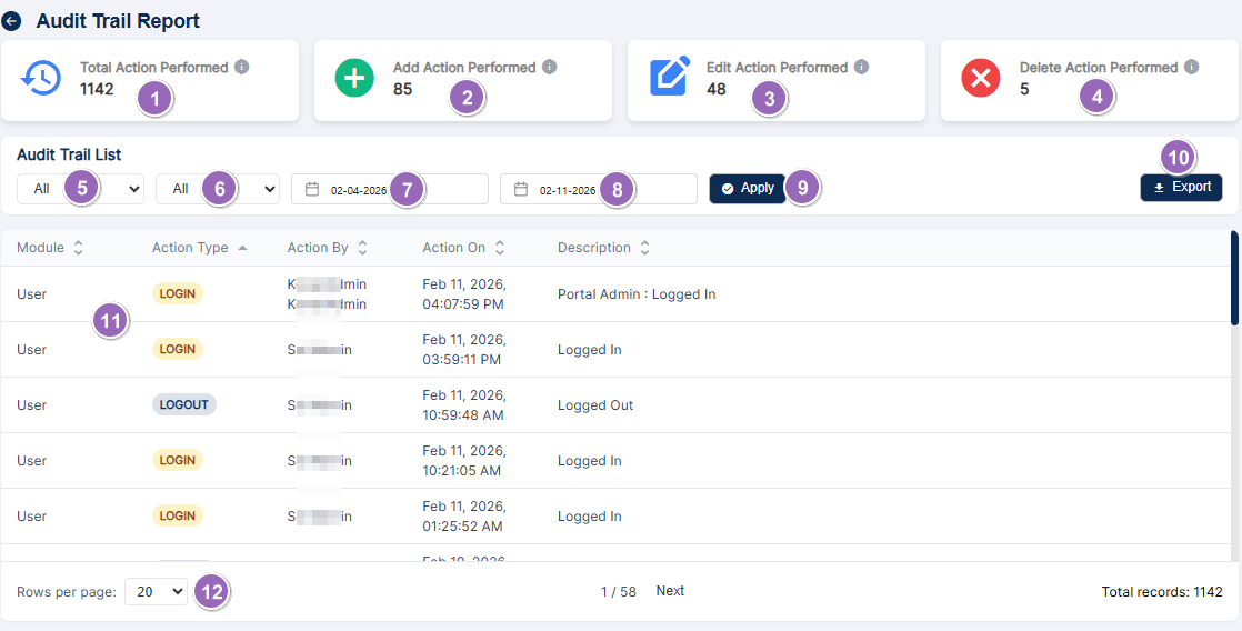 Fig: 13 - Audit Trail Report elements
The following sub-sections correlate with the functionalities of the various page elements as indicated via the numerical values in the above screenshot
-
1Total Action PerformedCard summarizes the total number of actions performed within the system.
-
2Add Action PerformedCard provides count of entries created in the system.
-
3Edit Action PerformedCard provides count of entries modified in the system.
-
4Delete Action PerformedCard provides count of entries removed from the system.
-
5Activity or Action Type dropdownDropdown to filter results by activity or action type.
-
6Module dropdownDropdown to filter actions by the application module or page.
-
7From Date filterCalendar selection field date picker to choose the start date for the results range.
-
8To Date filterCalendar selection field date picker to choose the end date for the results range.
-
9Apply buttonApplies selected filters and date range to refresh the grid view and fetch the displayed results.
-
10Export buttonExports the currently fetched results into a downloadable file format.
-
11Grid viewDisplays fetched results in a sortable column-based, tabular format.
-
12Pagination dropdownControls how many rows are shown per page and enables navigation between pages.
NOTE: The following sub-sections elaborate further the associated functionalities of the above-stated points.
3.1.1. Total Action Performed Card
The Total Action Performed card provides a consolidated count of all activities logged in the system during the selected reporting period.
The system automatically tracks every action performed across all modules. It combines every Add, Edit and Delete action into a single figure, giving users a high‑level snapshot of overall system usage. Each time a user adds, edits, or deletes a record, the system logs the event and increments the total count. This card updates dynamically in real time or when filters such as date range, module, or action type are applied, ensuring the displayed number always reflects the current dataset.
Benefit: Quickly shows the scale of activity, helping users gauge whether system usage is within expected levels.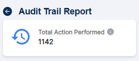 Fig: 14 - Total Action Performed Card
You can hover over the info icon to reveal the associated tooltip about the card.
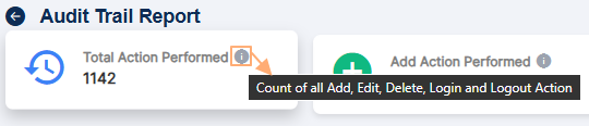 Fig: 15 - Total Action Performed Card tooltip
3.1.2. Add Action Performed Card
The Add Action Performed card highlights the number of new records created within the chosen timeframe. It focuses specifically on additions, which are often indicators of growth, onboarding, or new data entry.
Whenever a user creates a new entry in any module, such as adding a new audit, registering a user, creating a vendor assessment, or recording an attestation, the system logs the event as an Add action. Each logged addition increments the count displayed on this card.
Benefit: Helps track growth and onboarding by showing how many new records were introduced. Fig: 16 - Add Action Performed Card
You can hover over the info icon to reveal the associated tooltip about the card.
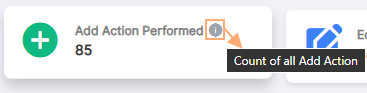 Fig: 17 - Add Action Performed Card tooltip
3.1.3. Edit Action Performed Card
The Edit Action Performed card displays the number of modifications made to existing records during the selected period. It focuses on updates that may alter the meaning, accuracy, or ownership of data.
When a user updates a record, for example, changing an audit type, modifying user details, or updating vendor information, the system logs the change as an Edit action. The card count increases accordingly and the details of the edit are captured in the grid view for transparency.
Benefit: Ensures visibility into data changes, supporting data integrity and accountability. Fig: 18 - Edit Action Performed Card
You can hover over the info icon to reveal the associated tooltip about the card.
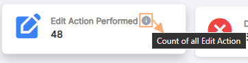 Fig: 19 - Edit Action Performed Card tooltip
3.1.4. Delete Action Performed Card
The Delete Action Performed card shows the number of records removed from the system within the selected timeframe. Since deletions are often sensitive, this card provides a focused view of such actions.
Each time a record is deleted, the system logs the event with details such as record ID, name and the user who performed the deletion. The card updates to reflect the total number of deletions in the reporting period.
Benefit: Highlights potentially sensitive or risky actions, making it easier to spot unauthorized removals.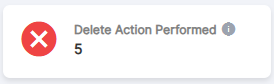 Fig: 20 - Delete Action Performed Card
You can hover over the info icon to reveal the associated tooltip about the card.
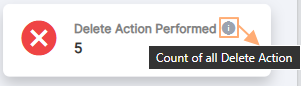 Fig: 21 - Delete Action Performed Card tooltip
3.1.5. Activity or Action Type Dropdown
This dropdown allows users to filter the report by action type.
The following options populate the dropdown:
- All
- Login
- Logout
- Add
- Edit
- Delete
When a user selects an option, the system refreshes the report after you click on the Apply button, to display only the chosen type of activity. For example, selecting Edit will show only modifications, while All will display every action.
Benefit: Saves time by narrowing the view to the most relevant actions.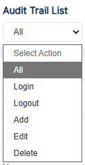 Fig: 22 - Activity or Action Type Dropdown
3.1.6. Module Dropdown
The Module dropdown filters the report by functional area, such as Audit, Vendor Assessment, Attestation, etc.
When a module is selected, the system refreshes the report after you click on the Apply button, to display only actions related to that specific module. This allows users to isolate activity within a particular function or area of interest.
Benefit: Provides targeted insights into a particular module without distraction from unrelated modular data.The dropdown options are present for the modules which are having its entries. For example, if no audits are created, then the Audits dropdown option will not be present here.
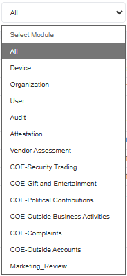 Fig: 23 - Module Dropdown
NOTE: The dropdown is initially blank, with only All option. The options get dynamically populated within the dropdown on the basis of module-wise activities. For example, if an audit is created, then the Audit option is visible in the expanded dropdown.
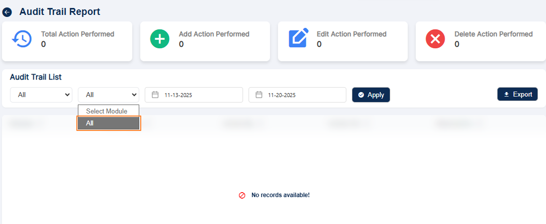 Fig: 24 - All option only present in the Module Dropdown
3.1.7. Calendar Selection – From Date
The From Date filter specifies the starting point of the reporting period, marking the earliest date from which data will be included in the report. By default, this filter is automatically set to one week prior to the current calendar date, ensuring that users capture a meaningful window of recent activity without needing manual adjustment. For example, if today is Friday, the From Date filter will automatically display the date of Friday of the previous week. This default behavior provides convenience by pre‑defining a standard reporting range, while still allowing flexibility for users to adjust the filter selection if they wish to analyze a longer or shorter period. By automatically setting the start date one week earlier, the system ensures that reports are both timely and relevant, helping users quickly identify trends and monitor activity over the past week.
Users select a date from the calendar picker and the system uses it as the earliest point for fetching records. Only actions performed on or after this date will be included in the report. Any future dates are greyed-out in the calendar and hence cannot be selected for filtering results.
By default, the date one week prior to the current date is set.
Benefit: Allows precise control over the starting date for the timeframe being analyzed.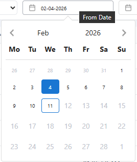 Fig: 25 - Calendar Selection – From Date
3.1.8. Calendar Selection – To Date
The To Date filter specifies the end point of the reporting period, marking the latest date for which data will be included in the report. By default, this filter is automatically set to the current calendar date, ensuring that users always capture the most up‑to‑date information without needing manual input. For example, if today is Friday, the To Date filter will automatically display the same selection. This default behavior provides convenience to the end user. Users may adjust the filter selection if they wish to generate reports for a past period, but the automatic setting ensures that, in most cases, the reporting window naturally extends to today.
Users select a date from the calendar picker and the system uses it as the latest point for fetching records. Only actions performed on or before this date will be included in the report. Any future dates are greyed-out in the calendar. Consider the following screenshot which was taken on 11th of February, 2026. All dates after it are disabled and cannot be set.
By default, the current date is set.
Benefit: Complements the ending date to define a custom reporting window.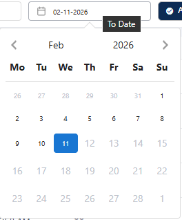 Fig: 26 - Calendar Selection – To Date
3.1.9. Apply Button
The Apply button activates the selected filters, including action type, module and date range.
Once the Apply button is clicked upon, the system refreshes the grid view to display only the records that match the chosen criteria. This ensures the report reflects the user's specific query.
Benefit: Ensures users see exactly the data they wish to find, without unnecessary clutter.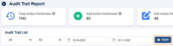 Fig: 27 - Apply button
3.1.10. Export Button
The Export button downloads a copy of the filtered results for offline use.
When clicked, the system compiles the current view into a .CSV (excel) file format. The exported file contains all the details visible in the grid view, preserving the applied filters.
Benefit: Provides a permanent, shareable record for compliance, auditing, or reporting purposes.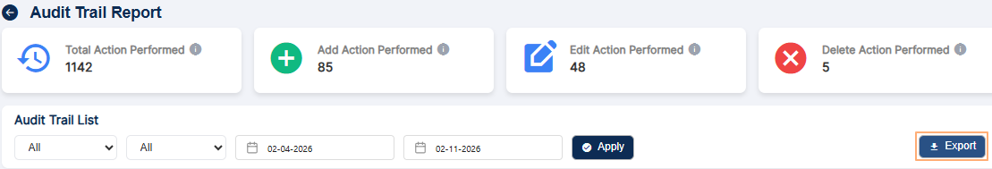 Fig: 28 - Export button
3.1.11. Grid View
The grid displays the detailed results of the audit trail report in a structured, tabular format.
Each row in the grid represents a logged action, showing details such as module, action type, user, date and specific changes made. The grid updates dynamically whenever filters are applied.
Benefit: Offers a clear, chronological and sortable view of logged activities for easy investigation.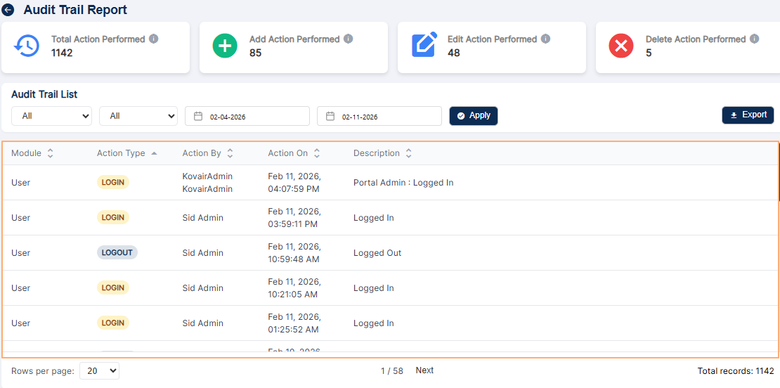 Fig: 29 - Grid view
The below table explains the column labels and its functions:
| Sl. No. | Field / Section Label | Description and Benefit |
|---|---|---|
| Module |
Identifies the specific functional area where the action took place, ensuring clarity on the context of activity.
This field helps users and auditors quickly understand which part of the application the record relates to, improving traceability and reducing confusion when reviewing logs. Benefit: Clear context speeds up troubleshooting and accountability. |
|
| Action Type |
Indicates whether the user operation was an
 , ,  , or , or  activity, making it easy to classify the nature of changes quickly with the help of the color-coded tags. activity, making it easy to classify the nature of changes quickly with the help of the color-coded tags.The visual tags and labels allow reviewers to scan records and immediately identify the kind of operation performed without reading full descriptions. Benefit: Faster classification and visual recognition of action types for efficient auditing. |
|
| Action By |
Shows which user performed the action, providing accountability and traceability.
Displaying the actor’s name or identifier ensures every change can be traced back to a responsible person, supporting security and compliance requirements. Benefit: Improves accountability and simplifies investigations into changes. |
|
| Action On |
Captures the exact date of the action, creating a reliable chronological record.
Recording the date of each action builds an accurate timeline of events, which is essential for audits, reporting, and resolving disputes. Benefit: Provides a dependable chronological trail for compliance and analysis. |
|
| Description |
Details what was changed, added, or removed, offering transparency into the specifics of the activity.
A clear description helps reviewers understand the scope and impact of the action without needing to reconstruct it from other data. Benefit: Enhances transparency and reduces time spent interpreting log entries. |
You can also sort any column data. Click on the arrow icons are the right side of the column header labels to sort the results in ascending or descending order.
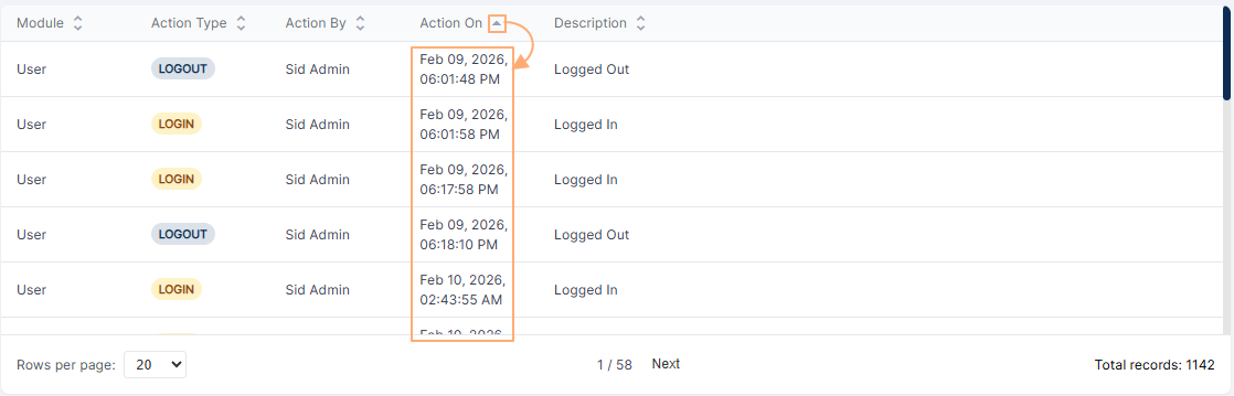 Fig: 30 - Sorted data of the Module column of grid view
3.1.12. Pagination Dropdown
The pagination dropdown controls how many entries are displayed per page in the grid view.
Users can select from options such as 20, 50, or 100 rows per page. The grid adjusts accordingly and navigation controls allow users to move between pages if the total records exceed the per‑page limit.
It also displays in the middle of the bottom bar the current page number in comparison to the total number of pages of grid view results. Beside it, Previous and Next buttons can be present to navigate to the previous and next report page respectively. At the right-bottom corner of the page, the total count of records populating the grid view is also displayed.
Benefit: Enhances usability by letting users control how much data they view at once, making it easier to scan quickly or analyze larger sets of records efficiently.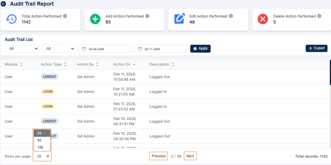 Fig: 31 - Pagination dropdown and other labels displayed at the bottom bar
4. Using the Compliance Overview Report
The Compliance Overview Report consolidated report displaying roll-up data from Audit, Attestation and Code of Ethics modules. It is a parameterized report based on the logged-in user and a date range.
- Click on the View All option of the Compliance Overview Report tile, to proceed to navigate to the report view.
- Select the user based on which whom you want to execute the search operation. By default, the logged-in user is selected (populates) the dropdown. However, if the logged-in user is set as the Supervisor of another existing user, then the username of the subordinate also populates the dropdown. But, the logged-in user is selected in the dropdown.
- Select the starting date from the start date calendar selection field. By default, it is set to 1st January of the current year.
- Select the ending date from the end date calendar selection field. By default, it is set to 31st December of the current year.
- Click on the Submit button to generate report results based on the filters set.
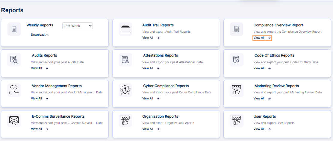 Fig: 32 - Option to navigate to the report
The following image shows the report page that loads. The following columns are present in the report page - DETAILS, # Of ITEMS, # Of ITEMS WITH RED FLAGS and # Of INCOMPLETED ITEMS. You can view the count of audits, attestations and code of ethics entries which are assigned to, red flagged and pending for the user.
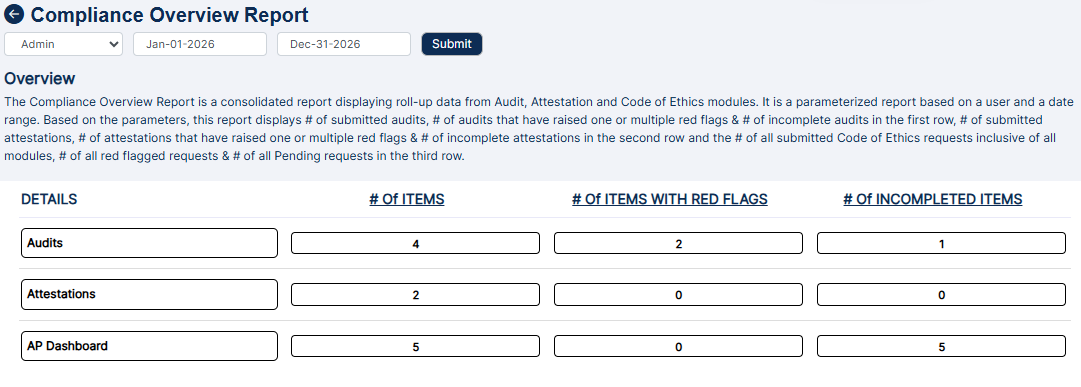 Fig: 33 - Compliance Overview Report view
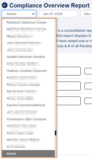 Fig: 34 - User selection dropdown
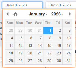 Fig: 35 - Start date calendar selection
 Fig: 36 - End date calendar selection
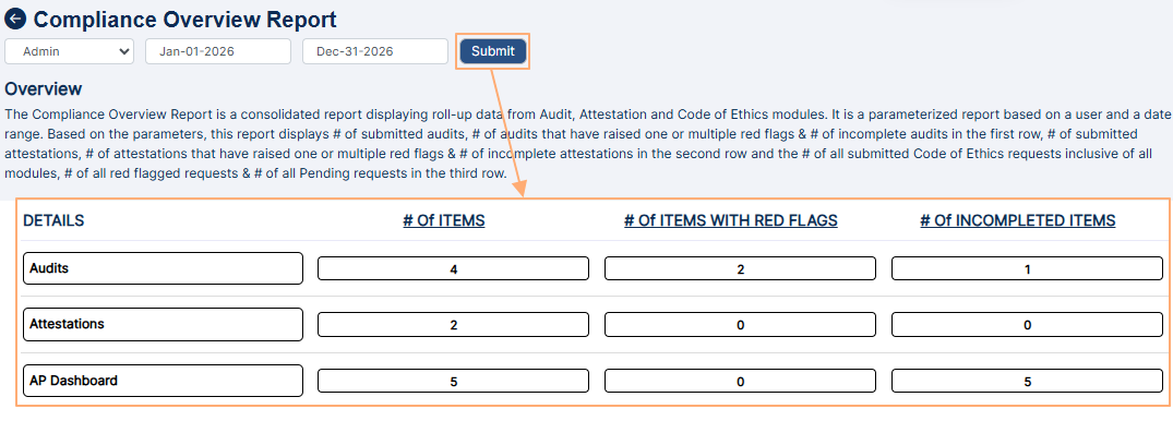 Fig: 37 - Search results generated
 NOTE:
NOTE:
- By default, the Compliance Overview Report loads the results related to the logged-in user for the current year.
- You can drill down the results further by clicking on the numeric values of the report. For example, clicking on the numeric value of the Audit row entry with red flags loads the following screen. As evident in the image, the count of the drilled down items match.
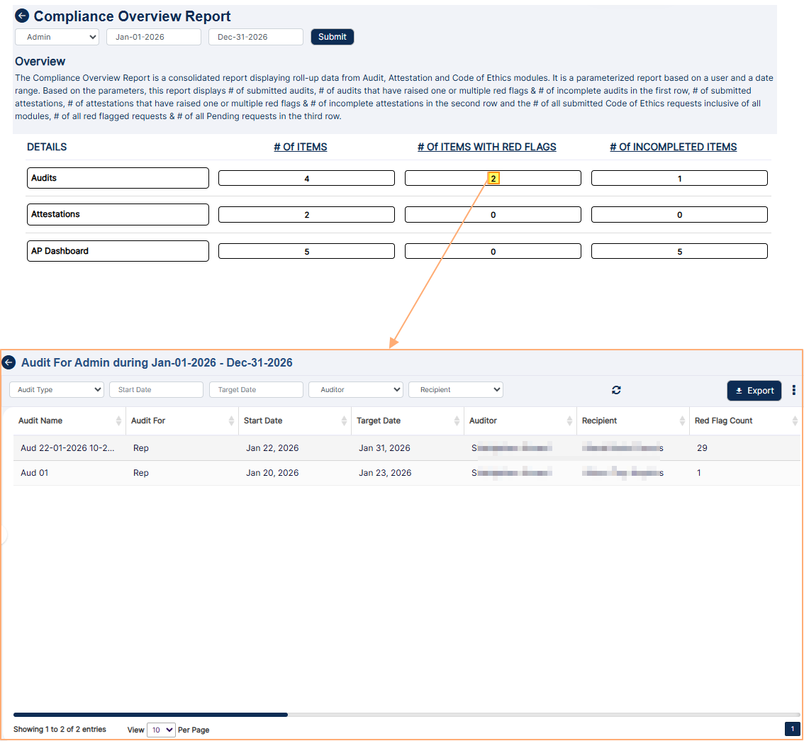 Fig: 38 - Drilled down view
5. Using the Audits Reports
The Audits Reports lets you search for existing audits created or processed. Set appropriate filters to generate report results as required. You can also export the generated report results.
Click on the View All option of the Audits Reports tile on the Reports page, to proceed to navigate to the audit report.
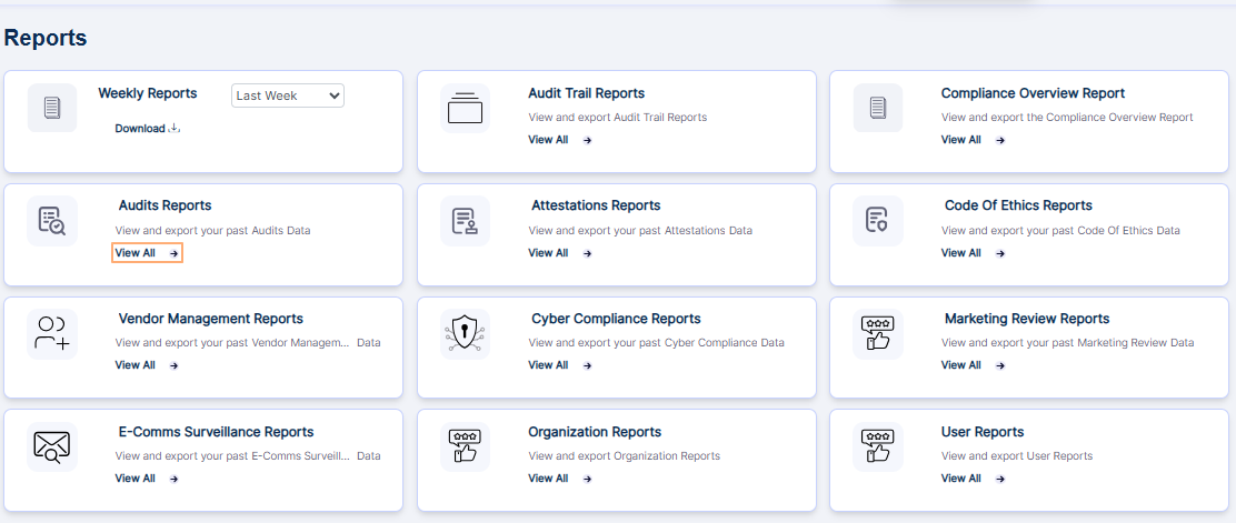 Fig: 39 - Option to navigate to the report
Alternatively, you can click on the Past Report button at the top right of the Audits page, to proceed to view the audit report. A user can view audits that they have created or audits where they have been assigned as an auditor or a recipient.
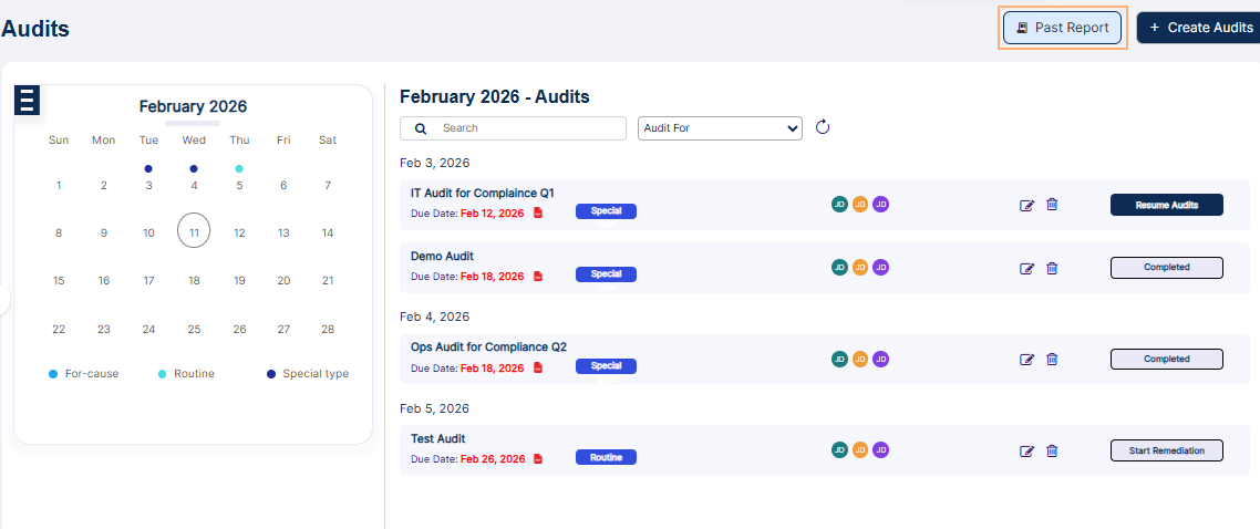 Fig: 40 - Past Report button
Consider this screen as a combination of dashboard and report view, where you can view drilldown of past audits, as well as search for past audits.
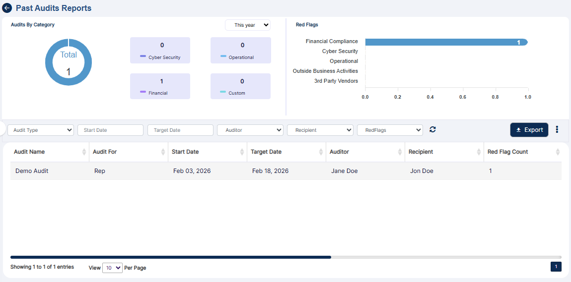 Fig: 41 - Past Audit Reports view
Let us illustrate the three sections which are present:
5.1. Audits by Category
Visualization of audits categorized by its type enhances clarity and organization, enabling users to analyze performance across different operational areas. It supports benchmarking and helps prioritize resources for areas requiring greater attention or improvement.
This section shows a donut chart illustration to represent the number of audits per audit category. There are four different types of audit categories as follows - Cybersecurity, Operational, Financial and Custom.
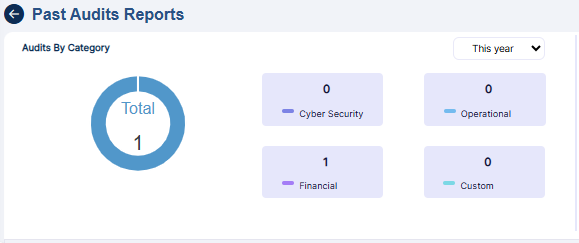 Fig: 42 - Audits By Category
- Each of these audit categories are color coded. Hover your mouse pointer over the donut chart to reveal a tooltip text about the audits count per audit category, out of the total audits count for that year. Refer to the following image to understand better.
- By default, the current year is selected. You can select another year from the year selection dropdown (at the top right of this section) to load the count of existing audits of different category types (of that year). This selection is only possible if audits were created and completed during that particular year.
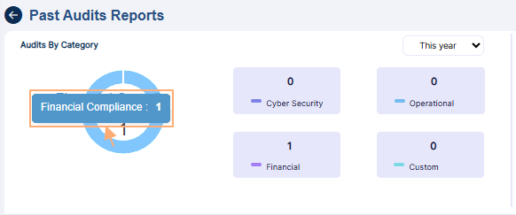 Fig: 43 - Audits By Category tooltip view
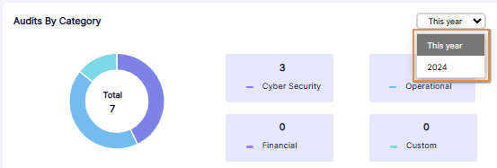 Fig: 44 - Year selection dropdown expanded view
Highlighting red flags according to audit types draws immediate attention to critical issues that require urgent action. This feature facilitates risk mitigation, ensures potential threats are addressed promptly, with a clear view of priority areas needing intervention. You can also view past years data if such dataset is present in the system.
This section shows a horizontal bar chart illustration to represent the red flags count per audit category type. There are five categories labeled as - Financial Compliance, Cyber Security, Operational, Outside Business Activities and 3rd Party Vendors. If there is no bar chart present for a category, then there is no red flagged question response for it yet.
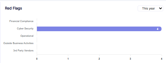 Fig: 45 - Chart view of Red Flags section
- By default, the current year is selected. You can select another year from the year selection dropdown at the top right of this section.
- Hover your mouse pointer over a displayed bar chart to reveal a tooltip text about the red flags count of that audit category. Refer to the following image to understand better.
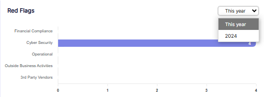 Fig: 46 - Year selection dropdown expanded view
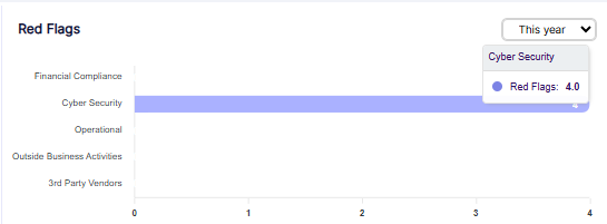 Fig: 47 - Tooltip view of Red Flags of Operational audit category
The grid view section provides a consolidated view of all audit activities, offering users a complete record for internal reviews, external audits, and regulatory inspections. With filters for audit type, date range, auditor, recipient, and red flags, users can quickly locate and analyze audits. The sortable grid view displays key details, ensuring transparency, efficient reporting, and easier compliance management.
You can search for and view existing audits from this section. Let us first have a look at the different filters that can be set.
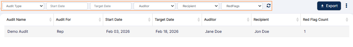 Fig: 48 - Grid view filter options of Past Report Report
- You can click on the Audit Type dropdown to expand its options. By default, no option is selected. These are the different audit template types which can be utilized in the system. The selectable options are loaded in accordance to the audit category. If audit for a particular category is not yet created, that category does not populate this dropdown. For example, consider the following screenshot which displays only the Financial Compliance option.
- You can select the date range using the provided Start Date and Target Date date selection fields.
- You can click on the Auditor dropdown to expand its options. Existing permitted/set users populate this dropdown.
- You can click on the Recipient dropdown to expand its options. This dropdown displays the full names of all users who are set as Recipient in different audits, as assigned in the Audit Details tab during audit creation.
- You can click on the RedFlags dropdown to expand its options. Selectable options are All, Yes and No. However, the dropdown does not reveal its options if there are no completed audits or if the completed audit has no red flags.
- The following image shows the view when there report results are fetched to populate the grid view.
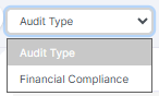 Fig: 49 - Audit Type dropdown options
 Fig: 50 - Date range fields
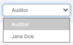 Fig: 51 - Auditor dropdown
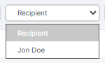 Fig: 52 - Recipient dropdown
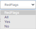 Fig: 53 - RedFlags dropdown
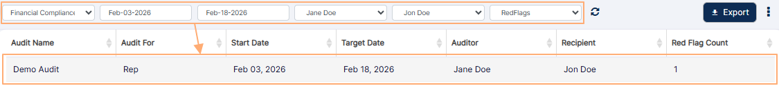 Fig: 54 - Report results in grid view
NOTE:
- All of the columns are sortable except for the Action column.
- The following columns populate the grid view:
-
1Audit NameDisplays the official title assigned to the audit. This helps identify the purpose, focus area, or the specific audit event being conducted.
Benefit: Provides clear reference and easy retrieval of audit records. -
2Audit ForIndicates the entity for which the audit is being performed.
Benefit: Helps in identifying the exact scope and target area of the audit. -
3Start DateDisplays the date on which the audit activity is to begin.
Benefit: Ensures tracking of audit timelines and scheduling accuracy. -
4Target DateShows the expected completion date of the audit. This acts as the target deadline for the particular audit.
Benefit: Helps maintain timely progress and prevents audit delays. -
5AuditorDisplays the name of the individual responsible for conducting or completing the audit.
Benefit: Provides clear accountability and point of contact for audit queries. -
6RecipientShows the individual user who will receive the audit findings or final reports.
Benefit: Ensures audit results reach the correct users for action. -
7Red Flag CountDisplays the number of issues, violations, or concerns detected during the audit.
Benefit: Provides a quick snapshot of audit risk level and compliance health. -
8CategoryIndicates the classification of the audit category based on its template.
Benefit: Helps organize and group audits for easy filtering and reporting. -
9OrganizationDisplays the name of the company / firm or sub-firm for which the audit is being performed.
Benefit: Reveals the proper mapping of audit data with organizational structure. -
10Audit YearSpecifies the year to which the audit belongs or is scheduled for.
Benefit: Helps maintain chronological audit records for compliance and review. -
11Audit TypeDefines the nature of the audit, such as Routine, For-cause, or Special type.
Benefit: Enables proper classification and workflow routing based on audit type. -
12ActionContains the vertical ellipsis icon, clicking on which toggles the visibility of the View Details menu option for a listed audit entry.
Benefit: Provides quick access to audit operations.
The following image shows the view when there is no fetched data to populate the grid view.
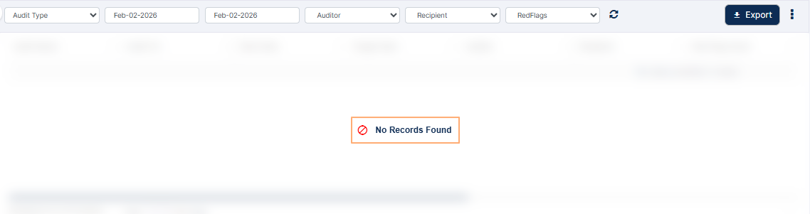 Fig: 55 - No Records Found label
5.3.1. Reset filters
You can click on the reset  icon to reset the report filters.
5.3.2. Exporting report results
- Click on the Export button to load the export options (to download a local copy the generated report). Two options labeled as CSV and PDF load below the button. Click on the former to download an excel file or on the latter to download a .pdf copy.
- Here is the view of the contents of the exported PDF file, after clicking on the PDF option. The file is named as AuditReport_YYYYMMDD_HHMMSS, where the timestamp is the Coordinated Universal Time (UTC).
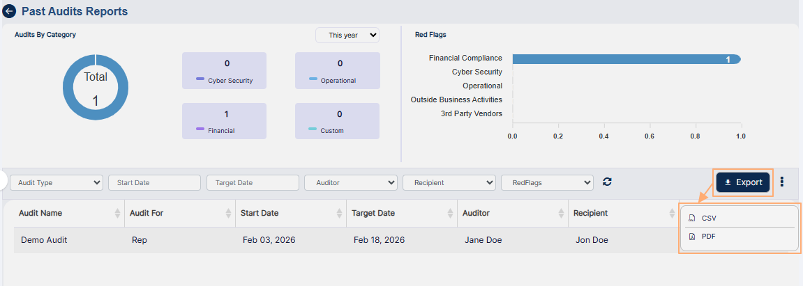 Fig: 56 - Export button
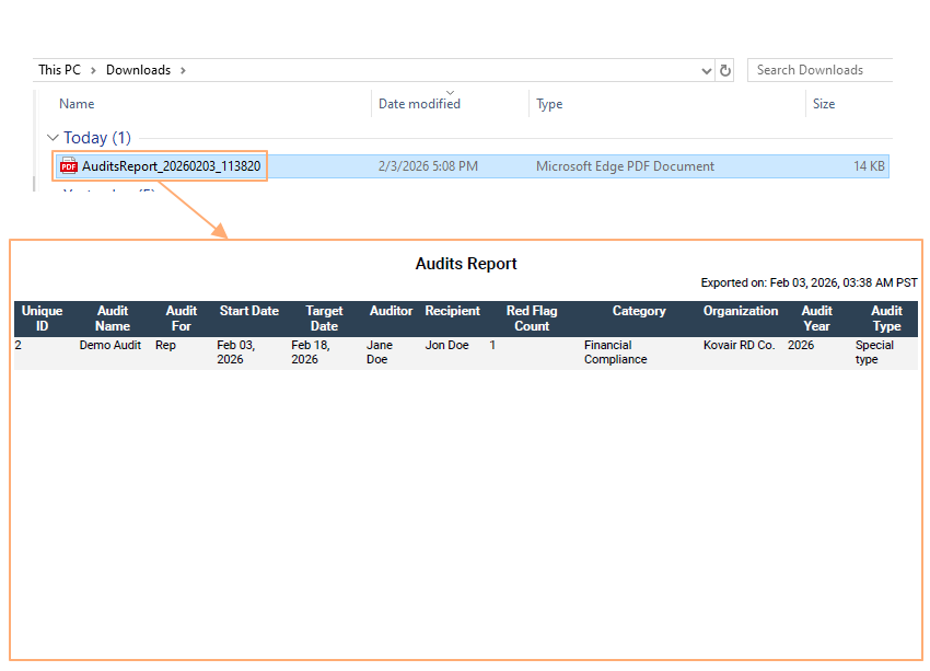 Fig: 57 - Exported PDF file content view
5.3.3. Customizing the grid view columns
Customization empowers users to tailor reports to their unique needs, improving relevance, enhancing stakeholder communication, and supporting data-driven decision-making. It ensures reports highlight the most critical information for each audience, as per their preferences and convenience.
- To customize the grid view columns from within the past audits report page, first click on the vertical ellipsis
 icon to the right of the Export button.
 - You can click on the right arrow icon to toggle the visibility of the column labels and its selection status.
- Make checkbox selections against the labels which you wish to display in the grid view. The greyed-out checkboxes cannot be deselected since those are always displayed in the grid. Click on the Save button after your checkbox selections are done. The modal window will close and the column changes made will get reflected in the grid view.
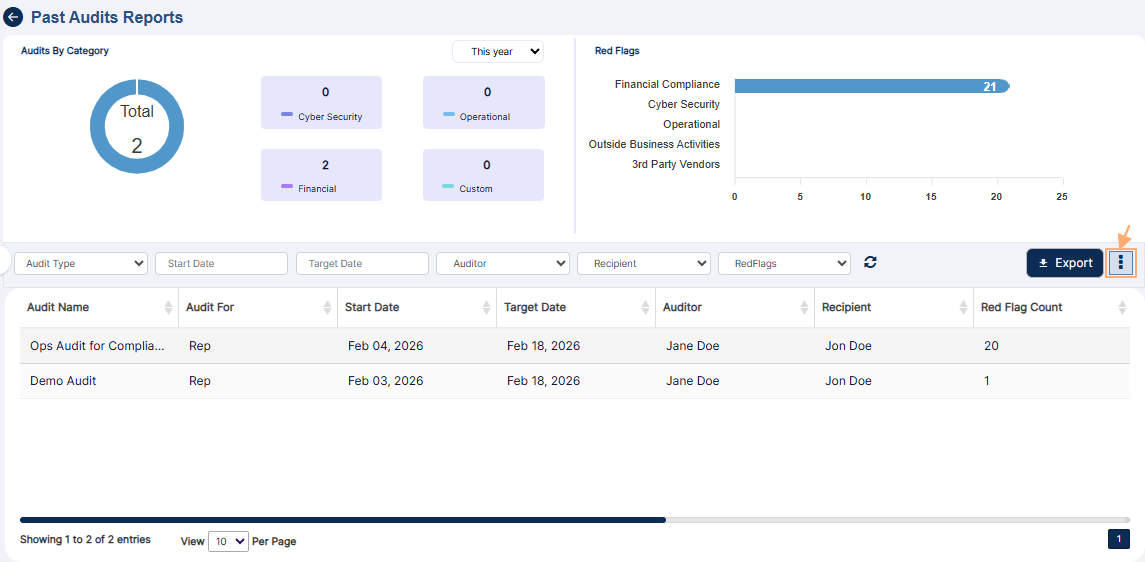 Fig: 58 - Icon to load modal window to customize grid view columns
The following Audit Attributes modal window loads.
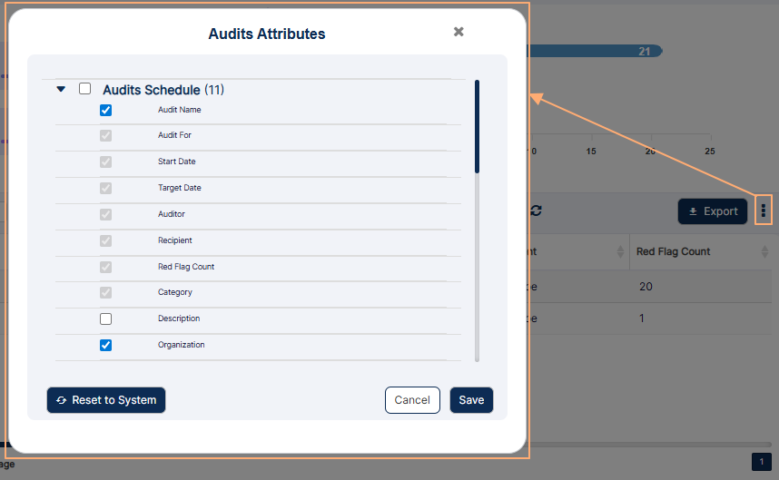 Fig: 59 - Audit Attributes modal window
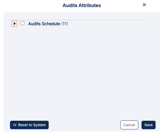 Fig: 60 - Collapsed view of the various column labels and its selection status
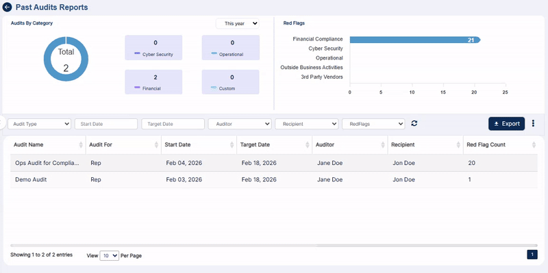 Fig: 61 - Saving the column checkbox selections
NOTE:
You can click on the Reset to System button to restore the column selections to the default setting.
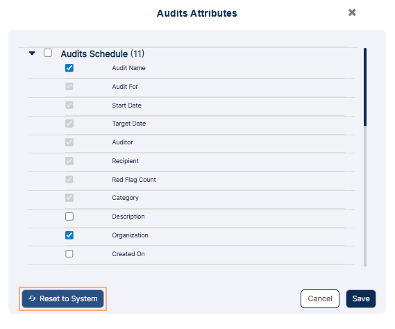 Fig: 62 - Button to reset columns display to default view
5.4. Pagination
Efficient navigation ensures smooth browsing of large datasets, improving accessibility and reducing cognitive load.
Pagination options are provided at the bottom-left, to navigate through multiple pages of entries, which populate the grid view as per the selected count of items per page. Use the provided options to display results accordingly or avail the left and right arrows to move through each page.
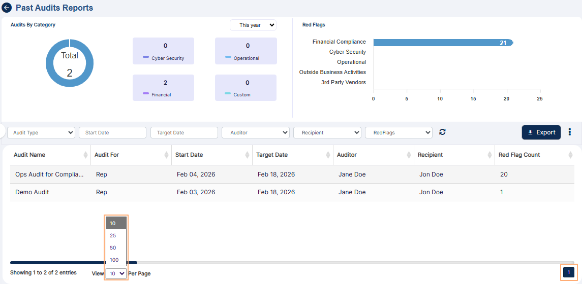 Fig: 63 - Pagination options
6. Using the Attestations Report
The Past Attestation Reports let you search for existing attestations which are completed. Set appropriate filters to generate report results as required. You can also export the generated report results.
Let us assume that you have navigated to the Reports page. Click on the View All option of the Attestations Report tile, to navigate to the attestation report.
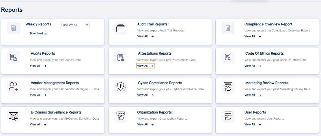 Fig: 64 - View All option of the Attestations Report tile on the Reports page
Alternatively, you can click on the Past Attestation Reports button at the top right of the grid view of the Attestations page to proceed to view the same attestations report.
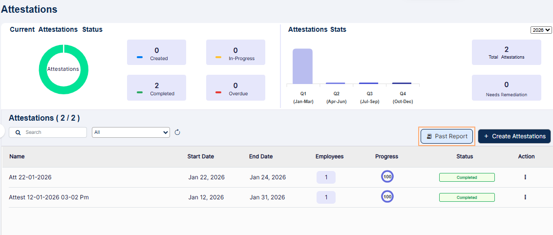 Fig: 65 - Option to navigate to the report
Here is the view of the report page. The report displays row entries of only the attestations which are completed.
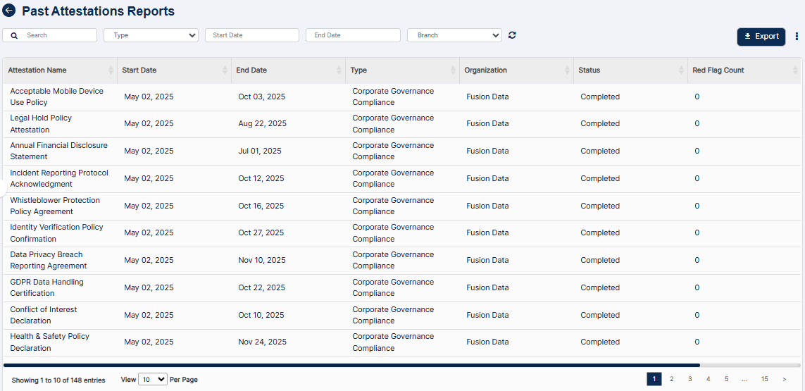 Fig: 66 - Past Attestation Reports view
The following filters are present in the report grid view.
- Search bar
- Category selection Type dropdown
- Start Date (date selection) calendar
- End Date (date selection) calendar
- Branch dropdown
 Fig: 67 - Past Attestation Reports filters
Let us illustrate each filter one by one.
6.1. Search bar
Enter the text based on which you want to execute the attestation search by. If matching entry is found, it will populate the report grid view.
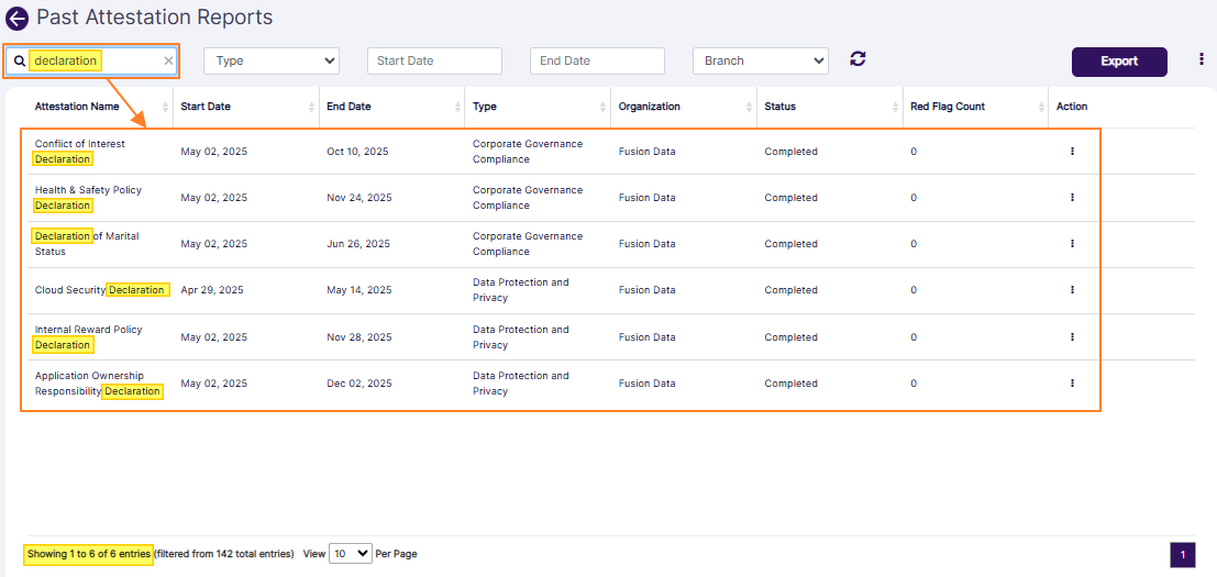 Fig: 68 - Report result fetched by search bar query
6.2. Category selection dropdown
The category selection dropdown is labeled as Type. Based on the categories of the completed attestation(s) present in the system, this dropdown is populated. You can make a dropdown selection to filter the report results based on an attestation category (provided that category entry populates the report results).
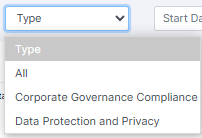 Fig: 69 - Category selection dropdown options
6.3. Start Date calendar
You can filter report results based on the attestation starting date by selecting a calendar date from the Start Date filter.
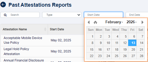 Fig: 70 - Start Date filter
6.4. End Date calendar
Similarly, you can filter report results based on the attestation ending date by selecting a calendar date from the End Date filter.
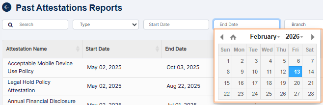 Fig: 71 - End Date filter
6.5. Branch dropdown
The Branch dropdown filter has the All option, along with the name of the firm (or parent company and its hierarchical companies, if created).
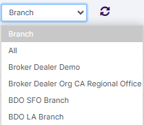 Fig: 72 - Branch filter
The report results are generated based on the filters set.
The following columns are present in the report grid view.
- Attestation Name
- Start Date
- End Date
- Type
- Organization
- Status
- Red Flag Count
- Action
NOTE:
All the columns except for the ACTION column are sortable.
6.6. Reset icon
You can click on the reset  icon to reset the report filters.
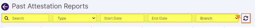 Fig: 73 - Reset icon
6.7. Export button
Click on the Export button to load the export options (to download a local copy of the generated report). Two options labeled as CSV and PDF load below the button. Click on the former to download an excel file or on the latter to download a .pdf copy.
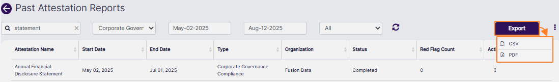 Fig: 74 - Export button
An excel file gets downloaded after you click on the CSV option. The file is named as AttestationReport_YYYYMMDD_HHMMSS (where the timestamp is the GMT).
You can also click on the vertical ellipsis icon of the ACTION column against any listed attestation to load the View Details menu option. Click on the option to load the modal window which displays the status-wise breakdown of employee contributions towards the attestation completion in the form of row entries. An Action column is present at the right side of a row entry in it. Click on vertical ellipsis icon within it to load the View Details menu option. Another modal window loads which displays the attestation questions and responses.
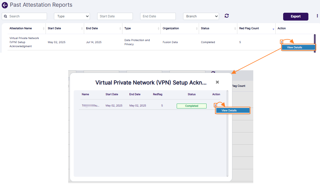 Fig: 75 - Proceeding to view the status-wise breakdown of employee contributions
An Export button is present at its bottom. Click on it to download the .pdf copy of this attestation report.
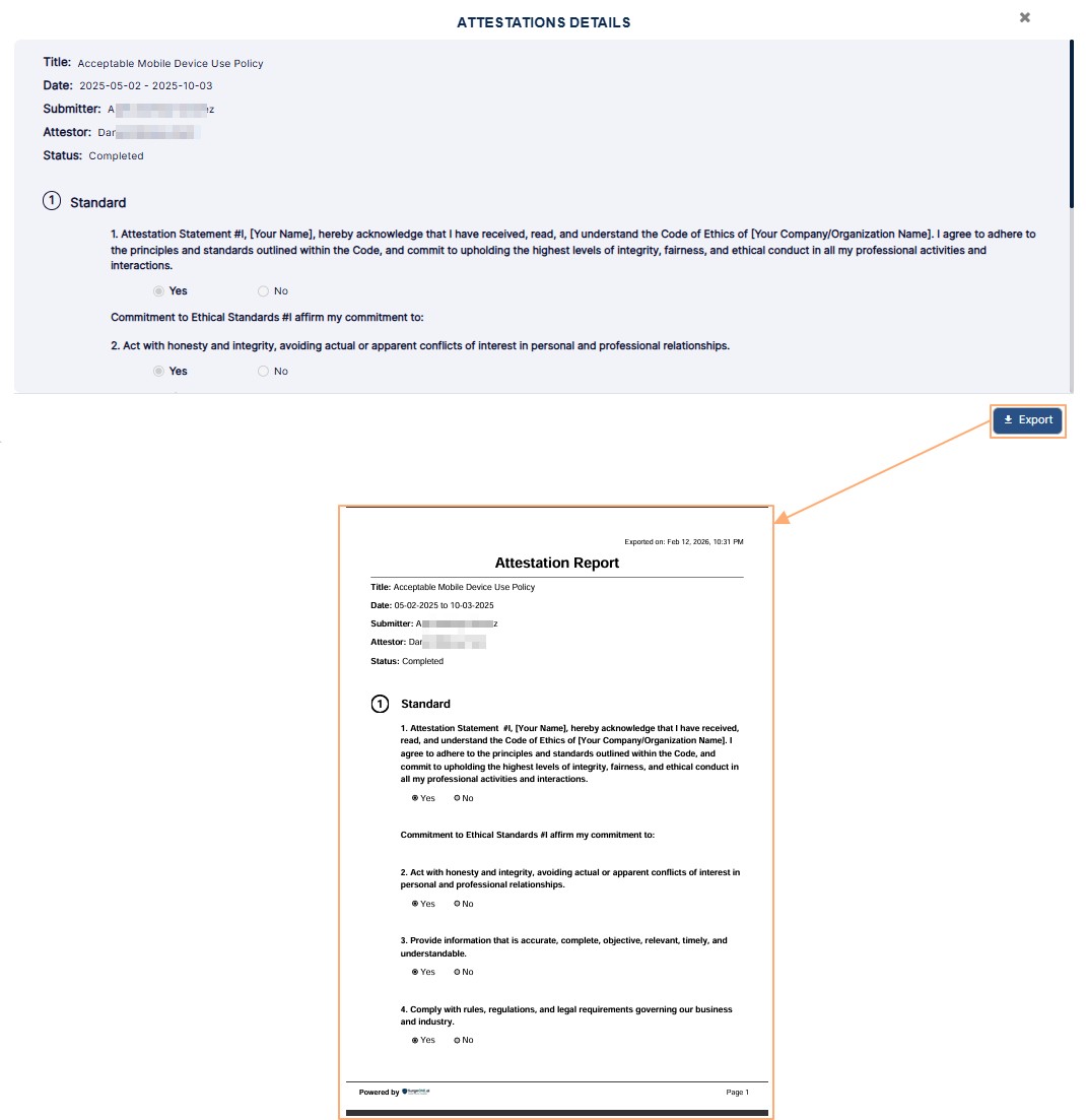 Fig: 76 - Exported PDF file content view of chosen attestation entry
6.8. Customizing the grid view columns
- To alter the columns of the view, you can click on the vertical ellipsis
 icon at the right of the Export button.
- Make permissible checkbox selections under the Attestation Schedule header to set the grid view according to your preference. The checkbox selections which cannot be modified are greyed-out.
- Click on the Save button to store changes made and close this modal window.
A Attestation Attributes modal window loads to display the list of columns and its current selection. The columns of the grid view which are visible by default are pre-selected in this modal window. You can customize and control the columns displayed in the grid view. However, you cannot control the greyed-out column labels. This feature enables you to tailor the grid view to show data which enhance user experience by providing flexibility and control, making it easier to focus on the most pertinent details.
The following selectable items (column labels) are displayed in the loaded modal window. Refer to the following table:
| Sl. No. | Column Label |
|---|---|
| 1 | Attestation Name |
| 2 | Start Date |
| 3 | End Date |
| 4 | Type |
| 5 | Organization |
| 6 | Description |
| 7 | Status |
| 8 | Year |
| 9 | Actual Start Date |
| 10 | Actual End Date |
| 11 | Red Flag Count |
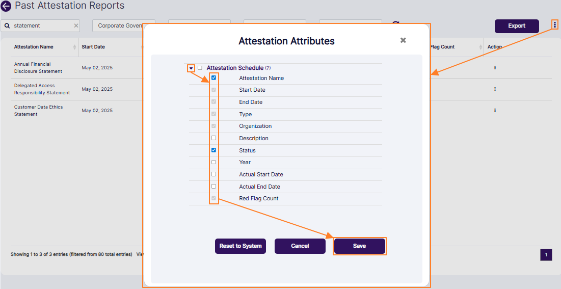 Fig: 77 - Customizing the report grid view column display
NOTE: If you click on the Reset to System button, then the checkbox selections are restored to the default state.
7. Using the Code Of Ethics Report
The Code Of Ethics Report lets you search for existing transactions or entries made in respect to the various Code of Ethics modules. Set appropriate filters to generate report results as required. You can also export the generated report results.
Let us assume that you have navigated to the Reports page. You can click on the View All option of the Code of Ethics tile, to navigate to the Past Code Of Ethics Report.
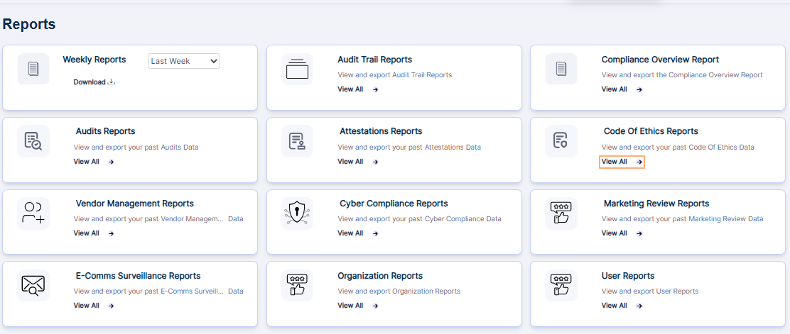 Fig: 78 - View All option of the Code of Ethics Report tile on the Reports page
Alternatively, if you are in the Code of Ethics page, click on the Past Report button of the Code of Ethics screen to navigate to the Past Code Of Ethics Report.
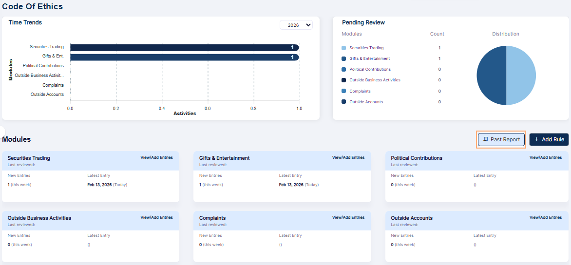 Fig: 79 - Past Code of Ethics Report button of the Code of Ethics page
The following image shows the report page that loads. The following columns are present in the grid view - Employee Name, Module Type, No. Of Entries, No. Of RedFlags and Actions.
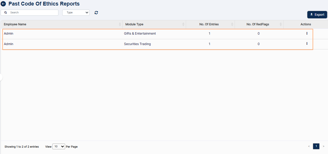 Fig: 80 - Past Code of Ethics Report view
Enter suitable text in the search bar based on which you want execute the search operation.
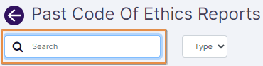 Fig: 81 - Search bar
Select the module type from the Type dropdown. By default, all selection is set.
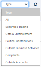 Fig: 82 - Type dropdown options
Search result(s) populate the grid view based on the filters set.
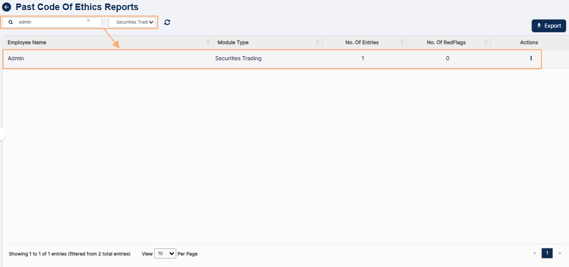 Fig: 83 - Search results generated
NOTE: Search is executed based on the following parameters (displayed in the grid view as the column names).
- All the columns except for ACTION are sortable.
- Click on the Export button to load the export options (to download a local copy the generated report). Two options labeled as CSV and PDF load below the button. Click on the former to download an excel file or on the latter to download a .pdf copy. The following image shows the view of a downloaded pdf file.
- You can click on the reset icon to reset the report filters.
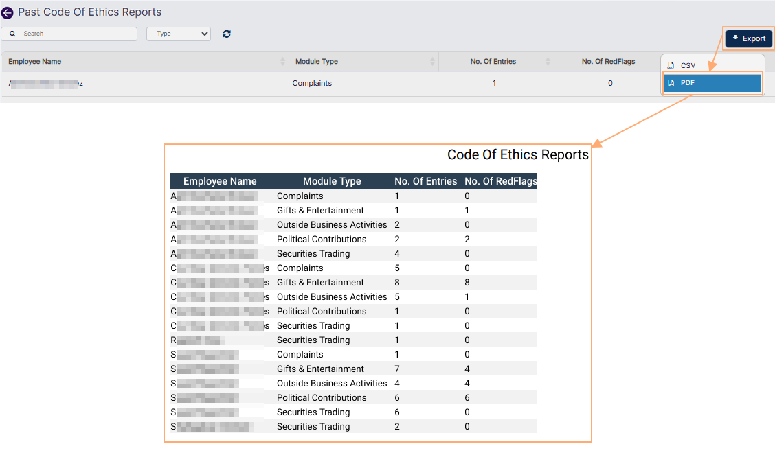 Fig: 84 - Exported report
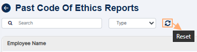 Fig: 85 - Filters reset icon
8. Using the Vendor Management Reports
The Vendor Management Reports lets you search for processed vendor due diligence entries. Set appropriate filters to generate report results as required. You can also export the generated report results.
Let us assume you have navigated to the Reports page. Click on the View All option of the Vendor Management Reports tile, to proceed to navigate to the Past Vendor Assessment Reports view.
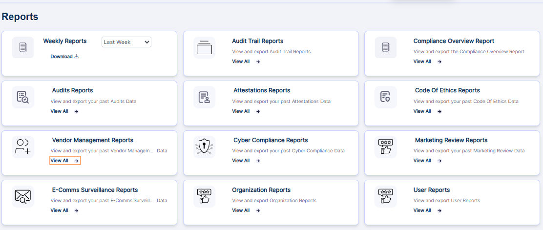 Fig: 86 - Option to navigate to the report
The following image shows the report page that loads. The following columns are present in the grid view - Unique ID, Vetting Title, Start Date, End Date, Status, Red Flag Score, VDD Category, View Summary and Action.
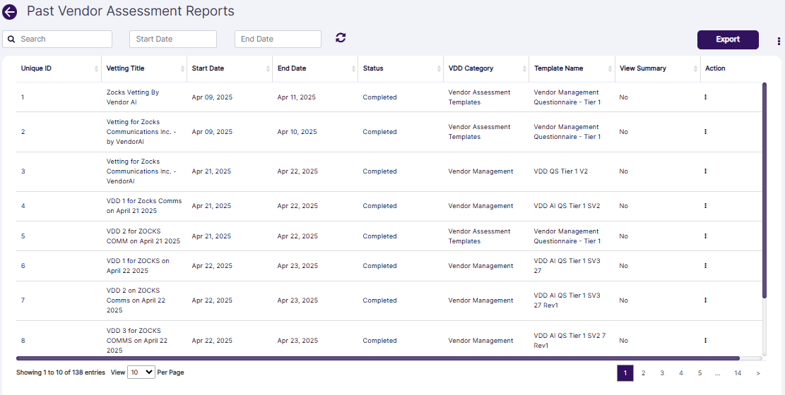 Fig: 87 - Vendor Management Reports view
The following filters are present in the report grid view.
- Search bar
- Start Date (date selection) calendar
- End Date (date selection) calendar
Let us illustrate each filter one by one.
8.1. Search bar
Enter the text based on which you want to execute the vendor assessment search operation. If matching entry is found, it will populate the report grid view.
8.2. Start Date calendar
You can filter report results based on the vendor assessment starting date by selecting a calendar date from the Start Date filter.
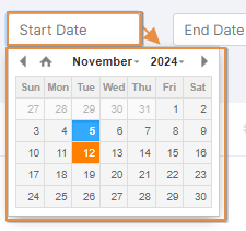 Fig: 88 - Start Date filter
8.3. End Date calendar
Similarly, you can filter report results based on the vendor assessment ending date by selecting a calendar date from the End Date filter.
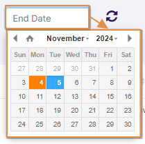 Fig: 89 - End Date filter
Search result(s) populate the grid view based on the filters set.
NOTE:
- All the columns except for Action are sortable.
- Click on the Export button to load the export options (to download a local copy of the generated report). Two options labeled as CSV and PDF load below the button. Click on the former to download an excel file or on the latter to download a .pdf copy. The following image shows the view of a downloaded pdf file.
- You can click on the refresh icon to reset the report filters.
- You can also click on the vertical ellipsis icon of the Action column against any listed vendor assessment to load the View Details menu option.
- Click on the option to load the modal window which displays the status-wise view. Click on the Completed label displayed under the Status column. The modal window loads displaying the assessment details, questions and responses. An Export button is present at its bottom. Click on it to download the .pdf copy of this vendor assessment report.
This modal window can also be loaded by clicking on the vertical ellipsis icon of the Action column and then on the expanded View Details menu option. - You can also click on the Export button to generate a pdf copy of the modal window dataset.
- You can click on the vertical ellipsis icon at the top-right of the Past Vendor Assessmwnt Reports page (beside the Export button to load the Vendor Assessment Attributes modal window. From within this modal window, you can proceed to customize the column label selections. Based on the modifications made to the checkbox selections, the visibility of the grid view columns get updated after you click on the Save button of this modal window. To restore the default view, click on the Reset to System button.
- Pagination options are provided at the bottom to control the page items limit and to navigate to other page entries
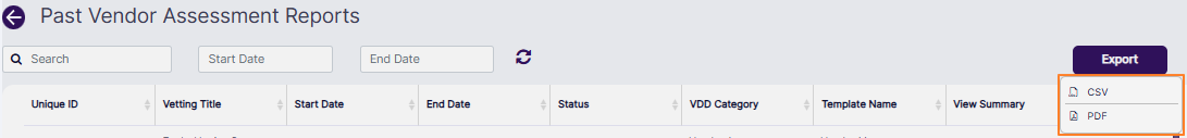 Fig: 90 - Export options
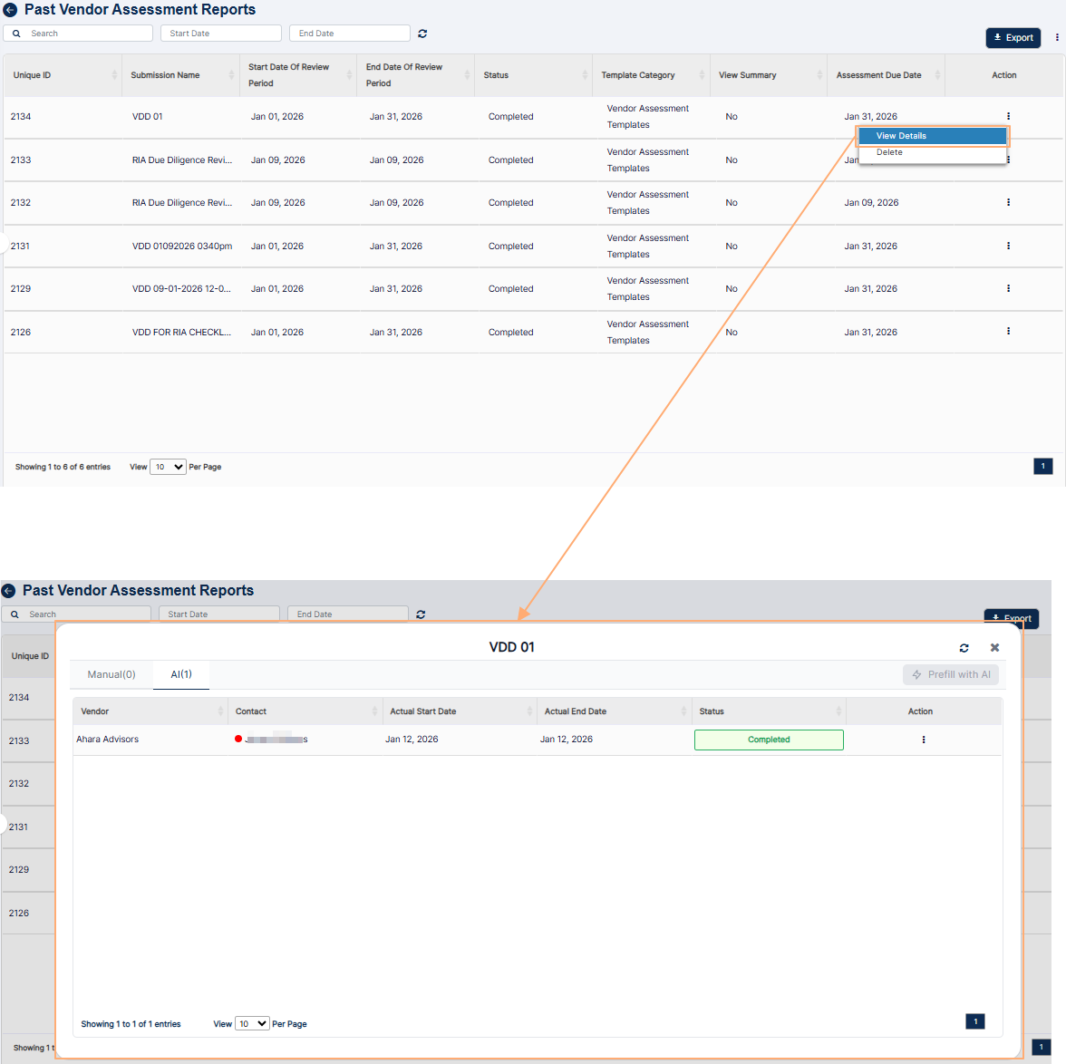 Fig: 91 - Proceeding to view the status-wise modal window
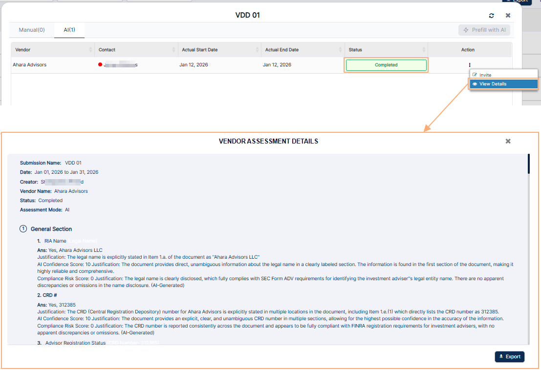 Fig: 92 - Detailed view
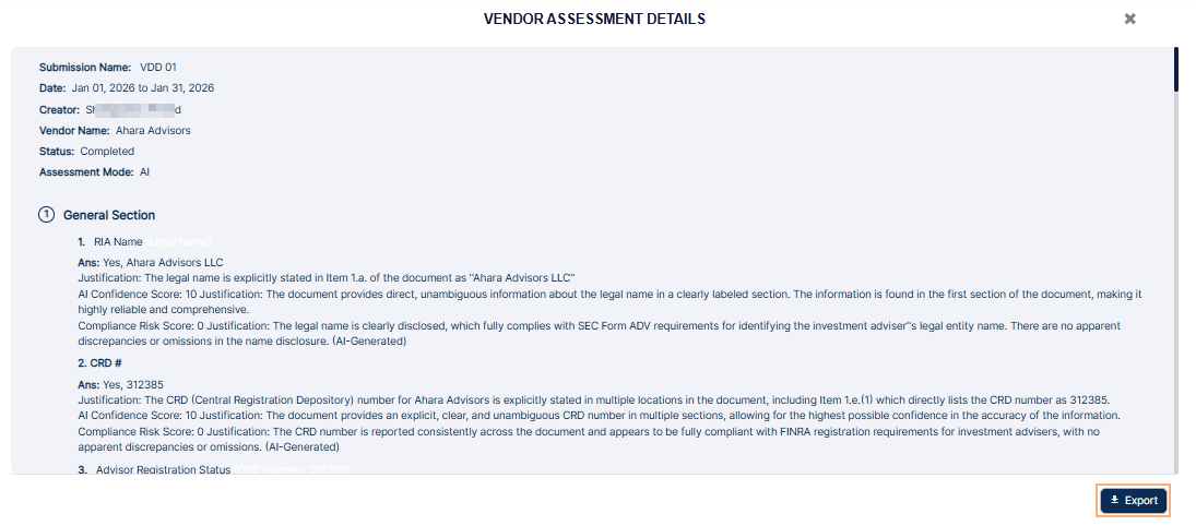 Fig: 93 - Proceeding to download the details
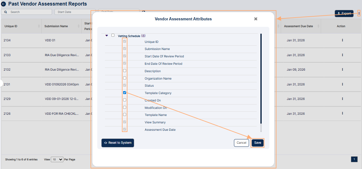 Fig: 94 - Downloaded report view
9. Using the Cyber Compliance Reports
The Cyber Compliance Report displays device data as per the dataset present in the Cyber Dashboard. The report has a dropdown to switch between Cyber, Device, Mobile, and Enrollment views. Select any one from these three values and based on that data the report will be populated accordingly in the grid. Users can easily switch between different data types using it to monitor issues and risk scores. You can also export the generated report results.
Click on the View All option of the Cyber Compliance Reports tile, to proceed to navigate to the report view.
 Fig: 95 - Option to navigate to the report
The following image shows the report page that loads.
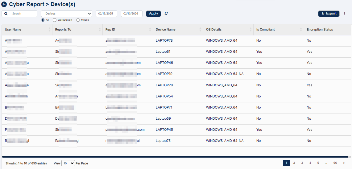 Fig: 96 - Cyber Compliance Reports view
The following filters are present above the report grid view.
- Search bar
- Entity selection dropdown
- Start Date (date selection) calendar
- End Date (date selection) calendar
Let us illustrate each filter one by one.
9.1. Search bar
Enter the text based on which you want to execute the search by. If matching entry is found, it will populate the report grid view.
9.2. Entity selection dropdown
You can filter report results based on the option selection of this dropdown. It contains three options as Devices, Enrollments and Incidents.
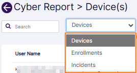 Fig: 97 - Entity selection dropdown filter options
If you select the Device dropdown (which is also selected by default) then three radio button load below the dropdown. The radio buttons are as follows:
- All - used to load all device related information received from endpoints, based on the text entered in the search bar, and / or the specified date range.
- WorkStation - used to load all workstations related data based on the text entered in the search bar, and / or the specified date range.
- Mobile - used to load only associated mobile devices related data based on the text entered in the search bar, and / or the specified date range.
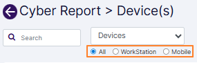 Fig: 98 - Radio button options
NOTE:
- When the Devices dropdown is selected and the All radio button is selected, then captured data related to workstations as well as mobile devices get displayed in the grid view. The following columns are displayed in the Cyber Report > Device(s) grid view:
- User Name - Displays the full name of the user which was provided at the time of user enrollment/registration, or was edited/updated later on. It is also displayed in the NAME column of Manage Users page.
- Reports To - Displays the name of the supervisor of this user. It is also displayed in the Manage Users page.
- Rep ID - Displays the unique REFERENCE ID value which was provided at the time of user creation/registration, or was edited/updated later on.
- Device Name - Displays the captured name of the device, or displays a N.A label if it not captured yet
- OS Details - Displays the operating system type and its version
- Is Compliant - Displays Yes or No label to indicate whether the said device is compliant of the deemed security standards or not
- Encryption Status - Displays Yes or No label to indicate whether the said device has encryption enabled or not
- When the Devices dropdown is selected and the WorkStation radio button is selected, then the information associated with user workstations, laptops, computers, etc. which are fetched by the Belarc application into SurgeONE get displayed. The following columns are displayed in the Cyber Report > Device(s) grid view:
- User Name - Displays the full name of the user which was provided at the time of user enrollment/registration, or was edited/updated later on. It is also displayed in the NAME column of Manage Users page.
- Reports To - Displays the name of the supervisor of this user. It is also displayed in the Manage Users page.
- Rep ID - Displays the unique REFERENCE ID value which was provided at the time of user creation/registration, or was edited/updated later on.
- Device Name - Displays the captured name of the device, or displays a N.A label if it not captured yet
- OS Details - Displays the operating system type and its version
- Is Compliant - Displays Yes or No label to indicate whether the said device is compliant of the deemed security standards or not
- Encryption Status - Displays Yes or No label to indicate whether the said device has encryption enabled or not
- Antivirus Enabled - Displays Yes or No label to indicate whether the said device has any antivirus application installed or not
- Antivirus Used - Displays text on whether antivirus is found on not, and if found - whether it is installed (and enabled) or installed but not enabled for real-time protection
- When the Devices dropdown is selected and the Mobile radio button is selected, then the user mobile devices' data fetched and stored in SurgeONE get displayed. The following columns are displayed in the Cyber Report > Device(s) grid view:
- User Name - Displays the full name of the user which was provided at the time of user enrollment/registration, or was edited/updated later on. It is also displayed in the NAME column of Manage Users page.
- Reports To - Displays the name of the supervisor of this user. It is also displayed in the Manage Users page.
- Rep ID - Displays the unique REFERENCE ID value which was provided at the time of user creation/registration, or was edited/updated later on.
- Device Name - Displays the captured name of the device, or displays a N.A label if it not captured yet
- Device Security Percentage - Displays either N.A label or a number between zero to hundred, including both, to indicate the secureness of the device based on the AI calculated device risk score
- OS Details - Displays the operating system type and its version
- Encryption Status - Displays Y or N label to indicate whether the mobile device has encryption enabled or not
- OS Upto Date Status - Displays Yes or No or Pending label to indicate whether the mobile device has the latest version of the operating system installed or not or whether the update is pending
- WiFi Connection Info - Displays whether the Wi-Fi connection of the mobile is enabled or disabled or unknown, and whether the connection is connected, personal, not connected, open or unknown
- When the Enrollments dropdown is selected, information related to the SurgeONE user enrollments get displayed. The following columns are displayed in the Cyber Report > Enrollment(s) grid view:
- User Name - Displays the full name of the user which was provided at the time of user enrollment/registration, or was edited/updated later on. It is also displayed in the NAME column of Manage Users page.
- Email ID - Displays the email address of the user which was provided at the time of user enrollment/registration. It is also displayed in the EMAIL column of Manage Users page.
- Device Count - Displays the numeric value denoting the number of captured device(s) which are associated with the user. It can also be displayed as zero if no device is captured yet.
- Activated - Displays Yes or No label to indicate whether the user is an active user of SurgeONE
- Not Invited - Displays Yes or No label to indicate whether the user is already invited to access SurgeONE or not. An email is triggered to the registered email address if the user is already invited.
- Invited but Not Activated - Displays either a Yes label when both Activated and Not Invited are set to No, or displays a No label when at least any one column out of the Activated and Not Invited columns is set to Yes
- When the Incidents dropdown is selected, then data related to the detected cyber incidents get displayed in the grid view. A slider is displayed before the start date filter, to select the AI detected risk score range (between 10 to 100). The following columns are displayed in the Cyber Report > Incident(s) grid view:
- Incident Source - Displays the origin or affected application/endpoint of the incident
- Linked User - Displays the associated account
- Isolation Status - Displays the isolation status of the incident. It can be displayed as either Isolated or Not Isolated.
- Incident Summary - Shows a brief information about the incident
- Detection Time - Shows the time of the incident in [(Month 3-lettered abbreviation) (DD) (YYYY)] format
- AI Suggested Severity - Displays the rank or tier of severity of the incident such as High, Low, etc.
- AI Risk Score (10 -> 100) - Displays the AI calculater risk score, where a higher score indicates a greater risk
- Status - Displays the current status of the incident such as Assigned, Resolved, Needs Review, etc.
- Assigned To - Displays the application username who is assigned to look into this incident. If no one is assigned, the column displays N.A label.
Here is the view of the filters and grid view when this dropdown option and radio button is selected.
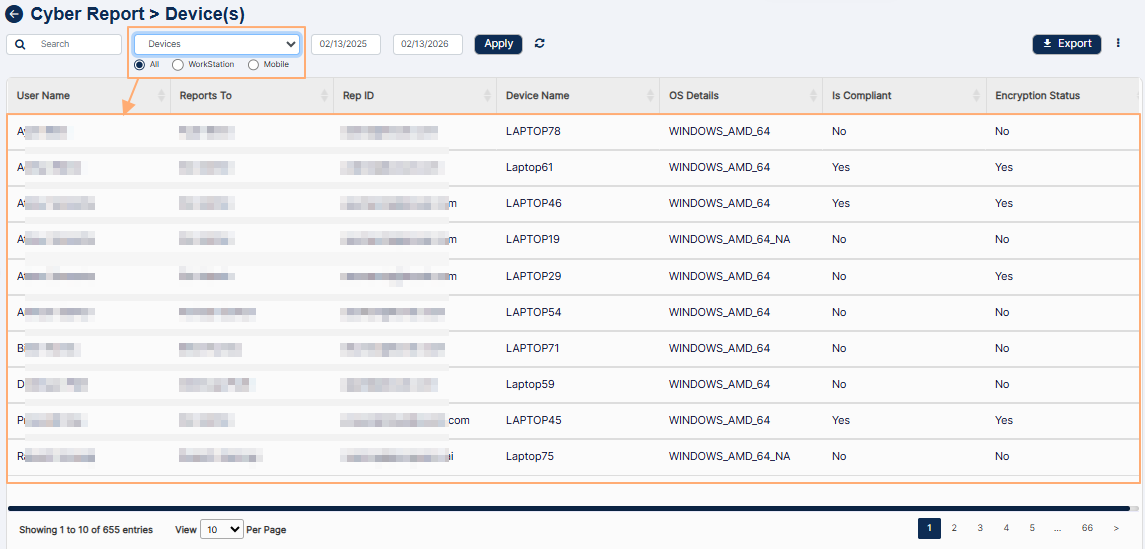 Fig: 99 - View of filters and grid view when Devices dropdown is selected and the All radio button is selected
Here is the view of the filters and grid view when this dropdown option and radio button is selected.
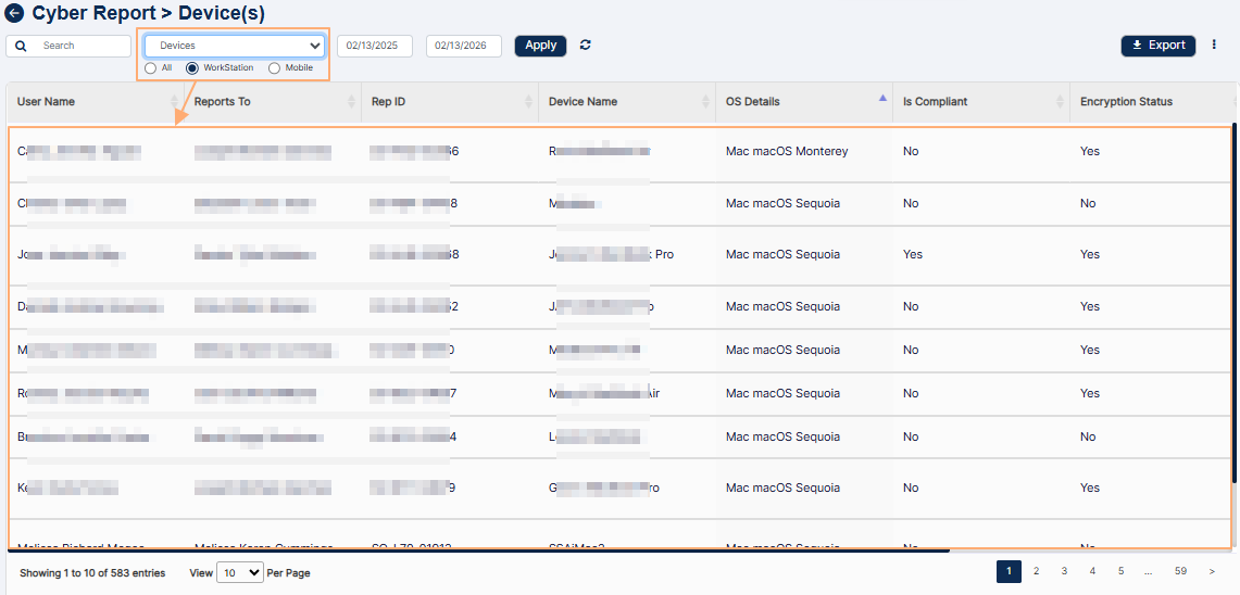 Fig: 100 - View of filters and grid view when Devices dropdown is selected and the WorkStation radio button is selected
Here is the view of the filters and grid view when this dropdown option and radio button is selected.
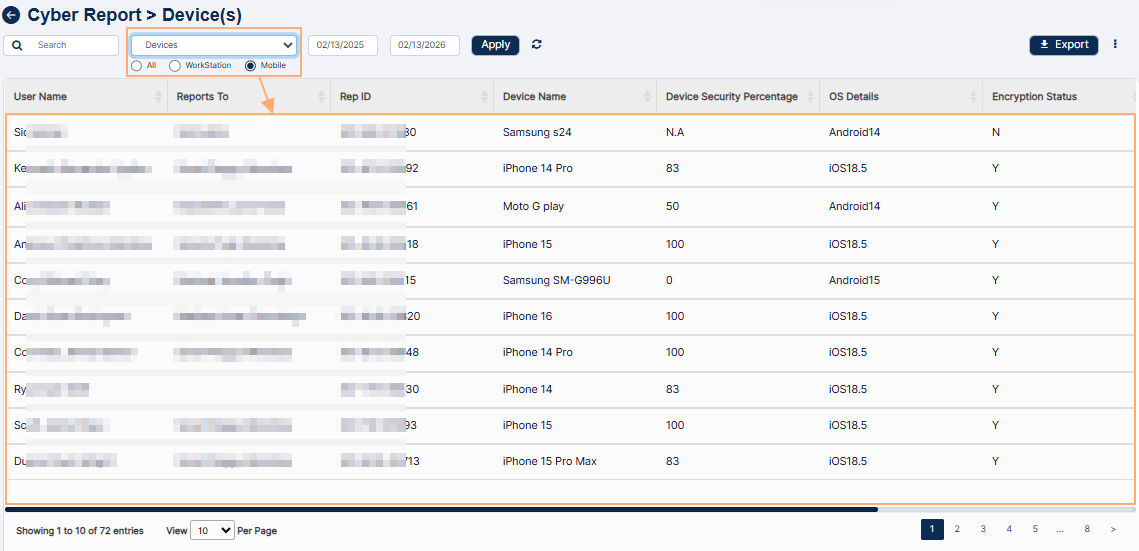 Fig: 101 - View of filters and grid view when Devices dropdown is selected and the Mobile radio button is selected
Here is the view of the filters and grid view when this dropdown option is selected.
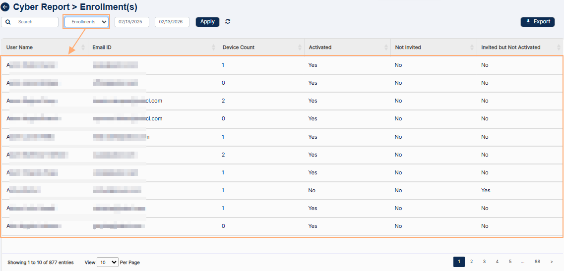 Fig: 102 - View of filters and grid view when Enrollments dropdown is selected
Here is the view of the filters and grid view when this dropdown option is selected.
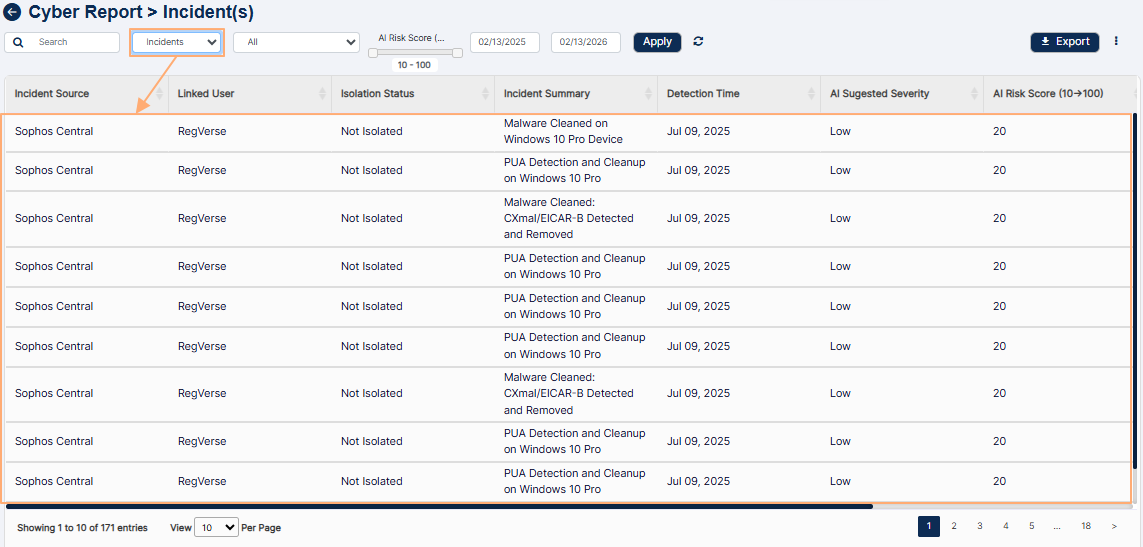 Fig: 103 - View of filters and grid view when Incidents dropdown is selected
9.3. Start Date calendar
You can filter report results based on the incident starting date by selecting a calendar date from the Start Date filter. By default, the current date is set.
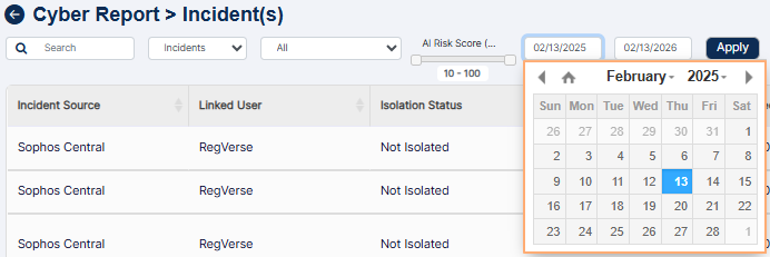 Fig: 104 - Start Date filter
9.4. End Date calendar
Similarly, you can filter report results based on the incident ending date by selecting a calendar date from the End Date filter. By default, the current date is set.
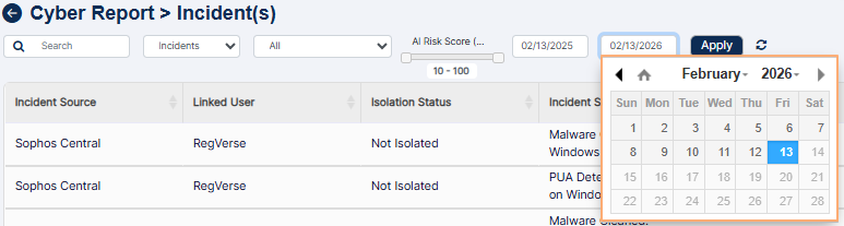 Fig: 105 - End Date filter
You can click on the Apply button to generate report results based on the filter(s) set.
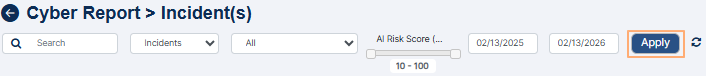 Fig: 106 - Apply button to generate report based on filters set
NOTE:
- All the columns are sortable.
- Click on the Export button to load the export options (to download a local copy of the generated report). Two options labeled as CSV and PDF load below the button. Click on the former to download an excel file or on the latter to download a .pdf copy.
- You can also click on the vertical ellipsis icon to the right of the Export button to customize the grid view columns. After making necessary checkbox selection, you must click on the Save button to make the changes to the grid.
- Pagination options are provided at the bottom to control the page items limit and to navigate to other page entries.
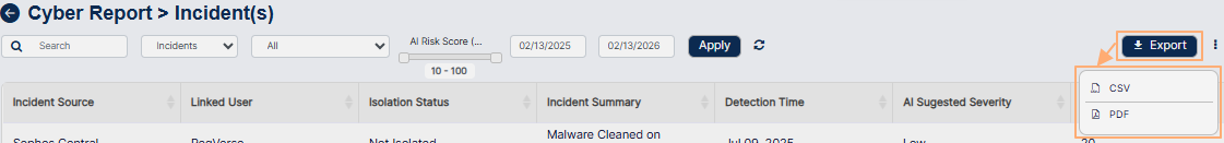 Fig: 107 - Export options
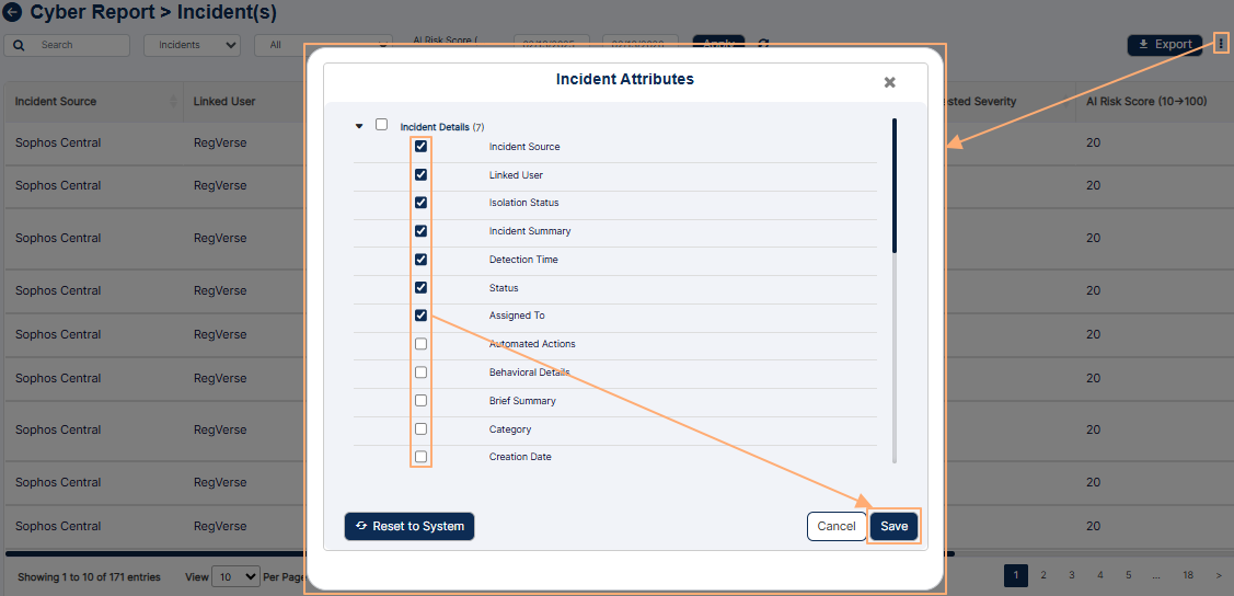 Fig: 108 - Customizing the grid columns visibility
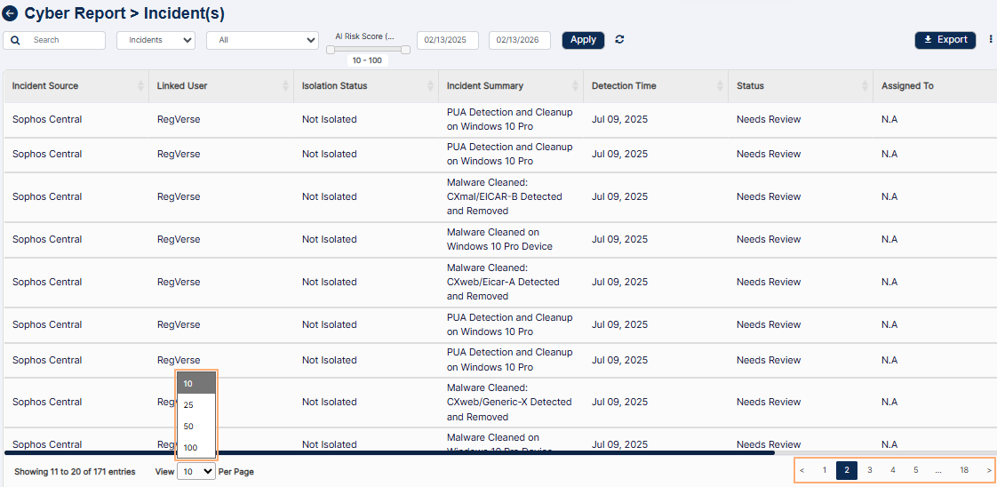 Fig: 109 - Pagination options
10. Using the Marketing Review Reports
Marketing Review Report enhances your analytical processes and empower your users to selectively filter and extract relevant data. With action-menu option on each row you can fetch the fully detailed review report as a PDF or Excel file.
Click on the View All option of the Marketing Review Reports tile, to proceed to navigate to the report view.
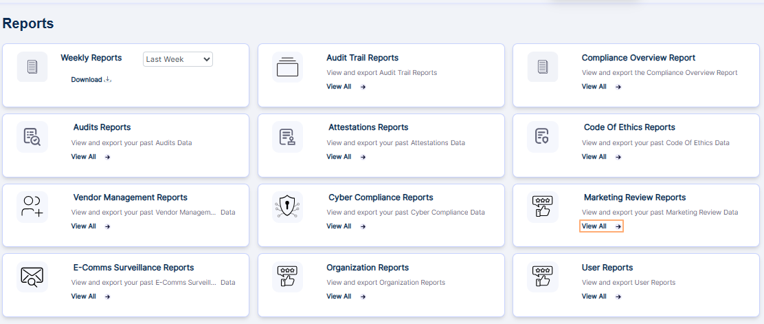 Fig: 110 - Option to navigate to the report
The following image shows the report page that loads.
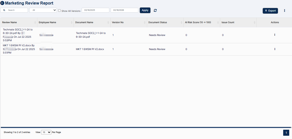 Fig: 111 - Marketing Review Reports view
The following filters or options are present above the report grid view.
- Search bar
- Document Status selection dropdown
- Show All Versions checkbox
- Start Date (date selection) calendar
- End Date (date selection) calendar
Let us illustrate each filter one by one.
10.1. Search bar
Enter the text based on which you want to execute the search by. If matching entry is found, it will populate the report grid view.
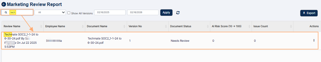 Fig: 112 - Searching for Marketing Review entries
10.2. Document Status selection dropdown
You can filter report results based on the option selection of this dropdown. It contains seven options as follows:
- All - Used to load all marketing content that has been reviewed or is currently under review, regardless of status or processing outcome.
- AI Review In Progress - Used to load all marketing content which is undergoing automated reviewing.
- Needs Review - Used to load all marketing content which have undergone automated reviewing but approver role user needs to be confirm AI based assessment.
- Back to Submitter - Used to load all marketing content which have undergone automated reviewing and issues have been detected and submitter action is needed.
- Approved - Used to load all marketing content which have been approved by the reviewer after undergoing an automated review.
- Expired – Used to load all marketing content where the displayed version is no longer active due to a newer version of the document being uploaded.
- AI Response Error - Used to load all marketing content that triggered an error during the automated review.
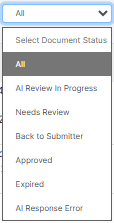 Fig: 113 - Document Status selection dropdown filter
10.3. Show All Versions checkbox
By default, only the latest uploaded version of a document is displayed in the grid. However, you can load all versions by selecting this checkbox
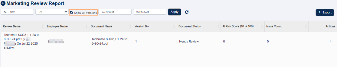 Fig: 114 - Show All Versions checkbox
10.4. Start Date calendar
You can filter results based on the upload date of a marketing document by selecting a calendar date from the Start Date filter. By default, the current date of the previous year is set.
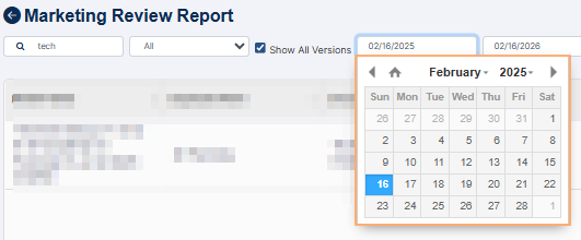 Fig: 115 - Start Date filter
10.5. End Date calendar
Similarly, You can filter results based on the upload date of a marketing document by selecting a calendar date from the End Date filter.
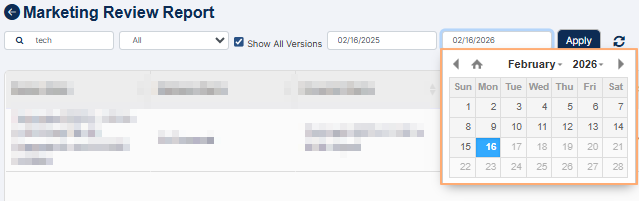 Fig: 116 - End Date filter
You can click on the Apply button to generate report results based on the filter(s) set.
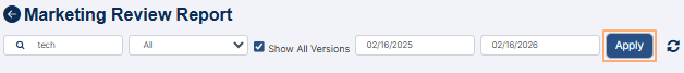 Fig: 117 - Apply button
You can click on the reset icon (at the right of the Apply button) to reset the filter(s) to the default state and refresh the grid view results.
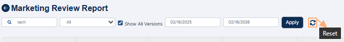 Fig: 118 - Reset icon
The following columns are present in the grid view by default.
- Review Name
- Employee Name
- Document Name
- Version No
- Document Status
- AI Risk Score (0 -> 100)
- Issue Count
- Actions
The Actions column present at the right side of a row entry can be used to load the row-context menu option. Click on vertical ellipsis icon within it to load the Download menu option.
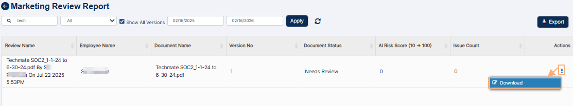 Fig: 119 - Using the Download menu option
After you click on it, a local copy of the report record gets downloaded. Here is the partial view of the opened pdf file which got downloaded.
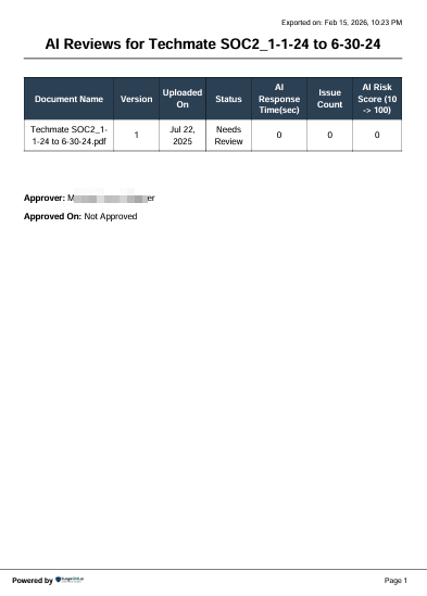 Fig: 120 - View of the contents of the downloaded file
NOTE:
- All the columns are sortable except for the Action column.
- Click on the Export button to load the export options (to download a local copy of the generated report). Two options labeled as CSV and PDF load below the button. Click on the former to download an excel file or on the latter to download a .pdf copy.
- You can also click on the vertical ellipsis icon to the right of the Export button to customize the grid view columns. After making necessary checkbox selection, you must click on the Save button to make the changes to the grid.
- Under the Marketing Review group label the following column checkboxes are present:
- Review Name
- Review Status
- Scheduled By
- Modified By
- Creation Date
- Modification Date
- Organization
- Review ID
- Under the Marketing Document group label the following column checkboxes are present:
- Employee Name
- Document Name
- Version No
- Document Status (its checkbox selection is enabled by default cannot be disabled)
- AI Risk Score (10 -> 100)
- Issue Count
- Approver
- Campaign
- Target Audience
- Type of Document
- Channel Type
- Notes for the Reviewer
- Date of Approval
- Pagination options are provided at the bottom to control the page items limit and to navigate to other page entries
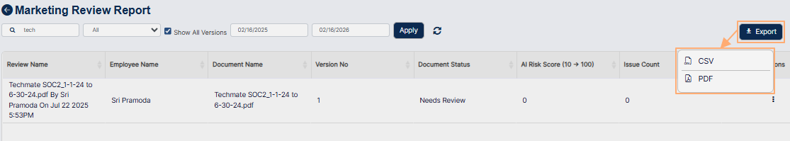 Fig: 121 - Options of the Export button
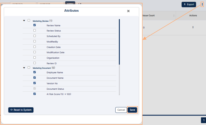 Fig: 122 - Customizing the grid columns visibility
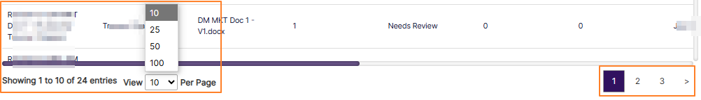 Fig: 123 - Pagination options
11. Using the E-Comms Surveillance Reports
The E-Comms Surveillance Report includes reviews conducted within a specified date range, offering more targeted insights. Report results can be filtered by search criteria and status. AI review summaries can be exported as pdfs or excel files to support executive reporting and ensure compliance documentation.
Click on the View All option of the E-Comms Surveillance Reports tile to proceed to navigate to the report view.
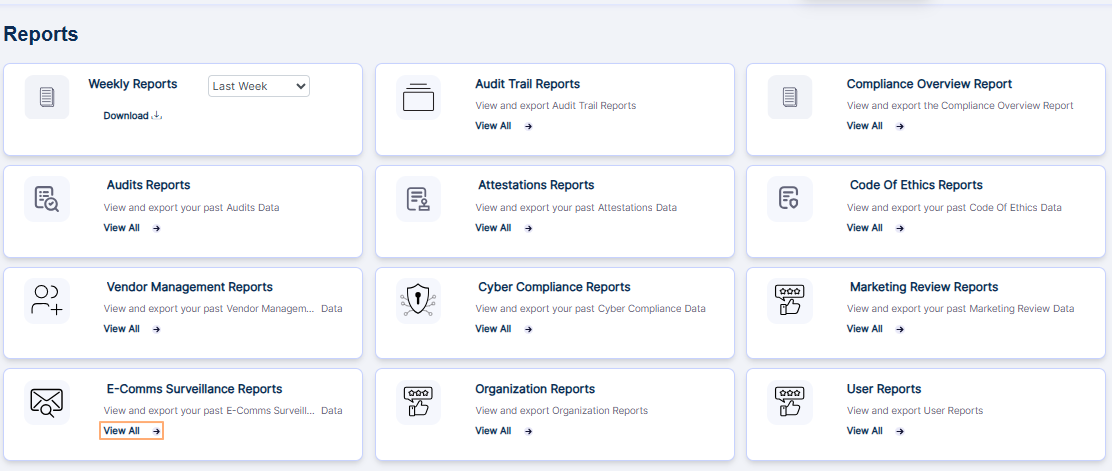 Fig: 124 - Option to navigate to the report
The following image shows the report page that loads.
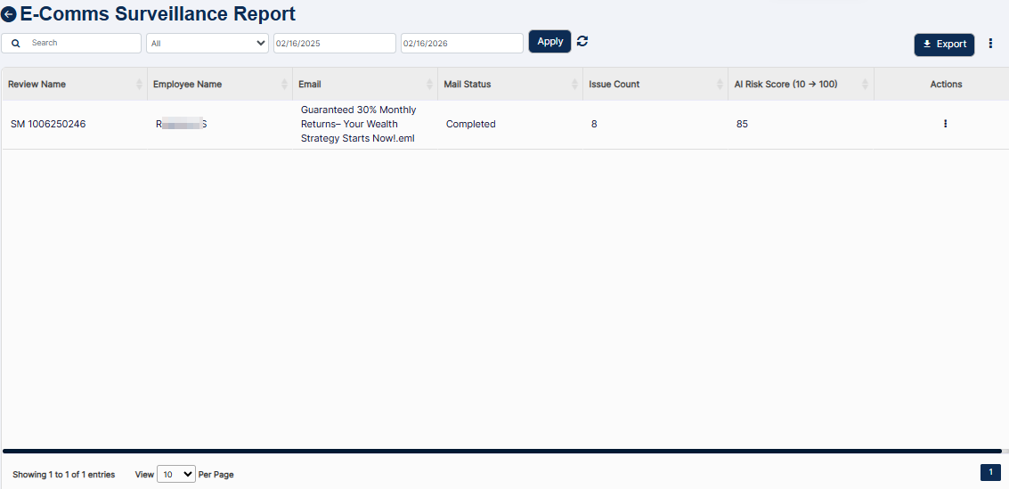 Fig: 125 - E-Comms Surveillance Report view
The following filters are present above the report grid view.
- Search bar
- E-Comms Surveillance status selection dropdown
- From Date (start date selection) calendar
- To Date (end date selection) calendar
Let us illustrate each filter one by one.
11.1. Search bar
Enter the text based on which you want to execute the search by. If matching entry is found, it will populate the report grid view.
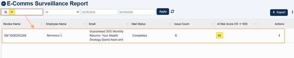 Fig: 126 - Search operation
11.2. E-Comms Surveillance Status selection dropdown
You can filter report results based on the option selection of this dropdown. It contains five options as follows:
- All - used to load all scanned emails from the assigned user mailboxes linked to every E-Comm Surveillance request, regardless of whether the emails were successfully extracted or an error occurred during processing.
- Completed - used to load all emails that were successfully scanned by AI.
- Mail Not Found - used to load all instances where no mails could be extracted for automated reviewing based on E-Comm Surveillance scheduling filters.
- AI Response Error - used to load all emails that triggered an error during the automated review.
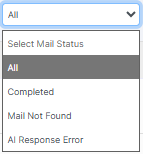 Fig: 127 - Status selection dropdown filter
11.3. From Date calendar
You can filter report results based on the E-Comm Surveillance schedule date by selecting a calendar date from the From Date filter. By default, the current date of the previous year is set.
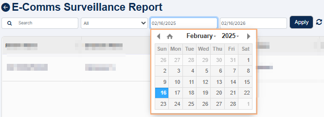 Fig: 128 - From Date filter
11.4. To Date calendar
Similarly, you can filter report results based on the E-Comm Surveillance schedule date by selecting a calendar date from the To Date filter. By default, the current date is set.
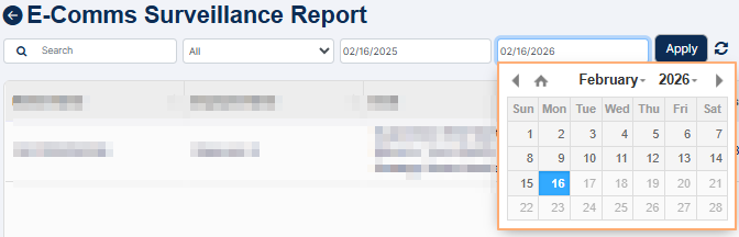 Fig: 129 - To Date filter
You can click on the Apply button to generate report results based on the filter(s) set.
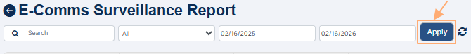 Fig: 130 - Apply button
You can click on the reset icon (at the right of the Apply button) to reset the filter(s) to the default state and refresh the grid view results.
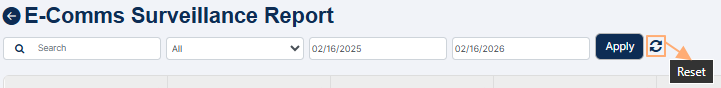 Fig: 131 - Reset icon
The following columns are present in the grid view by default.
- Review Name
- Employee Name
- Mail Status
- Issue Count
- AI Risk Score (10 -> 100)
- Actions
The Actions column present at the right side of a row entry can be used to load the row-context menu option. Click on vertical ellipsis icon within it to reveal the Download menu option.
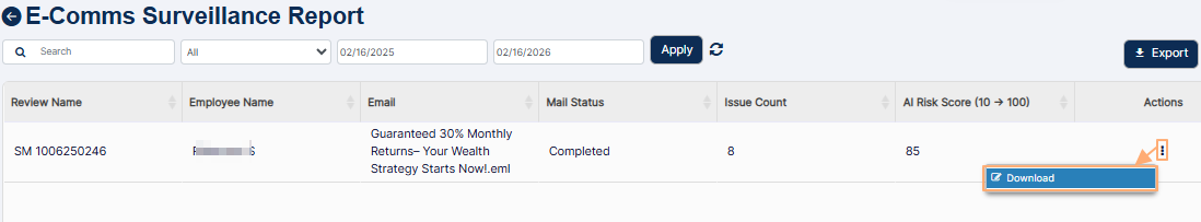 Fig: 132 - Using the Download menu option
After you click on it, a local copy of the report record of email assessment gets downloaded. Here is the view of the opened sample pdf file which got downloaded.
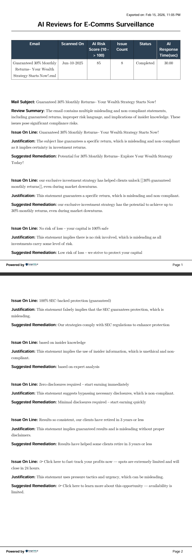 Fig: 133 - View of the contents of the downloaded file
NOTE:
- All the columns of the report grid view are sortable except for the Action column.
- Click on the Export button to load the export options (to download a local copy of the generated report). Two options labeled as CSV and PDF load below the button. Click on the former to download an excel file or on the latter to download a .pdf copy.
- You can also click on the vertical ellipsis icon to the right of the Export button to customize the grid view columns. After making necessary checkbox selection in the loaded modal window, you must click on the Save button to make the changes to the visibility of the grid columns.
- Under the E-Comms group label header the following column labels and associated checkboxes are present:
- Review Name
- Schedule ID
- Communication Status
- Scheduled By
- Modified By
- Start Date
- End Date
- Creation Date
- Modification Date
- Description
- Organization
- Under the Mail Document group label header the following column labels and associated checkboxes are present:
- Employee Name
- Mail Status
- Issue Count
- AI Risk Score (10 -> 100)
- Pagination options are provided at the bottom to control the page items limit and to navigate to other page entries
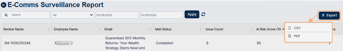 Fig: 134 - Export options
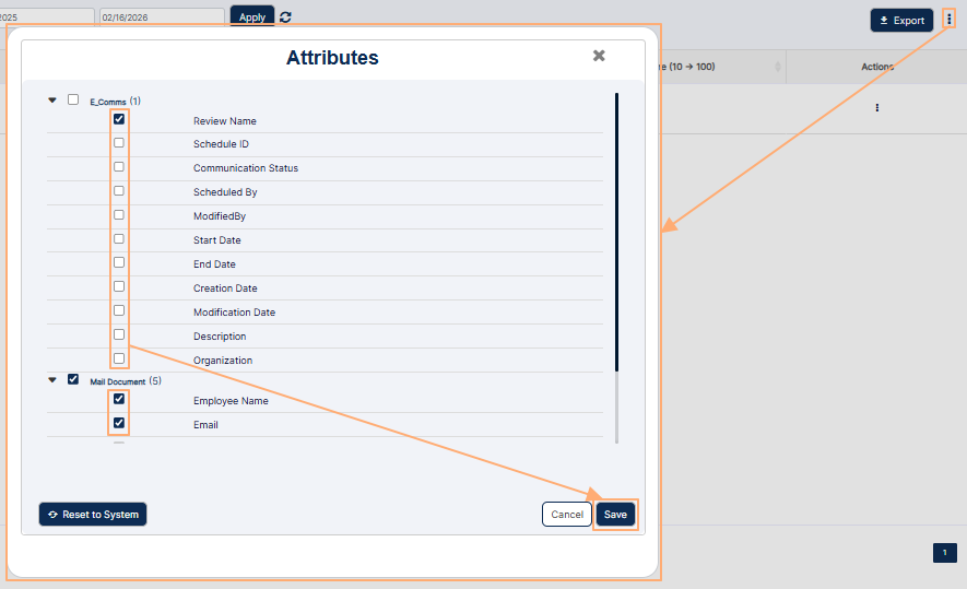 Fig: 135 - Customizing the grid columns visibility
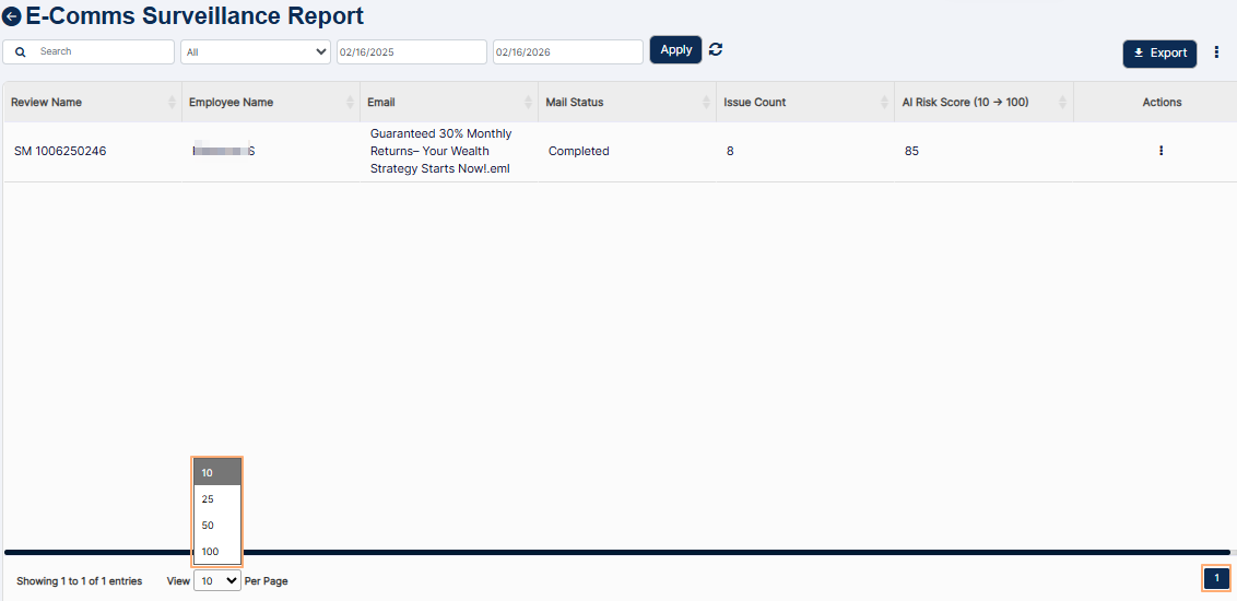 Fig: 136 - Pagination options
12. Navigating to the Organization Report page
To begin working with Organization Report, permitted users must first access the Reports module. The Organization Report page acts as the central hub for viewing details of your existing organizations or firms.
Click on the Reports menu group of the left panel and then on the View All option of the Organization Reports card.
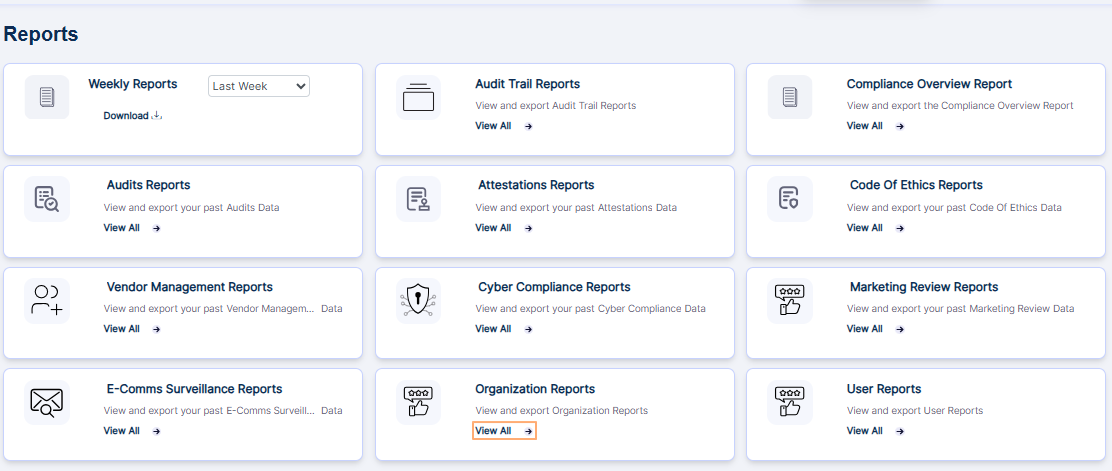 Fig: 137 - Option to view the Organization Report page
Clicking on this option loads the Organization Report page showing the organizations which are already created.
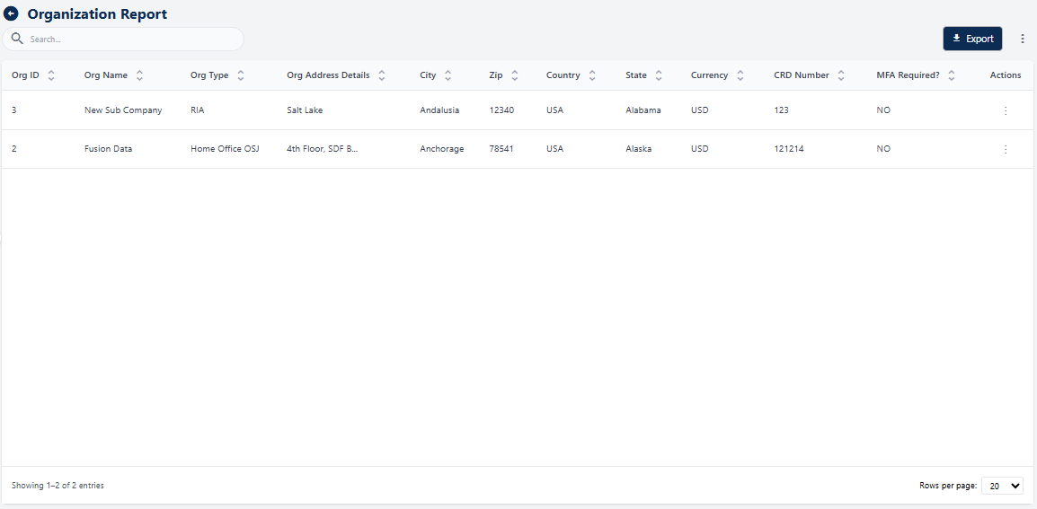 Fig: 138 - Organization Report page with created organizations displayed
NOTE: The report shows the organizations which are already created or visible in the Settings > Business Detail page or Settings > Org Hierarchy page, as indicated in the following screenshot.
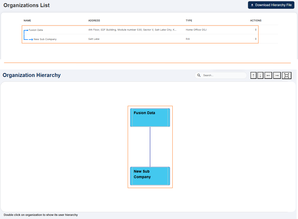 Fig: 139 - Organizations List and Organization Hierarchy page showing the same records as displayed in the report
Key Features of the Organization Report
- 1 Centralized Access Single interface for all organizational data, removing fragmented workflows.
- 2 Time Efficiency Quick search, sort, and export for faster reviews and collaboration.
- 3 Compliance Ready Built-in export feature ensures audit-ready, traceable, and consistently formatted data.
12.1. Understanding the Report page elements
The Organization Report page is designed for clarity, flexibility, and efficiency. It brings together essential tools like a search bar for quick lookups, a dynamic grid view for structured data visualization, and customizable columns to tailor the display to your needs.
Refer to the following screenshot which is marked with numerical values that correspond to the below stated points.
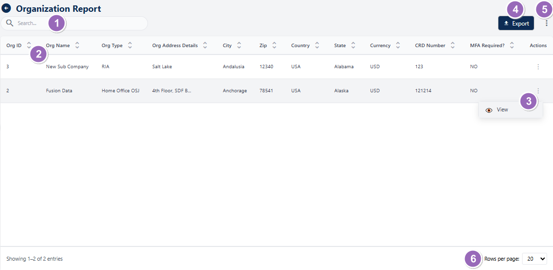 Fig: 140 - Understanding the various elements of the Organization Report page
-
1Search barThe search bar allows users to quickly locate added / modified organization's entries using keywords.
Benefit: Saves time and improves efficiency by enabling instant access to specific records. -
2Grid viewDisplays loaded or filtered results in a structured tabular format.
Benefit: Provides a clear, organized view for easier comparison and analysis. -
3Action columnContains a vertical ellipsis icon to toggle row-context menu options.
Benefit: Enhances usability by offering quick access to relevant actions without cluttering the interface. -
4Export ButtonEnables users to export application data for reporting, analysis, or compliance purposes in a convenient format.
Benefit: Facilitates easy sharing and offline analysis of organization data. -
5Customize Columns IconGrants the ability to shape your workspace by choosing the columns that fit your workflow for a cleaner, more focused view.
Benefit: Facilitates easy sharing and offline analysis of organization data. -
6Navigation OptionsProvides controls to navigate through multiple pages when sufficient entries are present.
Benefit: Enhances usability by allowing smooth browsing of large datasets.
NOTE: The following sub-sections elaborate further the associated functionalities of the above-stated points.
12.1.1. Searching for Organization Reports
The search bar at the top-left allows users to quickly locate specific organizations by entering keywords such as organization name, ID, or address details. The grid updates dynamically to display matching entries.
You can use the search bar to enter text and find matching results. It saves time by eliminating the need to scroll through large datasets and provides instant filtering for accurate results.
 Fig: 141 - Search bar to quickly find added Organization Report
The search operation gets executed on the all columns' data. Type any relevant keyword in the search bar and matching results are listed out.
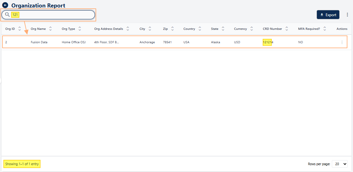 Fig: 142 - Filtered results
If no results are fetched by the executed search query, a No records found label in the grid view and a Showing 0 Records label is displayed below the grid view.
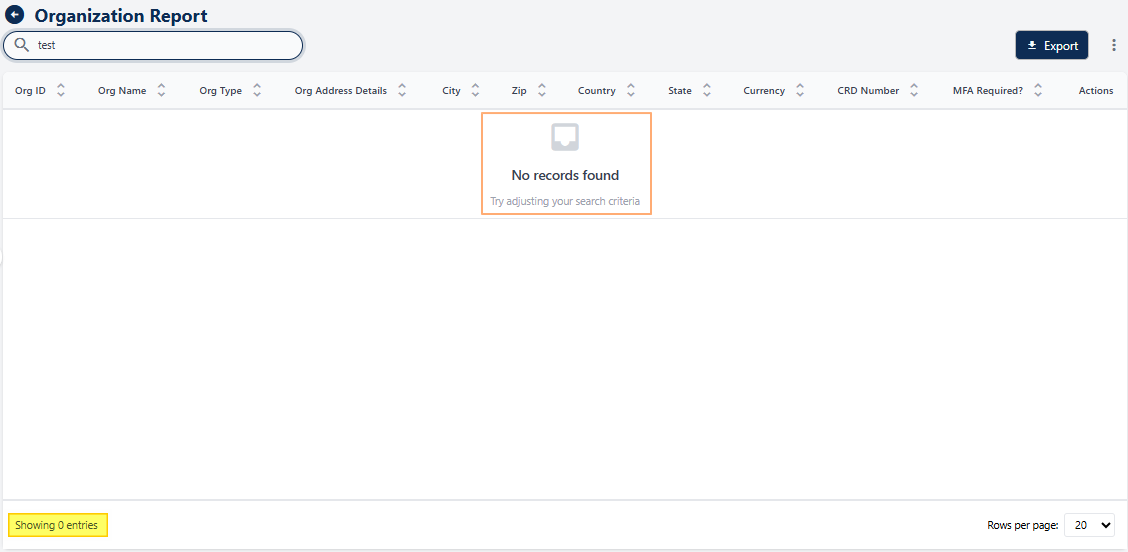 Fig: 143 - No matching records found
12.1.2. Understanding the grid view
The grid view displays multiple columns, each row representing a distinct organizational entry. This structured layout ensures all critical details are easily accessible by presenting information in a standardized and easy to understand format, without having to explore separate pages.
The grid view displays all created organizations as its entries. The column headers add significant value by enabling intuitive sorting across key attributes, allowing users to quickly prioritize the data most relevant to their task, whether that is compliance verification, regional coordination, or operational review. Consolidating all critical organizational details into a single, structured tabular reduces context switching and search time, streamlining workflows and improving overall operational efficiency.
Key Features of the grid view
- 1 Clear Structure Provides an organized view of important organizational attributes in one place.
- 2 Quick Identification Helps users locate key details instantly, enabling faster checks for audits or internal alignment.
- 3 Data-Driven Decisions Presents standardized information for easy interpretation and analysis.
The following columns are present by default:
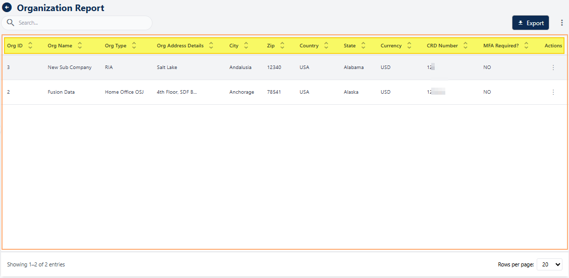 Fig: 144 - Organization Report grid view
-
1Org IDDisplays the unique identifier assigned to each organization, ensuring easy reference and differentiation.
-
2Org NameShows the official name of the organization for clear identification in reports and audits.
-
3Org TypeIndicates the category or type of organization (e.g., RIA, Home Office), helping classify entries for compliance and analysis.
-
4Org Address DetailsProvides detailed address information for location-based verification and correspondence.
-
5CityDisplays the city where the organization is located, aiding regional reporting and segmentation.
-
6ZipShows the postal code for accurate address validation and regional grouping.
-
7CountryIndicates the country of the organization, supporting global compliance and reporting needs.
-
8StateDisplays the state for regional compliance and jurisdictional checks.
-
9CurrencyShows the currency associated with the organization for financial consistency and reporting.
-
10CRD NumberDisplays the CRD number for regulatory identification and compliance verification.
-
11MFA Required?Indicates whether Multi-Factor Authentication is enabled and required for the organization, ensuring security compliance.
-
12ActionsContains a vertical ellipsis icon to toggle row-context menu options for performing actions.
12.1.3. Using the Action column
The Actions menu delivers clear value by providing immediate access to viewing detailed organizational profiles. This centralization of actions minimizes clicks and screen transitions, so that users can make instant, informed decisions.
Click on the vertical ellipsis icon against any displayed row entry of the grid view to toggle the row-context menu option.
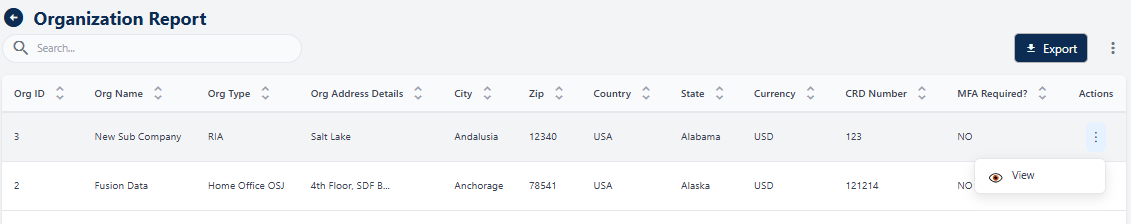 Fig: 145 - Action menu option
The following menu option is present:
-
1
 ViewUsed to view the details of an organization without the ability to make any modifications to the data.
NOTE: The following sub-section elaborates on the functionality associated with this option.
12.1.3.1. Using the View menu option
The View menu allows users to access detailed information about a particular organization. This option provides a comprehensive display of all associated data. By using the View feature, users can examine the organization's details with ease.
- Click on the vertical ellipsis icon under the Action column, against any displayed row entry of the Organization Report grid view to toggle the row-context menu option labeled as View.
- After clicking on it, the following modal window loads to display the key details of the organization as per the inputs made, either during the creation stages or during modifications later on.
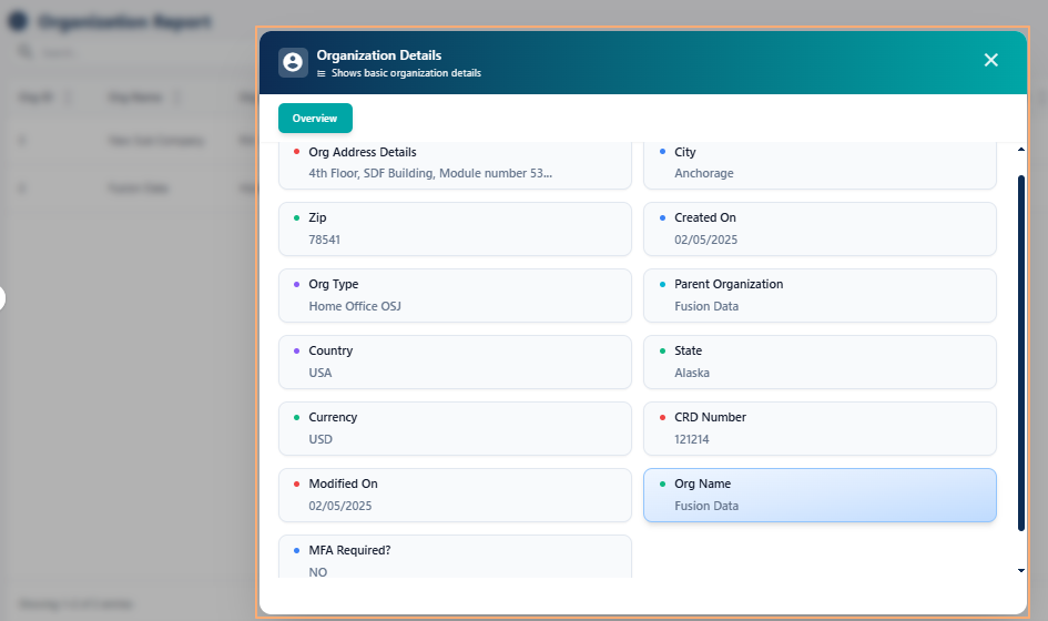 Fig: 147 - Viewing an Organization Detail entry
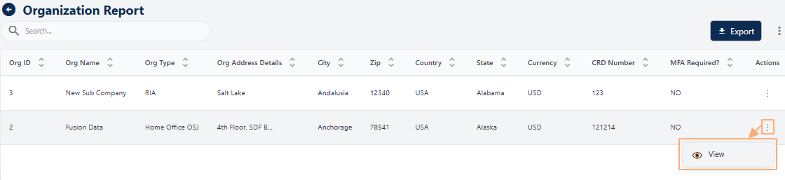 Fig: 146 - Clicking on the View menu option
The following information are displayed under the Overview section of the Organization Details modal window:
-
1Org Address DetailsCaptures the full address for precise location mapping and correspondence.
-
2CitySpecifies the city to support regional grouping and quick identification.
-
3ZipProvides the postal code for accurate area location and sorting.
-
4Created OnIndicates when the record was first added, aiding timeline tracking.
-
5Org TypeDefines the organization's category for classification.
-
6Parent OrganizationShows the linked parent entity for better organizational hierarchy understanding.
-
7StateDisplays the state for jurisdictional and geographic location ascertaining.
-
8CountryIdentifies the country for global compliance and reporting purposes.
-
9CurrencySpecifies the currency used for knowing the financial instrument across records.
-
10CRD NumberProvides the regulatory CRD identifier for compliance validation.
-
11Modified OnShows the last update date to maintain data accuracy and audit trails.
-
12Org NameDisplays the official firm name for clear identification and record matching.
-
13MFA Required?Indicates if the multi-factor authentication is enforced or not.
NOTE: Hovering over any organization data displays a tooltip with the full text or value, making it easier to view details that are truncated in the modal due to length.
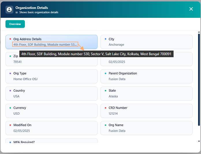 Fig: 148 - Tooltip view of field data
12.1.4. Using the Export button
The Export button, located at the top-right corner, allows users to download organization reports for offline use, sharing, and compliance purposes. It bridges in-platform data with external analysis and reporting workflows, ensuring that insights can travel across teams, meetings, and tools.
The Export button elevates usability by ensuring that organizational data can be captured in portable formats suited for compliance, reporting, and collaboration. It supports audit-readiness by enabling reliable record-keeping and traceability, while also simplifying the creation of executive summaries, presentations, and formal documentation. Click on the Export button at the bottom right to download a Excel CSV copy of the listed data.
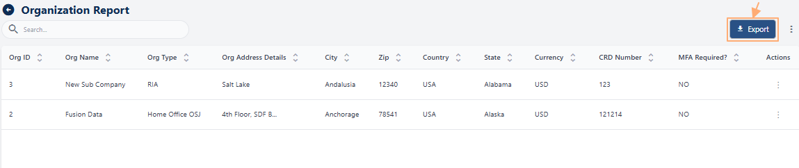 Fig: 149 - Export button to download CSV file
A local copy gets downloaded titled as ORGReport.
 Fig: 150 - Download successful
Here is the view of the opened CSV file, showing the same data as present in the grid during exporting.
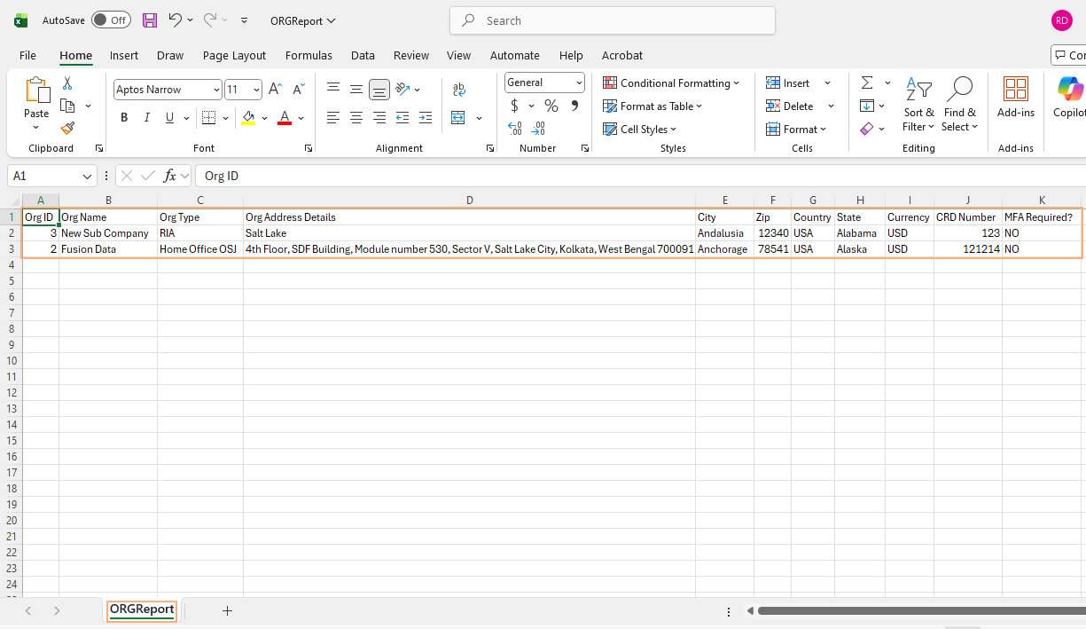 Fig: 151 - View of the file content
Key Features of Data Export
- 1 Data Sharing Facilitates collaboration by enabling easy distribution of structured datasets across teams.
- 2 Offline Analysis Enables reviewing and manipulating data without system access, ideal for remote work or executive briefings.
- 3 Backup Records Provides a secure way to store organizational data for record retention and historical comparisons.
12.1.5. Customizing the grid view columns
This feature is used for customizing data display. It offers precision control over what appears in the table and how it is presented, enabling a tailored experience that aligns with diverse roles and goals.
-
To customize the columns displayed in the Org Report grid view, click on the vertical ellipsis icon located at the right side of the grid header, next to the Export button.
- Select or deselect checkboxes to include or exclude columns from the grid view. Columns that are mandatory and cannot be changed will appear greyed out, such as Org Name. To select all columns, click on the checkbox present before the System Information header label.
- Click on the Save button to apply your changes and close the modal window.
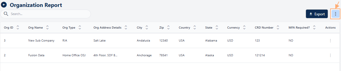 Fig: 152 - Option to customize grid view columns
An Add Columns modal window will appear, listing all available columns under the System Information section. Columns currently visible in the grid are pre-selected. This feature allows you to personalize the grid view by showing only the fields relevant to your workflow, improving clarity and efficiency.
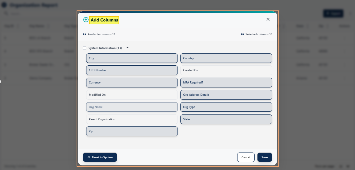 Fig: 153 - Loaded Add Columns modal window
The following column labels are available for selection. Columns marked with a green  tick in the below table are enabled or selected by default.
| Sl. No. | ||
|---|---|---|
 |
||
|
||
|
||
 |
||
|
||
|
||
|
||
|
||
|
||
|
||
|
||
|
||
|
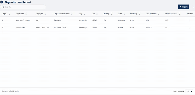 Fig: 154 - Performing operations in the loaded modal window
Key Features of the customizing grid columns
- 1 Greater Control Lets users customize the view to focus on attributes most relevant to their tasks.
- 2 Improved Accuracy Reduces data clutter by focusing on relevant subsets, making analysis more precise.
NOTE: As illustrated in the above image, clicking the Reset to System button restores the default column settings.
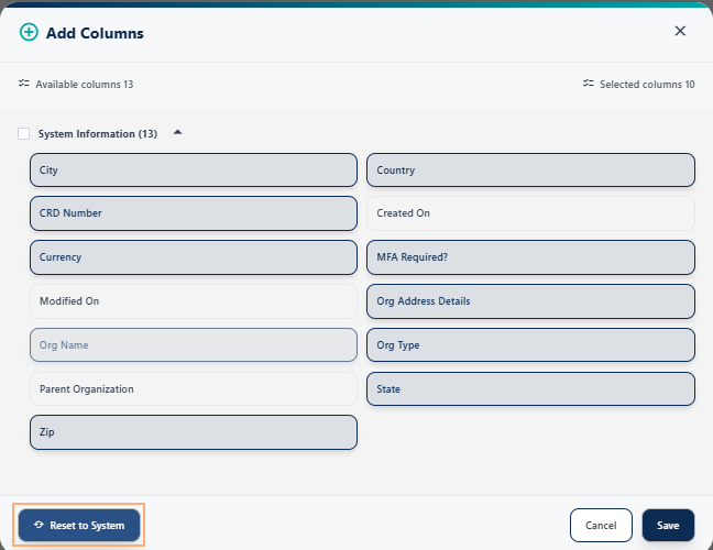 Fig: 155 - Reset to System button
12.1.6. Using the Pagination options
The Rows per Page dropdown at the bottom-right lets users control how many rows appear per page, improving readability and navigation. This adaptability is especially helpful when reviewing long lists or conducting side-by-side comparisons across multiple entries.
Pagination options are provided at the bottom-right, to navigate through multiple pages of entries, which populate the grid view as per the selected count of items per page. Selectable options are 10, 20, 50 and 100. By default, 20 is set. The Rows per Page dropdown control adds practical value by giving users the flexibility to balance readability and breadth of view, whether they prefer a concise page for meticulous review or a larger dataset for comparative analysis.
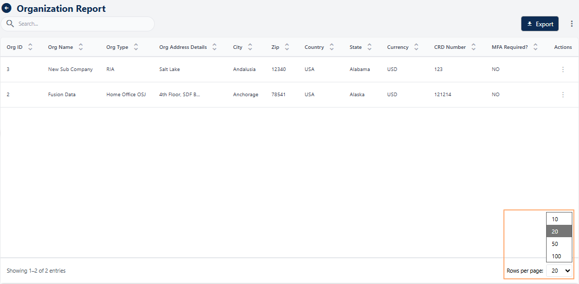 Fig: 156 - Pagination options
Previous and Next buttons are also present (when there are entries listed greater than the selected page item limit) to navigate to the next and previous pages respectively. When multiple pages are present, you can also click on the any displayed page number to go to that particular page.
 Fig: 157 - Previous and Next buttons with page numbers when multiple pages are present
13. Navigating to the User Report page
The User Report page provides a centralized view of all user related data, enabling users to search, sort, view, and export information efficiently. This page is designed for quick access to critical details of your existing users. To begin working with User Report, permitted users must first access the Reports module. The User Report page acts as the central hub for viewing details of your existing users or firms.
Click on the Reports menu group of the left panel and then on the View All option of the User Reports card.
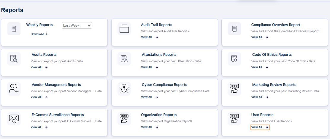 Fig: 158 - Option to view the User Report page
Clicking on this option loads the User Report page showing the users which are already created.
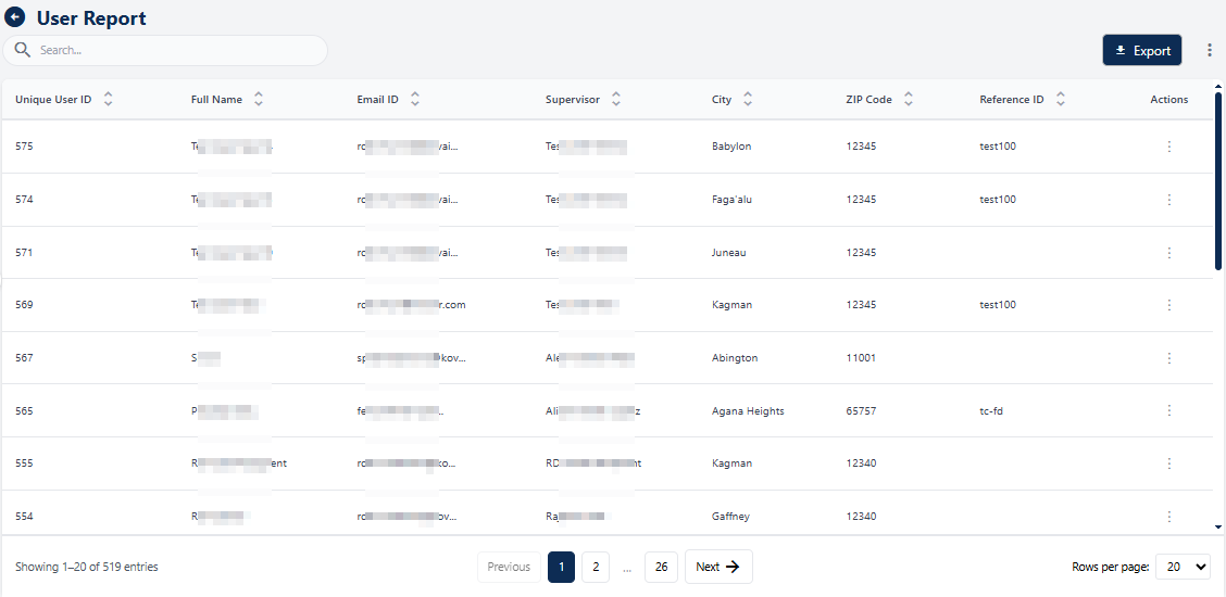 Fig: 159 - User Report page with created users displayed
NOTE: The report shows the users which are already created or visible in the Settings > Business Detail > Manage Users page, as indicated in the following screenshot.
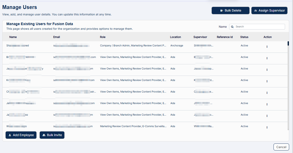 Fig: 160 - Manage Users page showing the same records as displayed in the report
Key Features of the User Report
- 1 Centralized Access Single interface for all user data, removing fragmented workflows.
- 2 Time Efficiency Quick search, sort, and export for faster reviews and collaboration.
- 3 Compliance Ready Built-in export feature ensures audit-ready, traceable, and consistently formatted data.
13.1. Understanding the User Report page elements
The User Report page is engineered for precision, scalability, and speed. It integrates advanced features like a lightning-fast search bar for instant queries, a dynamic grid interface for structured, real-time data visualization, and fully configurable columns that empower you to personalize the view for maximum efficiency.
Refer to the following screenshot which is marked with numerical values that correspond to the below stated points.
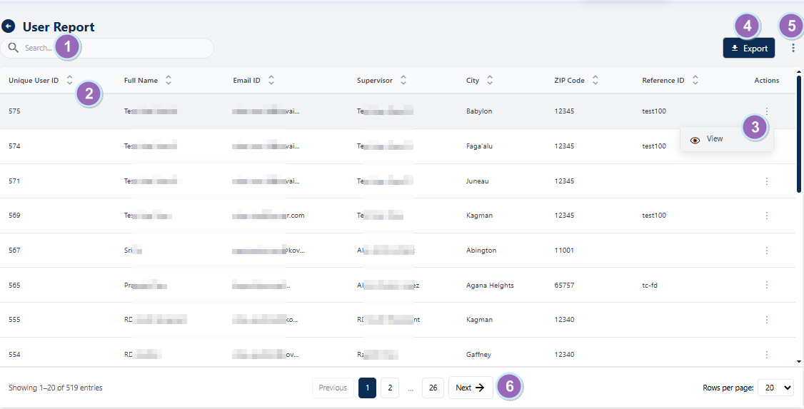 Fig: 161 - Understanding the various elements of the User Report page
-
1Search barThe search bar allows users to quickly locate added / modified user's entries using keywords.
Benefit: Saves time and improves efficiency by enabling instant access to specific records. -
2Grid viewDisplays loaded or filtered results in a structured tabular format.
Benefit: Provides a clear, organized view for easier comparison and analysis. -
3Action columnContains a vertical ellipsis icon to toggle row-context menu option.
Benefit: Enhances usability by offering quick access to view action without cluttering the interface. -
4Export ButtonEnables users to export application data for reporting, analysis, or compliance purposes in a convenient format.
Benefit: Facilitates easy sharing and offline analysis of user data. -
5Customize Columns IconGrants the ability to shape your workspace by choosing the columns that fit your workflow for a cleaner, more focused view.
Benefit: Facilitates easy sharing and offline analysis of user data. -
6Navigation OptionsProvides controls to navigate through multiple pages when sufficient entries are present.
Benefit: Enhances usability by allowing smooth browsing of large datasets.
NOTE: The following sub-sections elaborate further the associated functionalities of the above-stated points.
13.1.1. Searching for User Reports
The top-left search bar delivers easy lookups, enabling users to pinpoint specific user profiles by entering keywords like username, ID, or address details. As you type, the intelligent grid responds in real time, dynamically updating to showcase only the most relevant matches.
You can use the search bar to enter text and instantly find matching results. This feature saves time by eliminating the need to scroll through large datasets and applies real-time filtering for accurate, relevant outcomes.
 Fig: 162 - Search bar to quickly find added User Report
The search operation gets executed on the all columns' data. Type any relevant keyword in the search bar and matching results are listed out.
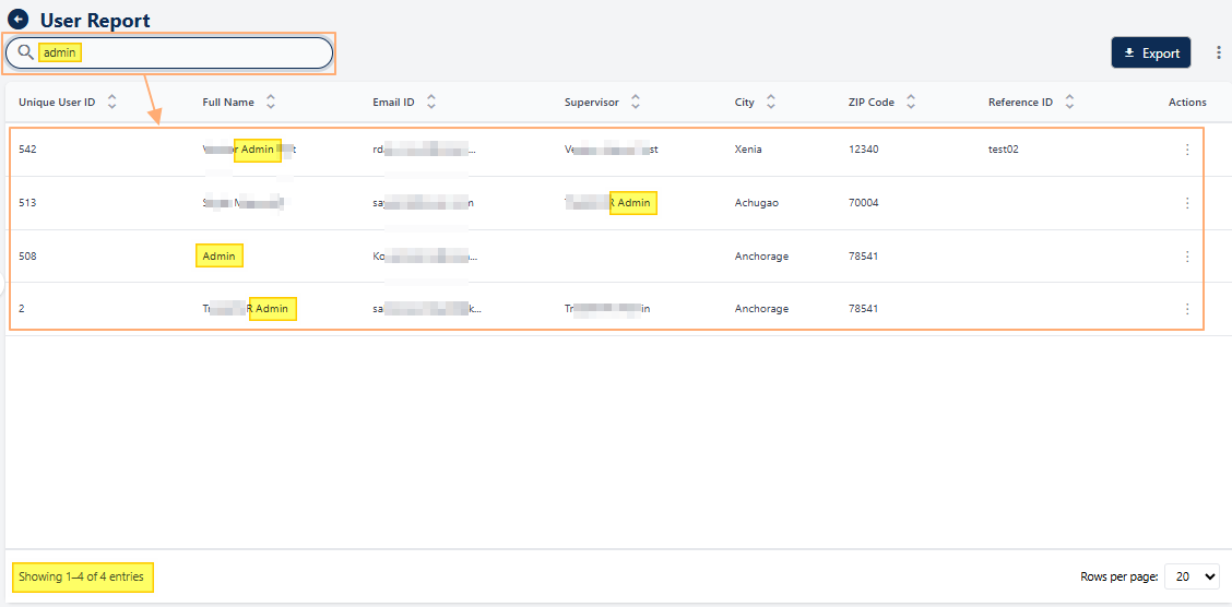 Fig: 163 - Filtered results
If no results are fetched by the executed search query, a No records found label in the grid view and a Showing 0 Records label is displayed below the grid view.
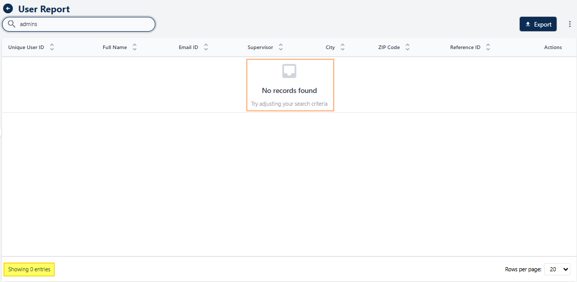 Fig: 164 - No matching records found
13.1.2. Understanding the grid view
The grid view organizes data into multiple columns, with each row representing a unique user record. This structured, standardized layout ensures critical details are instantly accessible, eliminating the need to navigate across multiple pages. The tabular format delivers clarity and efficiency at a glance.
The grid view consolidates all user records into a single, interactive interface. Each column header doubles as a powerful sorting tool, enabling intuitive prioritization across key attributes, whether for compliance checks, regional coordination, or operational audits. By centralizing critical details in a clean, structured table, it eliminates unnecessary context switching and reduces search time.
Key Features of the grid view
- 1 Clear Structure Provides an organized view of important user attributes in one place.
- 2 Quick Identification Helps users locate key details instantly, enabling faster checks for audits or internal alignment.
- 3 Data-Driven Decisions Presents standardized information for easy interpretation and analysis.
The following columns are present by default:
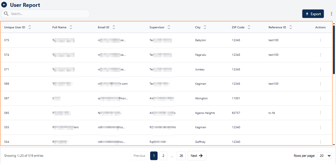 Fig: 165 - User Report grid view
-
1Unique User IDDisplays the system-generated unique identifier for each user, ensuring easy and clear differentiation across records.
-
2Full NameShows the complete name of the user for clear identification in reports and audits.
-
3Email IDDisplays the registered email address of the user, useful for communication and verification.
-
4SupervisorIndicates the name of the supervisor (if present) associated with the user for accountability and hierarchy mapping.
-
5CityDisplays the city where the user is located, aiding regional reporting and segmentation.
-
6ZIP CodeShows the postal code for accurate address validation and regional grouping.
-
7Reference IDDisplays an internal identifier for the user when available, providing a quick way to track records within the system.
-
8ActionsContains a vertical ellipsis icon to toggle row-context menu option for viewing data.
13.1.3. Using the Action column
The Actions menu acts as a centralized control hub, delivering instant access to detailed user profiles without unnecessary navigation. By minimizing clicks and eliminating screen transitions, it empowers users to make fast, informed decisions streamlining workflows and enhancing operational agility.
Click on the vertical ellipsis icon against any displayed row entry of the grid view to toggle the row-context menu option.
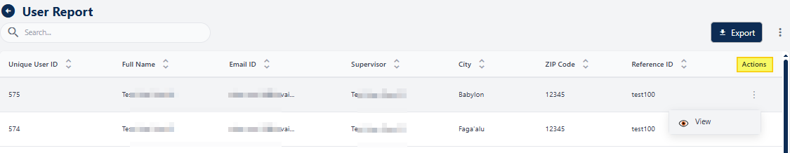 Fig: 166 - Action menu option
The following menu option is present:
-
1 ViewUsed to view the details of a user without the ability to make any modifications to the data.
NOTE: The following sub-section elaborates on the functionality associated with this option.
13.1.3.1. Using the View menu option
The View menu allows users to access detailed information about a particular user. This option provides a comprehensive display of all associated data. By using the view feature, users can examine the user's details with ease.
- Click on the vertical ellipsis icon under the Action column, against any displayed row entry of the User Report grid view to toggle the row-context menu option labeled as View.
- After clicking on it, the following modal window loads to display the key details of the user as per the inputs made, either during the creation stages or during modifications later on.
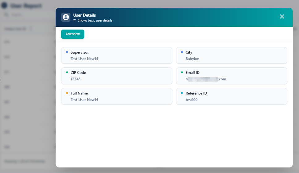 Fig: 168 - Viewing an User Detail entry
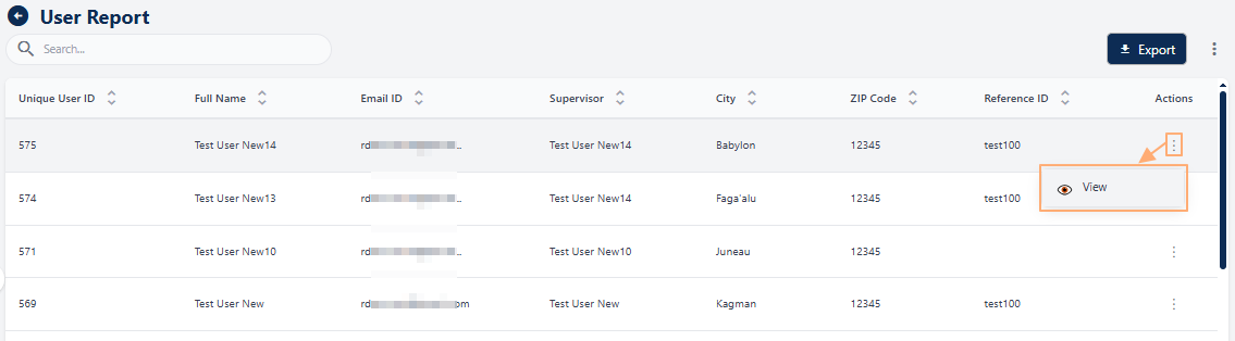 Fig: 167 - Clicking on the View menu option
The following information are displayed under the Overview section of the User Details modal window:
-
1SupervisorShows the name of the supervisor (if present) associated with the user for accountability and hierarchy mapping.
-
2CityDisplays the city where the user is located, useful for regional reporting and segmentation.
-
3ZIP CodeProvides the postal code for accurate address validation and location grouping.
-
4Email IDDisplays the registered email address of the user for communication and verification purposes.
-
5Full NameShows the complete name of the user for clear identification in reports and audits.
-
6Reference IDProvides an internal reference identifier (if present) for linking user records with other systems or processes.
NOTE: Hovering over any user data displays a tooltip with the full text or value, making it easier to view details that are truncated in the modal due to length.
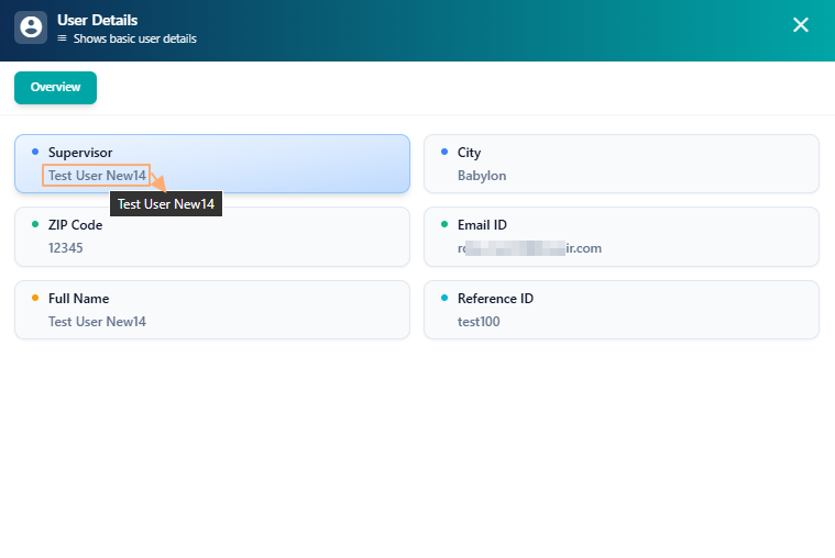 Fig: 169 - Tooltip view of field data
13.1.4. Using the Export button
The Export button, located at the top-right corner, acts as a seamless bridge between in-platform data and external requirements. With a single click, users can download comprehensive user reports for offline analysis, team sharing, or compliance documentation. This feature ensures insights remain portable, moving effortlessly across meetings, tools, and reporting systems while maintaining data integrity and operational continuity.
The Export button enhances usability by enabling user data to be captured in portable formats ideal for compliance, reporting, and collaboration. It supports audit readiness through reliable record-keeping and traceability, while simplifying the creation of executive summaries, presentations, and formal documentation. Simply click the Export button at the bottom right to download an Excel CSV copy of the listed data.
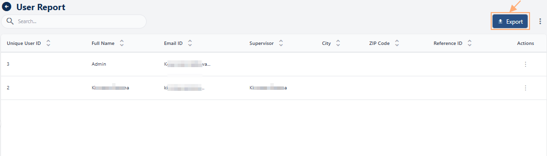 Fig: 170 - Export button to download CSV file
A local copy gets downloaded titled as USRReport.
 Fig: 171 - Download successful
Here is the view of the opened CSV file, showing the same data as present in the grid during exporting.
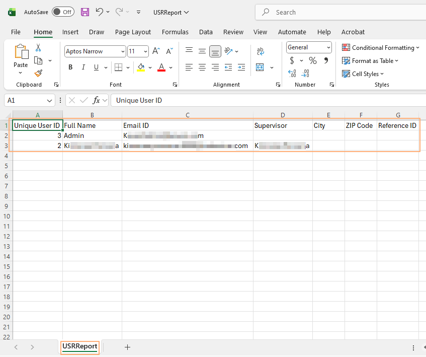 Fig: 172 - View of the file content
Key Features of Data Export
- 1 Data Sharing Facilitates collaboration by enabling easy distribution of structured datasets across teams.
- 2 Offline Analysis Enables reviewing and manipulating data without system access, ideal for remote work or executive briefings.
- 3 Backup Records Provides a secure way to store user data for record retention and historical comparisons.
13.1.5. Customizing the grid view columns
This feature empowers users to customize how data is displayed, offering granular control over what appears in the table and how it is organized. By enabling a fully tailored view, it adapts seamlessly to diverse roles and objectives, whether for compliance checks, operational oversight, or strategic analysis, delivering a personalized experience that maximizes clarity and efficiency.
-
To customize the columns displayed in the User Report grid view, click on the vertical ellipsis icon located at the right side of the grid header, next to the Export button.
- Select or deselect checkboxes to include or exclude columns from the grid view. Columns that are mandatory and cannot be changed will appear greyed out, such as Email ID and Full Name. To select all columns, click on the checkbox present before the System Information header label.
- Click on the Save button to apply your changes and close the modal window.
 Fig: 173 - Option to customize grid view columns
An Add Columns modal window will appear, listing all available columns under the System Information section. Columns currently visible in the grid are pre-selected. This feature allows you to personalize the grid view by showing only the fields relevant to your workflow, improving clarity and efficiency.
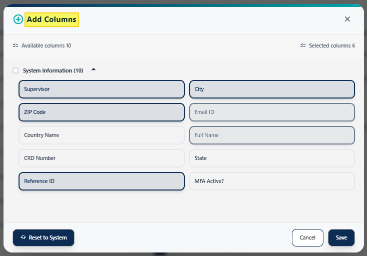 Fig: 174 - Loaded Add Columns modal window
The following column labels are available for selection. Columns marked with a green tick in the below table are enabled or selected by default.
| Sl. No. | ||
|---|---|---|
|
||
|
||
|
||
|
||
|
||
|
||
|
||
|
||
|
||
|
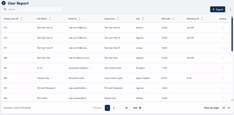 Fig: 175 - Performing operations in the loaded modal window
Key Features of the customizing grid columns
- 1 Greater Control Lets users customize the view to focus on attributes most relevant to their tasks.
- 2 Improved Accuracy Reduces data clutter by focusing on relevant subsets, making analysis more precise.
NOTE: As illustrated in the above image, clicking the Reset to System button restores the default column settings.
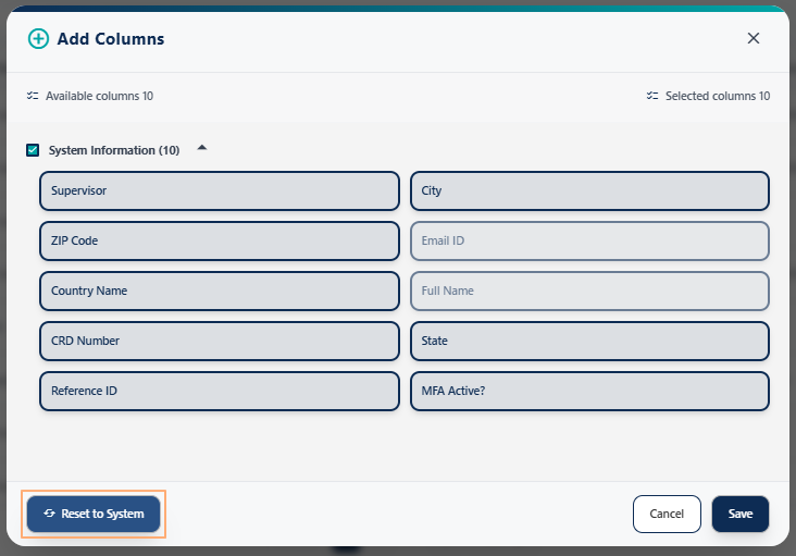 Fig: 176 - Reset to System button
13.1.6. Using the Pagination options
The Rows per page dropdown at the bottom-right lets users control how many rows appear per page, improving readability and navigation. This adaptability is especially helpful when reviewing long lists or conducting side-by-side comparisons across multiple entries.
Pagination options are provided at the bottom-right, to navigate through multiple pages of entries, which populate the grid view as per the selected count of items per page. Selectable options are 10, 20, 50 and 100. By default, 20 is set. The Rows per page dropdown control adds practical value by giving users the flexibility to balance readability and breadth of view, whether they prefer a concise page for meticulous review or a larger dataset for comparative analysis.
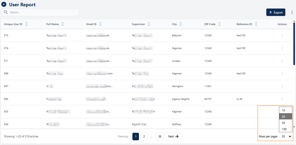 Fig: 177 - Pagination options
Previous and Next buttons are also present (when there are entries listed greater than the selected page item limit) to navigate to the next and previous pages respectively. When multiple pages are present, you can also click on the any displayed page number to go to that particular page.
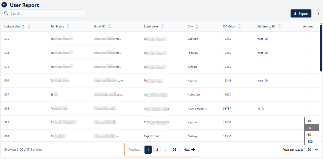 Fig: 178 - Previous and Next buttons with page numbers when multiple pages are present