
 This online help page offers detailed guidance on the SurgeONE.ai Manage Forms interface and its capabilities.
The Forms Library page serves as a powerful and transparent forms engine designed to align seamlessly with the business rules of your organization. It enables permitted users to create, clone, publish and customize forms with dynamic logic, ensuring that each submission adheres to operational standards and compliance requirements applicable for your organization. With built-in audit-readiness, every form entry is securely tracked and logged, providing a reliable trail for internal reviews or regulatory audits.
The Forms created here, once published, get reflected on the Forms module and can be included in the page grid view.
The accessibility and functionalities of the different sections of this page are dependent on the role based access controls / permissions set for the logged-in user. For more details refer to the Roles online help.
1. Navigating to the Settings > Forms Library page
To begin working with forms, permitted users must first access the Forms Library page, located under the Settings menu group. This page serves as the central hub for creating, editing and managing all form-related activities. Navigating here empowers users to configure forms according to organizational needs.
Click on the Settings menu group of the left panel and then on the Manage Forms / Forms Library menu option expanded under it.
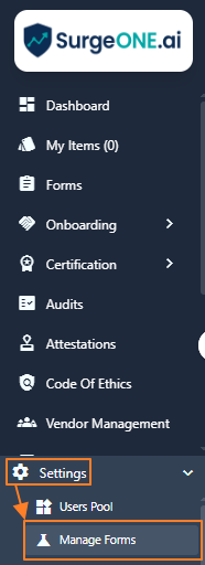 Fig: 1 - Manage Forms / Forms Library sub-menu option under the Settings menu option
Clicking on this menu option loads the Forms Library page showing the list of all the created forms related entries made in the application. Here is the view of the loaded page. These custom forms can then be used by the consulting firms and their agencies or clients.
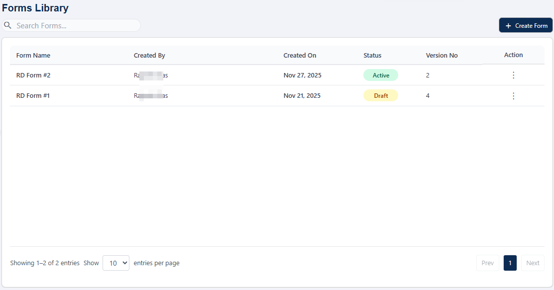 Fig: 2 - Manage Forms / Forms Library menu option loads the Forms Library page
 NOTE: If you are visiting the page for the first time and no other user of your organization has not created any custom form yet, then this page loads as blank.
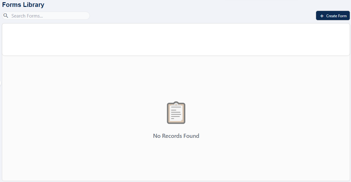 Fig: 3 - Manage Forms / Forms Library page blank
Key features of Forms Library page
- Flexible Creation – Create from scratch, edit or clone forms with customizable settings, policies and instructions.
- Role-Based Routing – Assign reviewers, approvers and filers dynamically for each form type.
- Seamless Publishing – Push forms across consultancy firms, agencies and clients with version control.
2. Understanding the various elements of the Forms Library page
The Manage Forms / Forms Library interface is composed of several key components that collectively support form management. Understanding these elements, such as the search bar, grid view, action menus and pagination controls enables users to interact with the system more effectively and confidently.
The SurgeONE Forms module allows consultancy/associate company admins and client company admins to create, manage and distribute forms that can be filled out by employees of client companies for smarter and dynamic forms workflows.
Refer to the following screenshot which is marked with numerical values that correspond to the below stated points.
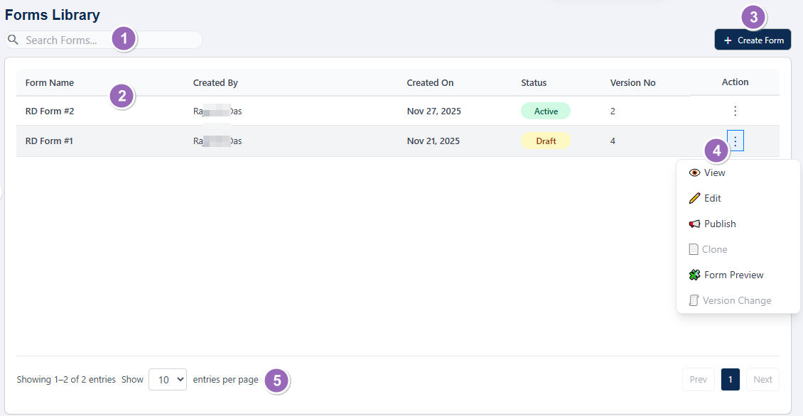 Fig: 4 - Understanding the various elements of the Forms Library page
-
1Search OptionsProvides filters to refine and locate existing form entries quickly and efficiently.
-
2Grid ViewDisplays loaded or filtered results in a structured column layout for easy review.
-
3+ Create FormButton to initiate the creation of a new form entry directly from the page.
-
4Action MenuContains the vertical ellipsis
 icon to toggle row-context menu options.
 -
5PaginationControls the number of items displayed per page and allows navigation across multiple pages.
-
6Export FormDownloads an excel version of a chosen form.
-
7Import FormProvides the functionality of importing a previously downloaded form in excel format.
NOTE: The following sub-sections elaborate further the associated functionalities of the above-stated points.
2.1. Searching for Forms Library entries
The search functionality allows users to quickly locate specific form entries using keywords. This feature is particularly useful when managing a large number of forms, as it reduces time spent browsing and ensures accurate retrieval of relevant records.
You can use the search bar to enter text and find matching results.
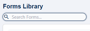
Fig: 5 - Search bar to find existing forms
Based on the text entered, matching results are listed out. The text based query operates on all the columns' data.
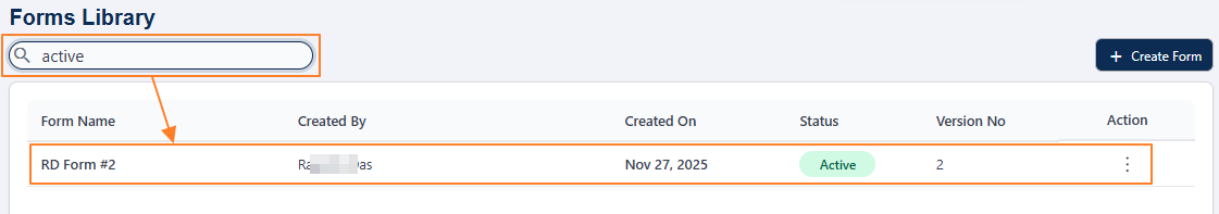 Fig: 6 - Filtered results
If no results are fetched by the executed search query, a No Records Found label populates the grid view.
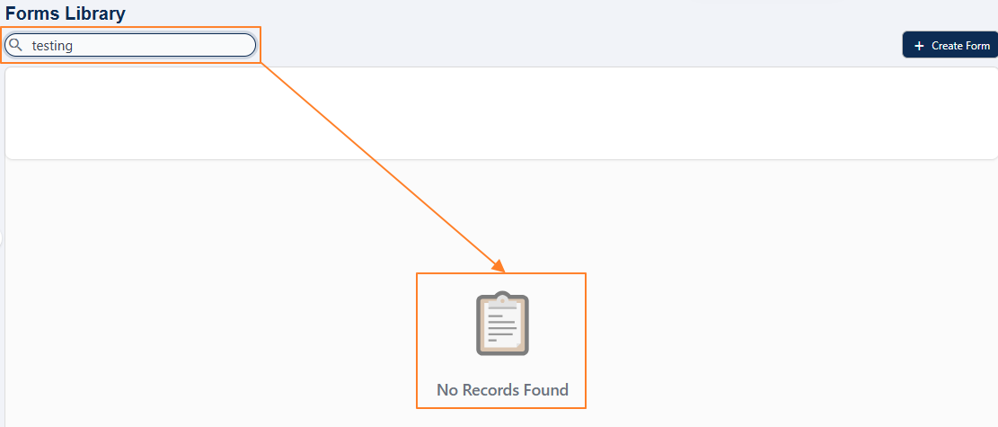 Fig: 7 - No records found
2.2. Understanding the grid view
The grid view presents form entries in a structured, tabular format. Each row typically represents a form, with columns displaying attributes such as form name, status, creation date and available actions. This layout provides users with a clear overview and facilitates efficient monitoring and comparison of forms.
The grid view displays all form entries.
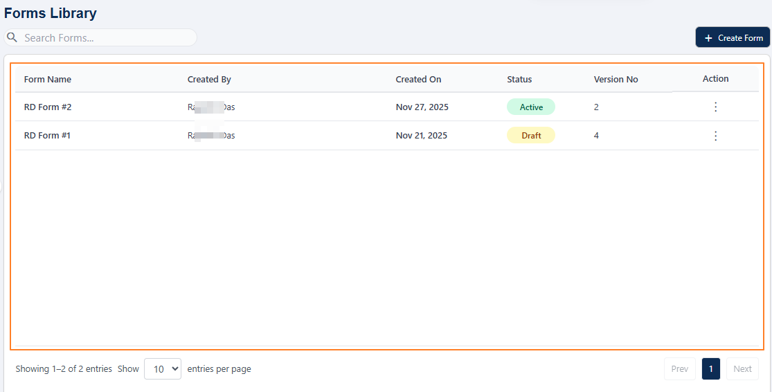 Fig: 8 - Forms Library grid view
The following columns are present:
-
1Form NameDisplays the label of the form entry, entered in the Form Name field of the Create Forms Form Details tab during creation.
-
2Created ByIndicates the name of the user who originally created the custom form.
-
3Created OnDisplays the date when the form was created for clear chronological tracking.
-
4StatusShows the current status of the form using color-coded tags for quick recognition.
-
5Version NoShows the current version of the form in whole number. Using the Version Change menu option increments this system-controlled value.
-
6ActionContains the vertical ellipsis icon to toggle row-context menu options such as Edit, Publish, etc.
2.3. Creating a new Form
Creating a new form is a guided process that walks users through several configuration steps. This structured approach ensures that each form is properly defined, configured and designed to meet specific business requirements.
Click on the + Create Form button at the top right, to proceed to create a new Forms Library entry for your organization.
 Fig: 9 - + Create Form button
2.3.1. Step #1 - Providing Form Details
In this initial step, users enter basic information about the form, including its title, description and category. These details help identify the purpose of the form and configurable, dynamic workflow settings make it easier to manage its lifecycle within the SurgeONE system.
The following page loads. Enter form-specific details here. Perform the following activities to provide necessary details in the General Information and Workflow Settings sections:
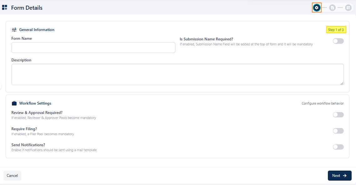 Fig: 10 - Form Details first stage view
- The first section of this first step of form creation is titled as General Information. Enter an appropriate name for the new form in the Form Name field. Validation is employed in the name label as it is a mandatory field. As you enter text in this field, the page header also updates accordingly.
- You can find a slider icon beside the Is Submission Name Required? label. It is disabled by default. Enable the slider if a Submission Name field will be added at the top of form and it will be mandatory.
- You can find a slider icon beside the Autofill Required? label. It is disabled by default and its selection is optional. If enabled, CRD Field will be added and if a valid CRD Number is provided the form will be autofilled
- Select a dropdown option of the Category dropdown field. It is an optional field. You may select any one listed option.
- You may enter a suitable description in the Description field. It is an optional field.
- You can find a slider icon beside the Reviewer & Approver Required? label. Use the slider to load two rows of multiple dropdowns, which can be used to proceed to set reviewers and approvers.
- Select any one out of the existing reviewer pools from the Reviewer Pool dropdown. The created reviewer pools of the Users Pool page populate this dropdown. All users belonging to the selected pool get notified about the form by default. There are two related dropdowns related to it next to the Reviewer Pool dropdown.
-
AReviewer Rule dropdownIt contains two options Any and All. The former is set by default. When Any option is selected, any one user belonging to the selected Reviewer Pool is required to take action during the reviewing action in the form workflow. While, when All option is selected, every user belonging to the selected Reviewer Pool are required to take action during the reviewing action in the form workflow.
-
BRule Mode dropdownIt is disabled by default. When All option is selected in the Reviewer Rule dropdown, this dropdown gets enabled. It contains two options - Parallel and Sequential. The Parallel option can be used when the users belonging to the selected Reviewer Pool needs to take action at their own convinience without any order, while the Sequential option can be used when an order needs to be followed by the reviewers.
-
- Similarly, select any one out of the existing approver pools from the Approver Pool dropdown. The created approver pools of the Users Pool page populate this dropdown. All users belonging to the selected pool get notified about the form by default. There are two related dropdowns related to it next to the Approver Pool dropdown.
-
AApprover Rule dropdownIt contains two options Any and All. The former is set by default. When Any option is selected, any one user belonging to the selected Approver Pool is required to take action during the reviewing action in the form workflow. While, when All option is selected, every user belonging to the selected Approver Pool are required to take action during the reviewing action in the form workflow.
-
BRule Mode dropdownIt is disabled by default. When All option is selected in the Approver Rule dropdown, this dropdown gets enabled. It contains two options - Parallel and Sequential. The Parallel option can be used when the users belonging to the selected Approver Pool needs to take action at their own convinience without any order, while the Sequential option can be used when an order needs to be followed by the approvers.
-
- You can find a slider icon beside the Require Filing? label. If enabled, a Filer Pool selection becomes mandatory and the created filer pools of the Users Pool page populate this dropdown. All users belonging to the selected pool get notified about the form by default. There are two related dropdowns related to it next to the Filer Pool dropdown.
-
AFiler Rule dropdownIt contains two options Any and All. The former is set by default. When Any option is selected, any one user belonging to the selected Filer Pool is required to take action during the reviewing action in the form workflow. While, when All option is selected, every user belonging to the selected Filer Pool are required to take action during the reviewing action in the form workflow.
-
BRule Mode dropdownIt is disabled by default. When All option is selected in the Filer Rule dropdown, this dropdown gets enabled. It contains two options - Parallel and Sequential. The Parallel option can be used when the users belonging to the selected Filer Pool needs to take action at their own convinience without any order, while the Sequential option can be used when an order needs to be followed by the filers.
-
- You can find a slider icon beside the Send Notifications? label. Enable the slider if notifications should be sent using a mail template. It cannot be enabled unless either one or both of the above two sliders are enabled.
- Click on the Next button (at the bottom right) to go to the next stage.
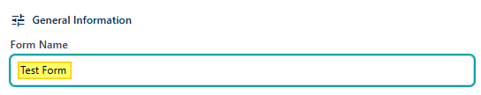 Fig: 11 - Entering a name for this custom form
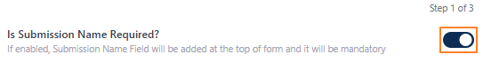 Fig: 12 - Submission Name slider enabled
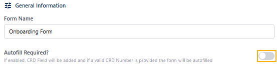 Fig: 13 - Submission Name slider enabled
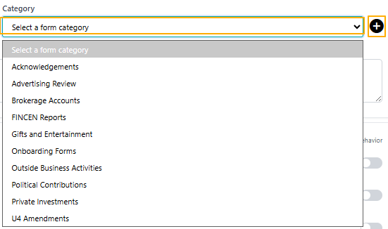 Fig: 14 - Setting the option of the Category dropdown field
You can also create a custom category by clicking on the + icon next to the dropdown and entering the category label in the loaded modal window. Click on the Add button to confirm. A success notification gets triggered and the added category is visible in the dropdown list.
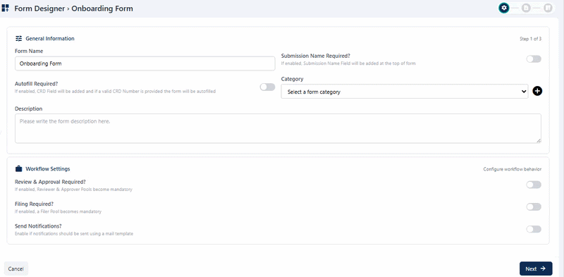 Fig: 15 - Setting the custom option of the Category dropdown field
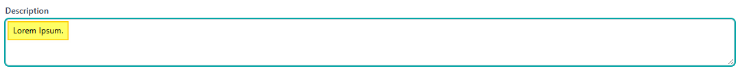 Fig: 16 - Entering a name for this custom form
The second section of this first step of form creation is titled as Workflow Settings. It is used to configure the workflow behavior of the created form. None of the fields here are mandatory so this section can be left untouched if approval or filer workflow is not required for the custom form.
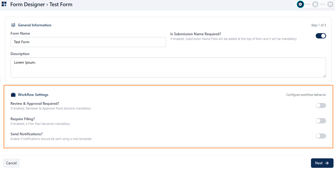 Fig: 17 - Workflow Settings section
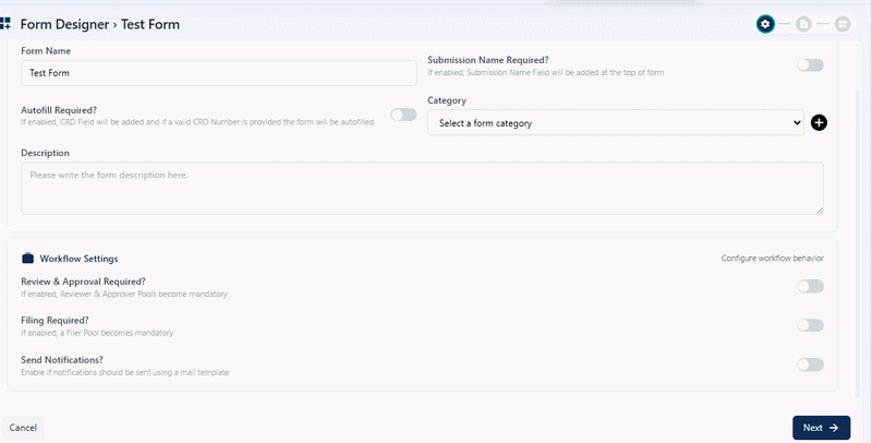 Fig: 18 - Loaded dropdowns after slider enabling
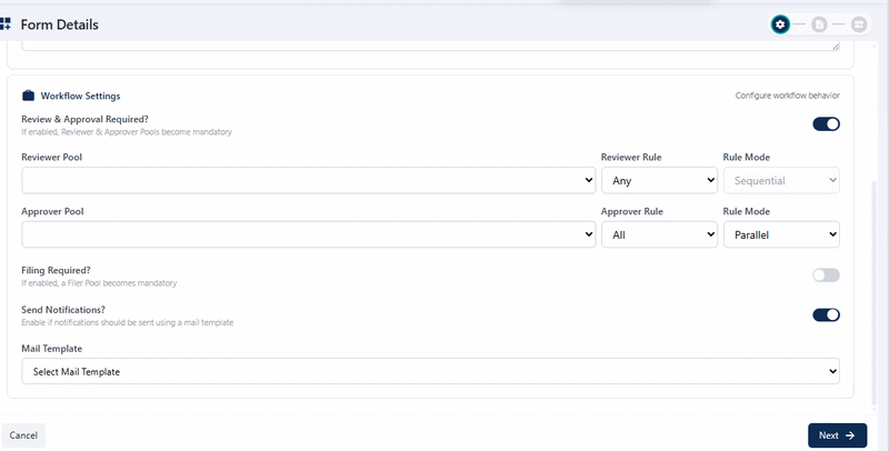 Fig: 19 - Loaded Filer Pool dropdown and related dropdowns after Require Filing? slider enabling
 Fig: 20 - Send Notifications? slider dependancy on above sliders
When enabled, a mail template selection becomes mandatory in the Mail Template dropdown that loads below it. After enabling the slider, proceed to select an option from the Select mail Template dropdown, to set the applicable mail template which would be associated with this new form. The associated templates present in the Template Library populate this dropdown. The chosen template will be triggered to the email inboxes of the user of the specified pools.
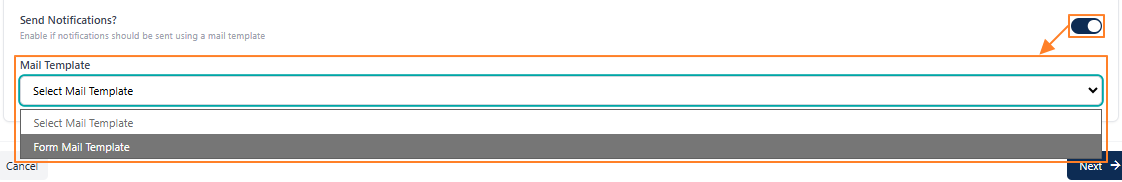 Fig: 21 - Loaded Mail Template dropdown after Send Notifications? slider enabling
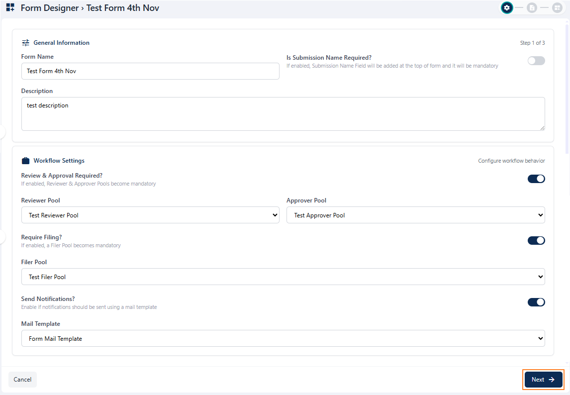 Fig: 22 - Next button to proceed to the second step
NOTE: You can proceed only if all the field validations are met on this page. Otherwise, the system will prompt appropriate validation tooltips below the field(s).
- The form name and type selection is mandatory in the General Information section. Otherwise, the following validation tooltips are triggered below the fields, if you keep the fields blank and try to proceed to the next step.
- Validation is employed on the name of the form being created. If you enter a name in the Form Name field, while another form already exists with the same name in the same organization and then click on the Next button, the system will prompt the following tooltip and floating notification to instruct you to provide a different name.
- If the Review & Approval Required? slider is enabled, at least one option selection in the Reviewer Pool and Approver Pool dropdowns of the Workflow Settings section is mandatory. Otherwise, the following validation tooltips are triggered below the dropdown fields, if you keep the dropdowns blank and try to proceed to the next step.
- If the Require Filing? slider is enabled, at least one option selection in the Filer Pool dropdown of the Workflow Settings section is mandatory. Otherwise, the following validation tooltips are triggered below the dropdown field, if you keep the dropdown blank and try to proceed to the next step.
- If the Send Notifications? slider is enabled, at least one option selection in the Mail Template dropdown of the Workflow Settings section is mandatory. Otherwise, the following validation tooltips are triggered below the dropdown field, if you keep the dropdown blank and try to proceed to the next step.
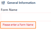 Fig: 23 - Field validations of General Information section
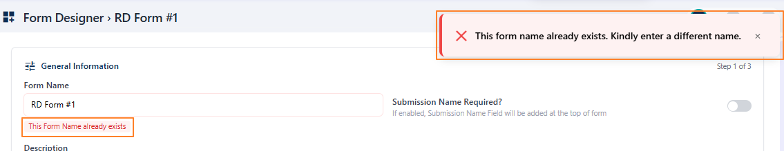 Fig: 24 - Validation on Form Name field
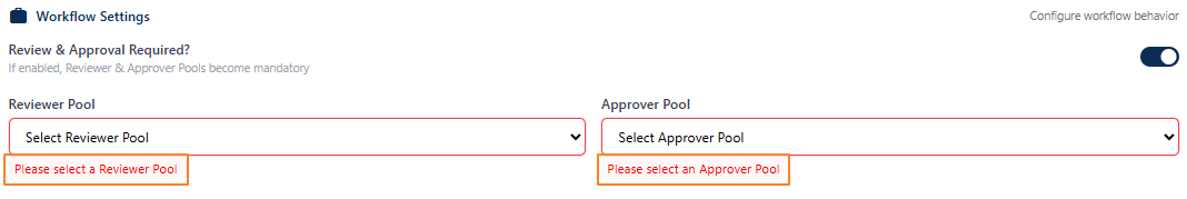 Fig: 25 - Field validations for reviewing and approval dropdowns of Workflow Settings section
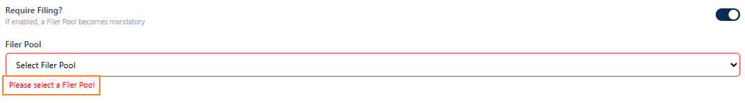 Fig: 26 - Field validations for filing dropdown of Workflow Settings section
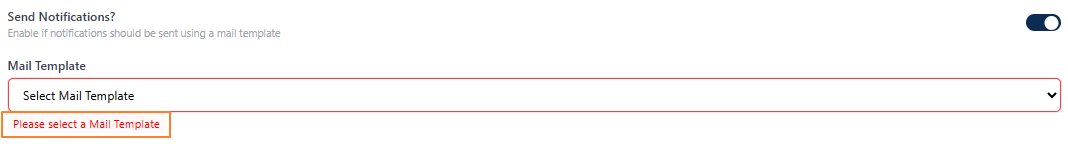 Fig: 27 - Field validations for mail template of Workflow Settings section
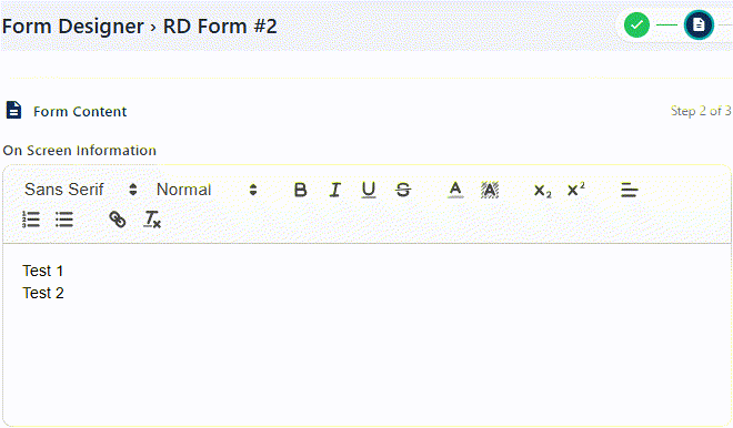
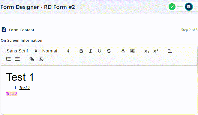
2.3.2. Step #2 – Stating Form Content
Stating the form instructions involves clearly defining the essential information that will appear within a form. This includes user-facing guidance such as on-screen info, information for the reviewer, policy statements, procedural rules and instructions that ensure clarity and compliance while using the newly created form.
In the second stage, which is titled as Form Content, you can set appropriate form instructions or details of this new form.
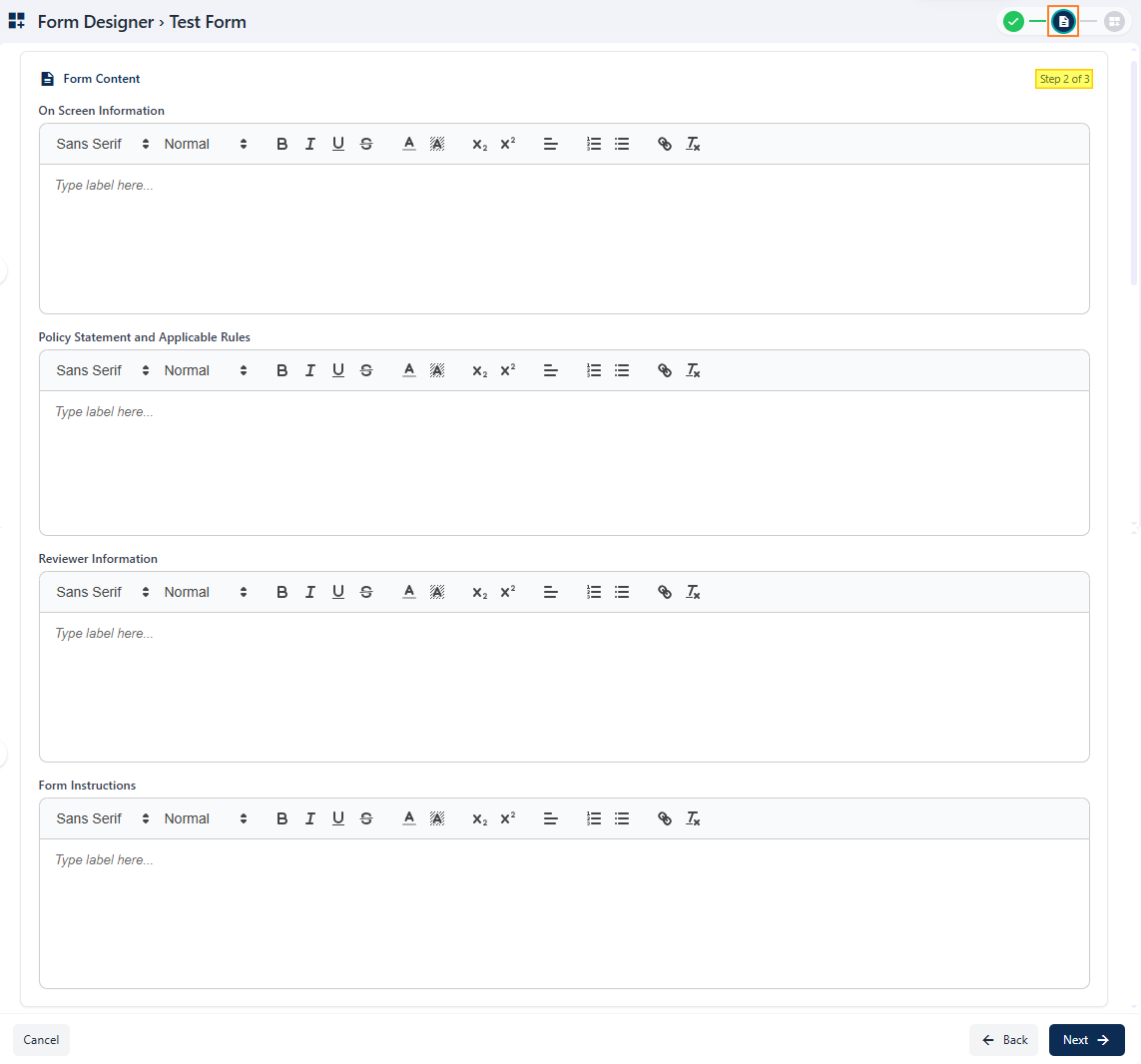 Fig: 28 - Form Content
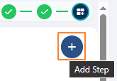
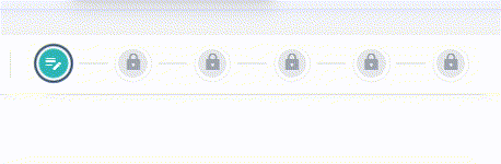
NOTE: At the top-right, you can view a breadcrumb view of the three steps of form creation with the help of appropriate icons.
 Fig: 29 - Form Creation breadcrumb view to indicate progress
- The first icon is a green tick mark, indicating that the initial step of the form creation process has been successfully completed. This gives you confidence that your progress is being tracked accurately.
- The second icon is highlighted or selected, showing that you are currently working on the second step. This visual cue helps you stay oriented and focused on the task at hand, ensuring a smooth and guided experience.
- The third icon is greyed-out, signifying that the final step is yet to be reached. This allows you to anticipate the remaining step in the new form creation process.
The step number is also mentioned below it, for example: Step 2 of 3.
Refer to the following table which explains what activities you can perform here (although none of the user input fields are mandatory in this step):
| Sl. No. | Field / Section Label | Description and Benefit |
|---|---|---|
| On Screen Information |
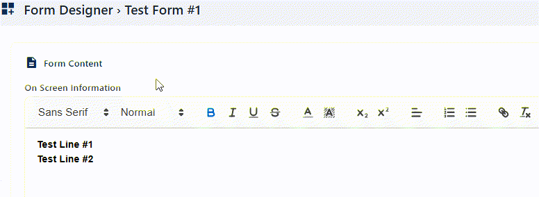
You can set a suitable information in the panel area which will be displayed on screen to guide users with contextual details or instructions while they view, use or fill out the form.
This section provides users with a concise overview of the form's purpose and requirements directly on the screen. It highlights the key fields to be completed, offers guidance on expected input formats, and ensures that users understand the context before proceeding. Benefit: Clear upfront details reduce confusion and improve accuracy in submissions. |
|
| Policy Statement and Applicable Rules |
You may set a suitable policy or rule in the field area.
All submissions made through this form are subject to the organization's policies and applicable rules. Users are expected to provide truthful and complete information, adhere to confidentiality standards, and comply with relevant regulations. Any misuse of the form or violation of stated policies may result in corrective action. Benefit: This section ensures transparency and establishes a clear framework for accountability. |
|
| Reviewer Information |
You can also set a suitable information in the respective panel area to assist the assigned reviewer with important info.
Details of the assigned reviewer are provided here to maintain clarity and accountability in the evaluation process. The reviewer's name, designation, and contact information may be displayed to allow users to follow up if necessary. Benefit: Visible review instructions build trust and ensure proper handling of form submissions. |
|
| Form Instructions |
You may also set applicable instructions or logic that the form should follow during execution in the Form Instructions area.
This section outlines step by step guidance for completing the form accurately. Instructions may include how to fill each field, acceptable formats for responses, and examples where applicable. Users are encouraged to review these directions carefully before submission to avoid errors or delays. Benefit: Clear instructions help streamline the process and ensure consistency across all entries. |
Click on the Next button (at the bottom right) after providing requisite information in the respective fields to go to the third step or Form Designer stage.
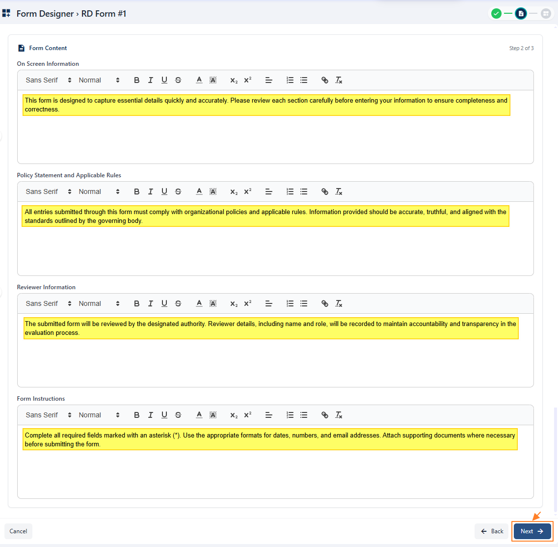 Fig: 30 - View of the entered data and Next button
NOTE:
The following table illustrates the various text related operations that you can perform for any of the fields of this page.
| Sl. No. | Answer Field Name | Description and Benefit |
|---|---|---|
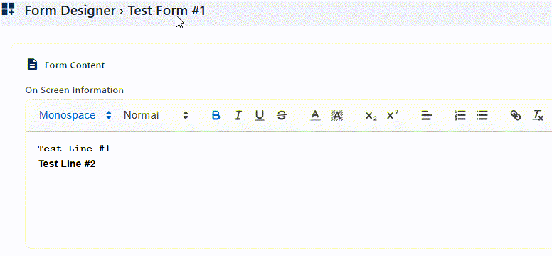
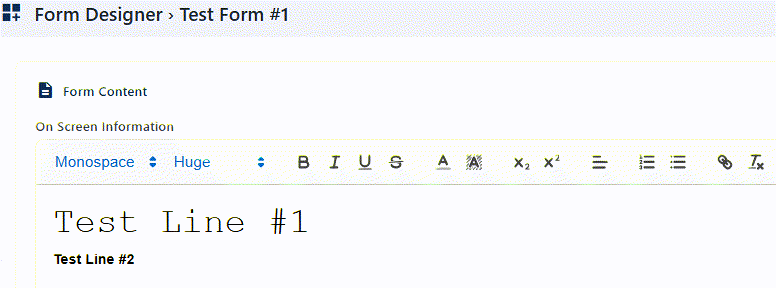
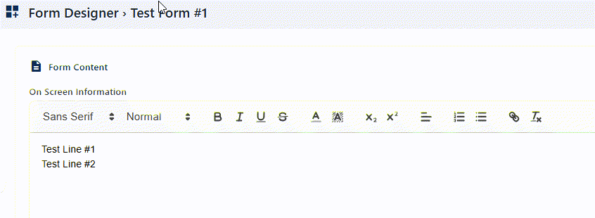
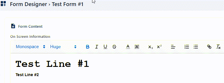
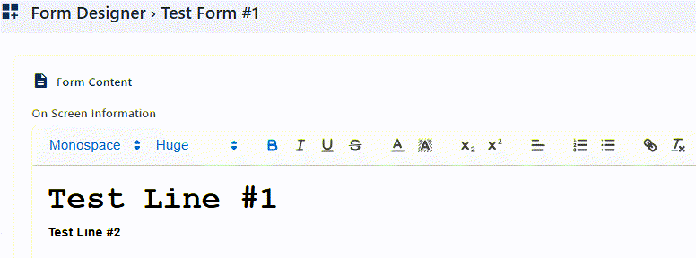
| Font Style |
Allows changing the typeface of text. Selectable dropdown options are Sans Serif, Serif and Monospace, where the former is set by default. Benefit: Enhances readability and visual appeal. |
|
 | ||
| Font Size |
Adjusts the size of text characters. Selectable dropdown options are Small, Normal, Large and Huge, where the second one is set by default. Benefit: Improves emphasis and accessibility. |
|
 | ||
| Bold |
Makes selected text thicker and darker. It can be enabled or disabled. By default, it is disabled. Benefit: Highlights important words or phrases. |
|
 | ||
| Italic |
Slants selected text to the right. It can be enabled or disabled. By default, it is disabled. Benefit: Adds emphasis or denotes titles. |
|
 | ||
| Underline |
Draws a line beneath the selected text. It can be enabled or disabled. By default, it is disabled. Benefit: Signals importance or clickable links. |
|
 | ||
| Strikethrough |
Draws a line through the selected text. It can be enabled or disabled. By default, it is disabled. Benefit: Indicates removal or outdated content. |
|
 | ||
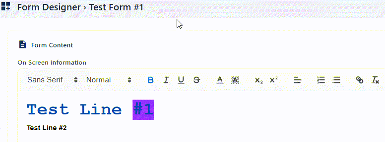
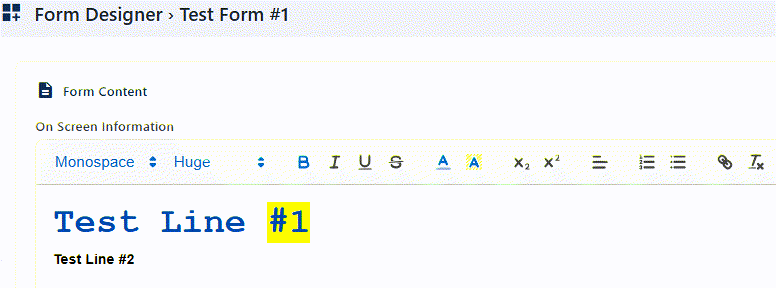
| Text Color |
Changes the color of the selected text. Clicking on it loads a color selection palette comprising of 35 default colors. The color black is set by default. Benefit: Adds emphasis and improves design aesthetics. |
|
 | ||
| Background Color |
Applies color behind the selected text. Clicking on it loads a color selection palette comprising of 35 default colors. The color white is set by default. Benefit: Highlights sections for better visibility. |
|
 | ||
| Subscript |
Displays the selected text slightly below the baseline. It can be enabled or disabled. By default, it is disabled. Benefit: Useful for chemical formulas or footnotes. |
|
 | ||
| Superscript |
Displays the selected text slightly above the baseline. It can be enabled or disabled. By default, it is disabled. Benefit: Commonly used for exponents or references. |
|
 | ||
| Align |
Positions the selected text left, center, or right. Selectable dropdown options are align left, align centre, align right and justified, where the former is set by default. Benefit: Improves layout consistency and readability. |
|
 | ||
| Numbered List |
Creates an ordered list with numbers, starting from 1. It can be enabled or disabled. By default, it is disabled. Benefit: Organizes steps or sequences clearly. |
|
 | ||
| Bullet List |
Creates an unordered list with bullets. It can be enabled or disabled. By default, it is disabled. Benefit: Presents items neatly without hierarchy. |
|
 | ||
| Insert Link |
Adds a clickable hyperlink to text. Select any entered text and click on this icon to load a Enter link panel. Enter the web address to hyperlink with the selected text and click on the Save button to store it. The font style changes to blue color with an underline, indicating a hyperlink. Clicking again on this hyperlink loads the Visit URL panel with Edit and Remove options, to either modify the address or remove the created hyperlink respectively. Benefit: Connects users to external resources easily. |
|
 | ||
| Remove Formatting |
Clears all applied text styles. Select any entered text and click on this option to remove any formatting previously made to the selected text. The rest of the unselected content remains unchanged. Benefit: Resets content to plain text for consistency. |
|
 | ||
2.3.3. Step #3 – Designing Form
The final step involves designing the form layout. Users can add fields, labels and input types using a visual editor. This intuitive design process allows for the creation of user-friendly forms that capture the necessary data accurately and efficiently.
In the third stage, you can set the layout and answer fields of this new form to obtain responses when the form is in use later on.
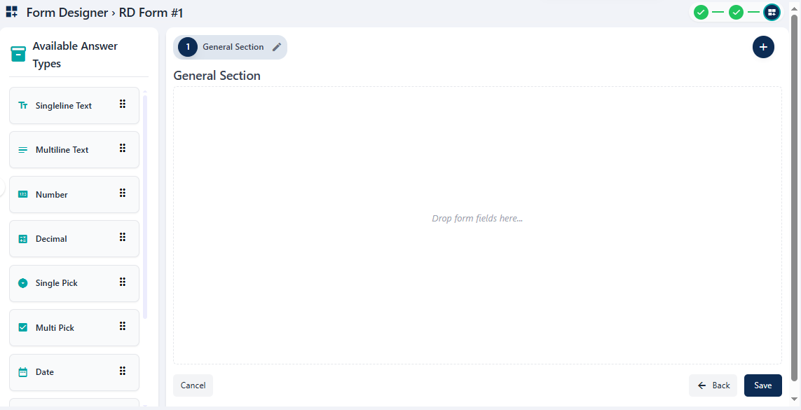 Fig: 32 - Form Designer
- The left panel contain the available answer types which can be clicked upon to be moved onto the right panel area of section(s), while creating/editing a form. You can also drag and drop these. Here is the view of the various options which are present.
- Make atleast one answer type addition / field in the form section.
- You can add more answer types, configure the field values or add multiple sections to the custom form. More details on these have been mentioned in the NOTE section below.
- Click on the Save button to create the new form.
- After you click on the it, the button label changes to Saving. The Form Designer page closes. Get redirected to the Forms Library page where you can find the newly saved form listed in the grid view. The status of the form is set to Draft and the version number is 1.
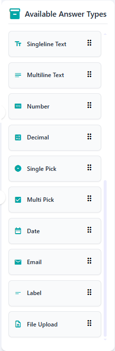
Fig: 33 - Available Form Fields of the Left Panel
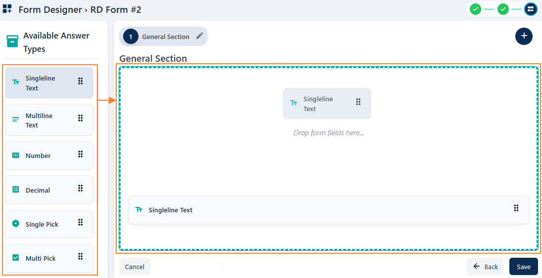
Fig: 34 - Adding any one answer type from the available ones
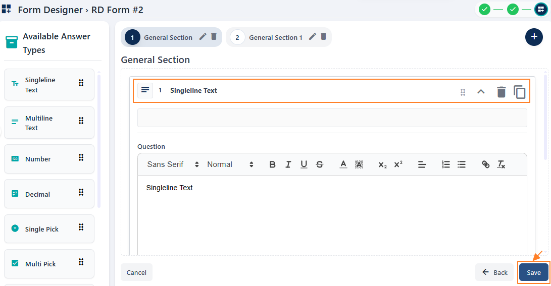
Fig: 35 - Saving a custom form
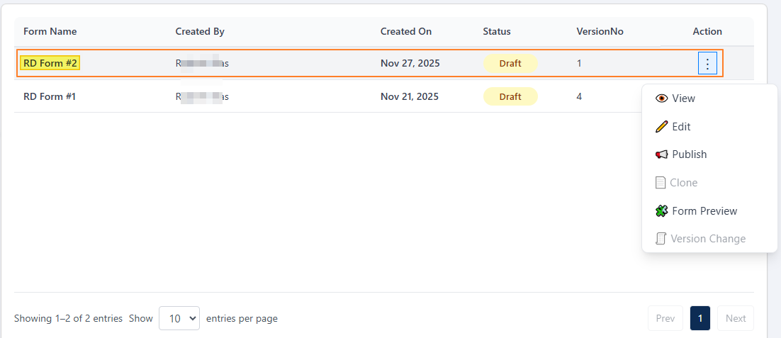
Fig: 36 - View of the saved form
NOTE:
- Validation is employed on available answer type selection in the default section present. At least one from the left panel must be selected in a form section here to proceed to save the form. Otherwise, the following validation message gets prompted.
- Even if you include any available answer type in the default section, but you have added more section(s), validation is employed on field selection in each of these multiple sections present. At least one field must be selected within each section to proceed to save the form. Otherwise, the following validation message gets prompted.
- Validation is employed on the cancel operation. If you have made unsaved additions or changes to the form design or answer types selection or field changes, and then click on the Cancel button, then the system will prompt the following modal window to obtain your confirmation. Click on Yes, Cancel to do so.
- If you add more than three sections, then the section headers except the one currently in view are displayed in a collapsed state, showing only the section number. You can click on any displayed section number to expand the area and view the name along with the edit and delete icons, while the others get displayed in a collapsed view.
- The draft version form needs to be published from the Manage Forms page to be available in the Forms page.
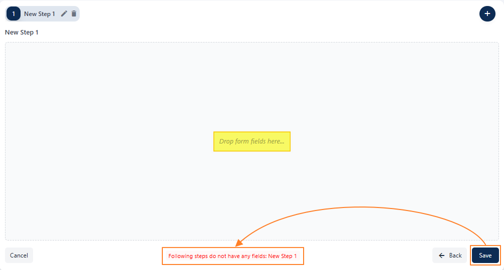 Fig: 37 - Validation on field selection in the default section
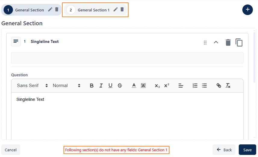 Fig: 38 - Validation on field selection when multiple sections are present
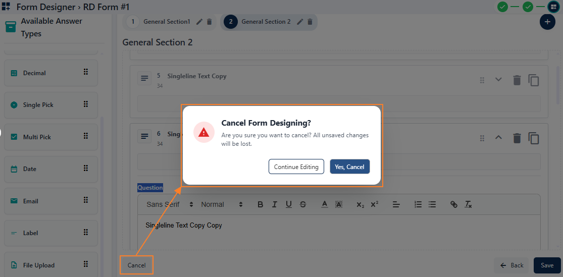 Fig: 39 - Validation on Cancel operation
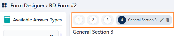 Fig: 40 - View of collapsed section headers when there are more than 3 sections present
- Let us understand the fields or elements of this form designer (regarding the Available Answer Types of the left panel area) interface with the help of the following points.
| Sl. No. | Answer Field Name | Description and Benefit |
|---|---|---|
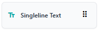 |
Used for short responses such as names, titles, or brief comments. Benefit: Keeps input concise and easy to review. |
|
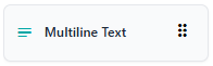 |
Ideal for longer responses like feedback, notes, or descriptions. Benefit: Provides ample space for detailed information. |
|
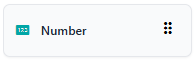 |
Restricts input to whole numbers only. Benefit: Guarantees numeric precision for counts or IDs. |
|
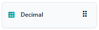 |
Allows entry of numbers with decimal points for precise values. Benefit: Captures exact values such as measurements or currency. |
|
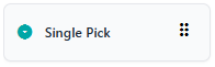 |
Presents a dropdown or radio button list where only one option can be selected. Benefit: Simplifies decision-making by enforcing a single choice. |
|
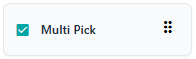 |
Enables users to select multiple options from a list. Benefit: Captures broader input when more than one answer applies. |
|
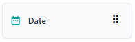 |
Provides a calendar picker for selecting dates. Benefit: Reduces errors and ensures consistency in date entry. |
|
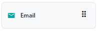 |
Validates input to ensure it matches an email format. Benefit: Ensures reliable and correctly formatted contact information. |
|
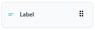 |
Displays static text or instructions within the form. Benefit: Improves clarity by guiding users without requiring input. |
|
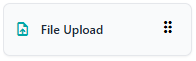 |
Allows users to attach documents, images, or other files. Benefit: Supports richer submissions with attachments or supporting materials. |
- Let us understand the various fields of the Available Answer Types with the help of the following table.
| Sl. No. | Answer Field Name | Description and Benefit |
|---|---|---|
| Serial Number and Answer Type |
Specifies the question number of the current section and the format of user input expected for it. Benefit: Assists the user to view the question number and understand the type of response required. |
|
| Question |
The prompt or query presented to the user for response. It is displayed as the field label in the form. Benefit: Guides users clearly on what to answer. |
|
| PlaceHolder |
Temporary text shown inside the input field of a form to guide the user. Benefit: Provides quick hints for expected input. |
|
| Help Text |
Additional information that clarifies how to answer the question. A question mark  icon is present in the form beside the field label. Hovering your mouse pointer over it reveals the help text entered as a tooltip. icon is present in the form beside the field label. Hovering your mouse pointer over it reveals the help text entered as a tooltip.Benefit: Reduces confusion and improves accuracy. |
|
| Is Required |
Indicates whether the user must provide a response before submitting. If the slider is enabled, a red color asterisk (*) sign indicates that it is a mandatory field during form fill up. Benefit: Ensures critical information is always collected. |
|
| Make Sub Question? |
Allows branching logic based on the user's answer. If the slider is enabled then the next Dependent On field label changes to Sub Question of. Benefit: Enables dynamic and personalized forms. |
|
| Dependent On |
Links this question's visibility or relevance to another field's response. The existing single pick questions populate the dropdown. If the Make Sub Question? slider is enabled then the next Dependent On field label changes to Sub Question of. In this case, the existing questions of the current section, which are arranged before this question, populate the dropdown. Benefit: Keeps forms context‑aware and streamlined. |
|
| Options |
Lists predefined choices available for selection in pick‑type fields. It is present for Single Pick and Multi Pick. For Single Pick and Multi Pick types, by default two options are present as Option 1 and Option 2. You can modify the option labels. An Add Option button is present to add more options. Benefit: Simplifies and standardizes form responses via option selections. |
- Let us understand the other UI elements present in the Form Designer right panel area with the help of the following table.
| Sl. No. | Icon | Name | Purpose |
|---|---|---|---|
 |
Add Section | Button creates a new section in the form layout titled as General Section and the title is followed by an incremental section serial number. | |
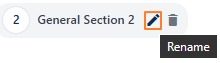 |
Rename | Allows renaming of a section's default title. | |
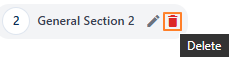 |
Delete | Removes an entire section from the form. The fields included in the section also get removed. | |
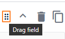 |
Drag field | Lets you reposition an answer type by dragging it. Repositioning changes the question number automatically. However, you must have multiple answer types added to a section to be able to drag and reposition any one at a time. | |
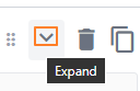 |
Expand | Displays the full content or associated fields of a chosen answer type. After clicking, the down arrow icon changes to a up arrow icon. | |
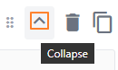 |
Collapse | Hides field details of the answer type to save space. After clicking, the up arrow icon changes to a down arrow icon. | |
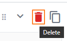 |
Delete | Removes a selected answer type from the form. | |
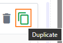 |
Duplicate | Creates a copy of the selected answer type below it, with a Copy label added to the cloned copy's Question label and other field details copied as it was in the original one. |
- The below table illustrates the various fields present for each available answer type.
 |
|
|
|
|
|
 |
|
|
|
|
|
|
|
|
|
|
|
|
|
|
|
|
|
|
|
|
|
|
|
|
|
|
|
|
|
|
|
|
|
|
|
|
|
|
|
|
|
|
|
|
|
|
|
|
|
|
|
|
|
|
|
|
|
|
|
|
|
|
|
|
|
|
|
|
|
|
|
|
2.4. Using the Action column menu options
Each form entry includes an Action column with menus offering various management options. These options provide quick access to common tasks such as editing, publishing and previewing forms, streamlining the workflow for administrators who are tasked to create custom forms.
Click on the vertical ellipsis icon against any displayed row entry of the grid view to toggle the row-context menu options.
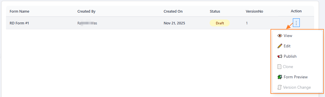 Fig: 41 - Action column menu options
The following menu options are present:
-
1ViewUse this option to view or check any created form step-wise, before further actions are taken.
-
2EditAllows modifications to a form that has not yet been published.
-
3PublishUse this option to publish any created form, making it available for use.
-
4CloneCreates an exact replica of a form, which can later be modified if required. Feature currently disabled
-
5Form PreviewDisplays the structure or designed layout of the created form for review.
-
6Version ChangeAllows creation of different versions of a form that has already been published.
The following sub-sections elaborate on the functionalities associated with these options.
NOTE: Some of the action menu options can load as greyed-out depending on the status of the form.
The Clone menu is greyed-out in both Active and Draft status forms since it is currently disabled.
- The action menu option Version Change is greyed-out if a form is in draft status (yet to be published). Hence, you cannot update versions of such a form (displayed with the
 status tag).
- The action menu options Edit and Publish become greyed-out once a form is published. Hence, you cannot make modifications or re-publish an already published form (displayed with the
 status tag).
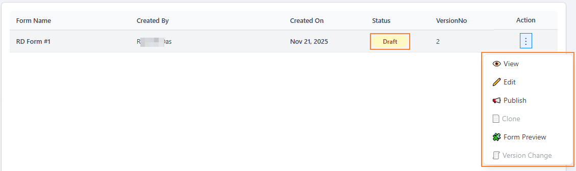 Fig: 42 - Action column menu options of a form with Draft status
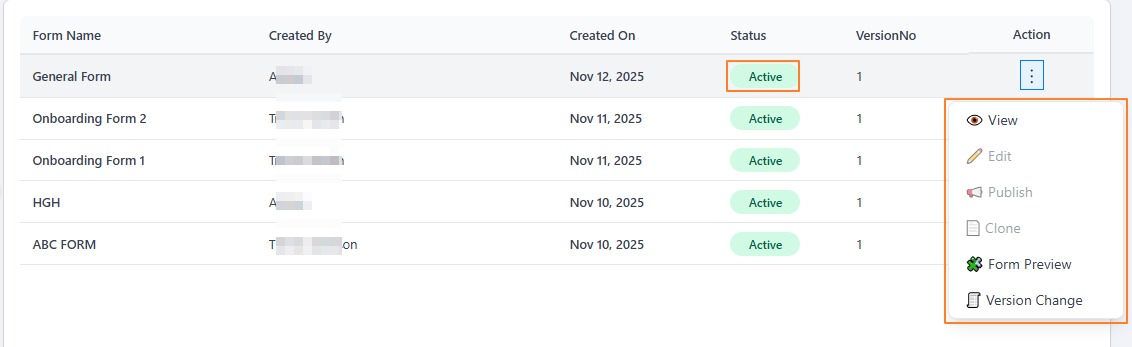 Fig: 43 - Action column menu options of a form with Active status
2.4.1. Using the View menu option
The preview feature enables users to view the form as it will appear to end-users. This helps verify layout, functionality and content before making the form live, reducing the risk of errors.
- Click on the vertical ellipsis icon under the Action column, against any displayed row entry of the Forms Library page to toggle the row-context menu option labeled as View.
- After clicking on it, the following page loads with the General Information and Workflow Settings sections visible. The breadcrumb on the top-right indicates that you are currently viewing the first step. Here you can view the entire form name, type, description, reviewer pool, approver pool, filer pool related info and applicable mail template, if set earlier. All data/fields are in read-only mode since you are viewing the form details.
 Fig: 45 - General Information and Workflow Settings sections
- Click on the Next button at the bottom-right to proceed to the second step.
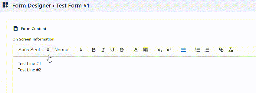
- Get redirected to the second step of the form, titled as Form Content. The breadcrumb on the top-right indicates that you are currently viewing the second step. There are four fields here labeled as follows:
- On Screen Information
- Policy Statement and Applicable Rules
- Reviewer Information
- Form Instructions
- Click on the Next button at the bottom-right to proceed to the third and last step.
- Get redirected to the third step of the form with the Field Library panel displayed on the left panel and the steps and constituting answer types / fields on the right side of the page, as designed for the form earlier. You cannot drag and drop any answer types from the left panel. The breadcrumb on the top-right indicates that you are currently viewing the third step.
-
On the right, each field configuration can be viewed by clicking on the expand
 icon. Scroll down on the expanded field config area to view the details. You can also view the fields of each section / step by clicking on the label displayed at the top. You cannot make any changes here. Click on the collapse
  icon to close the expanded view. The + icon at the top-right (to add a new section), the Available Answer Types left panel elements and the Save button at the bottom-right are displayed, but all are disabled since you are in view mode.
- Click on the Cancel button to exit this view form mode, close this page and get redirected to the Forms Library page showing the grid view.
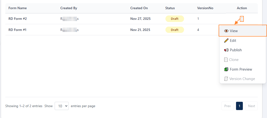 Fig: 44 - Clicking on the View menu option
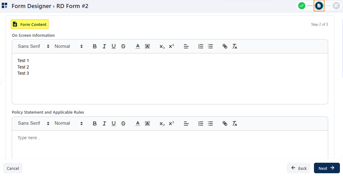 Fig: 46 - Form Content view of the second step
 Fig: 47 - Third step various page elements
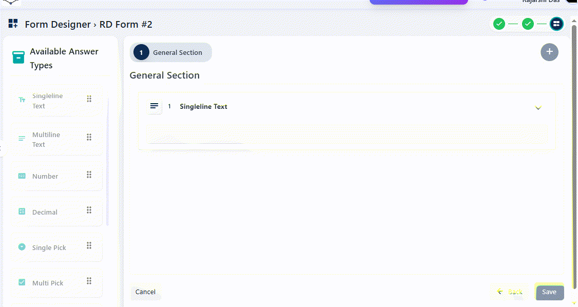 Fig: 48 - Animated view of the third step of a custom form
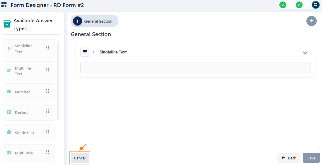 Fig: 49 - Cancel button to exit the form view mode
2.4.2. Using the Edit menu option
Selecting the Edit option allows users to modify an existing form. This is useful for updating content, adjusting configurations, or refining the design based on feedback, regulatory updates or changing requirements.
- Click on the vertical ellipsis icon under the Action column, against any displayed row entry of the Forms Library page to toggle the row-context menu option labeled as Edit.
- After clicking on it, the following page loads with the General Information and Workflow Settings sections visible. The breadcrumb on the top-right indicates that you are currently in the first step of form editing. Here you can view the entire form name, type, description, reviewer pool, approver pool, filer pool related info and applicable mail template, if set earlier. All data/fields are in editable mode. Make necessary changes as per your requirement.
Fig: 51 - General Information and Workflow Settings sections
- Click on the Next button at the bottom-right to proceed to the second step.
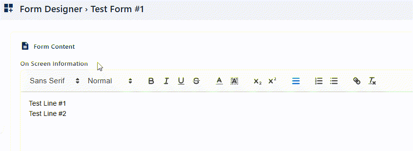
- Get redirected to the second step of the form, titled as Form Content. The breadcrumb on the top-right indicates that you are currently in the second step. There are four fields here labeled as follows:
- On Screen Information
- Policy Statement and Applicable Rules
- Reviewer Information
- Form Instructions
- Click on the Next button at the bottom-right to proceed to the third and last step.
- Get redirected to the third step of the form with the Field Library panel displayed on the left panel and the steps and constituting questions / form fields on the right side of the page, as designed for the form earlier. You can drag and drop any fields from the left panel. The breadcrumb on the top-right indicates that you are currently viewing the third step.
-
On the right, each field configuration can be viewed by clicking on the expand icon. Scroll down on the expanded field config area of an existing answer type to view the previously provided details. Click on the collapse icon to close the expanded edit field details area.
You can also view the answer types included in each section by clicking on the label displayed at the top. You can make any changes here. - You can also use the delete icon to remove an answer type from the section, or use the duplicate icon to clone a particular field configuration of an answer type.
- Click on the + icon at the top-right to add a new section and drag answer types from the left side on this new section. Make appropriate field level configurations.
- Click on the Save button at the bottom-right once you have made all of your changes. This closes this page and redirects you to the Forms Library page, showing the updated form in the grid view.
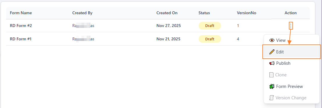 Fig: 50 - Clicking on the Edit menu option
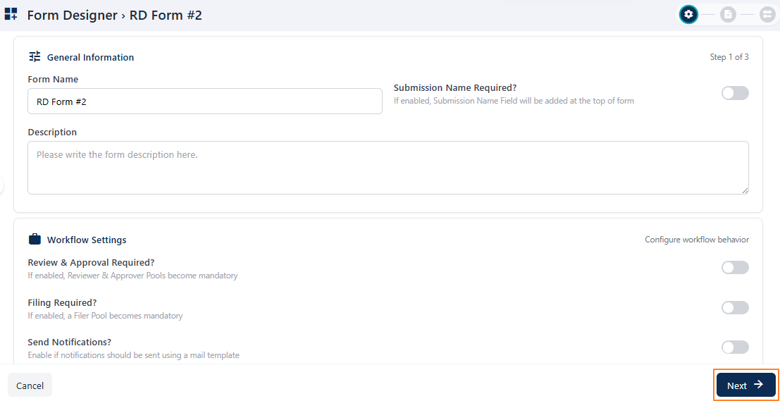 Fig: 52 - Proceeding to the second stage
Fig: 53 - Form Content partial view of the second step
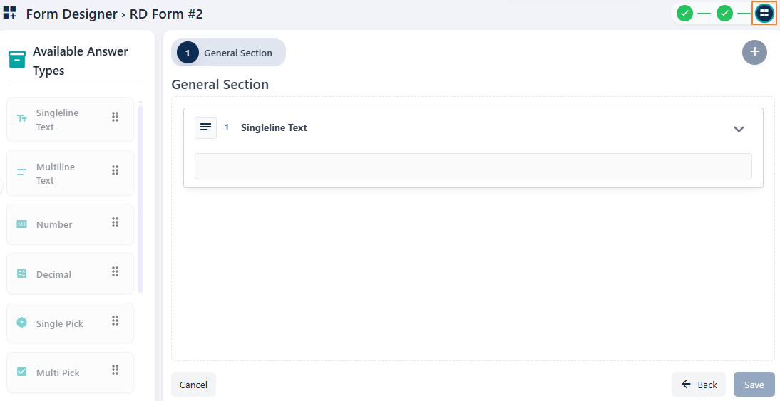 Fig: 54 - Third step various page elements
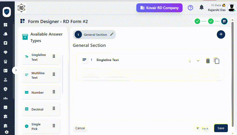 Fig: 55 - Animated view of editing a custom form in the third step
2.4.3. Using the Publish menu option
The Publish option makes the form available for use. Once published, the form can be accessed by intended users and submissions will be logged accordingly in the SurgeONE system.
The Forms created here, once published, get reflected on the Forms page. To publish a created form, perform the following step:
- Click on the vertical ellipsis icon under the Action column, against any displayed row entry of the Forms Library page to toggle the row-context menu option labeled as Publish. The status of the form must be Draft. Otherwise, this menu option is greyed-out.
- Click on it. A confirmation modal loads. Provide your confirmation to publish this form by clicking on the Yes, Publish button.
- The following success notification gets triggered and the form gets published - which can be used by associated firms, agencies or clients. The status of the form gets updated showing the color-coded Active tag, as visible under the Status column of the grid view.
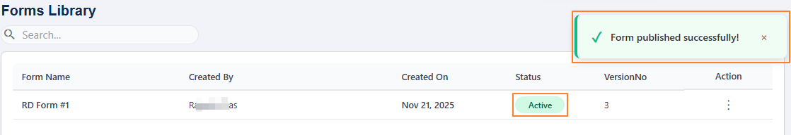 Fig: 57 - Success notification and form status update
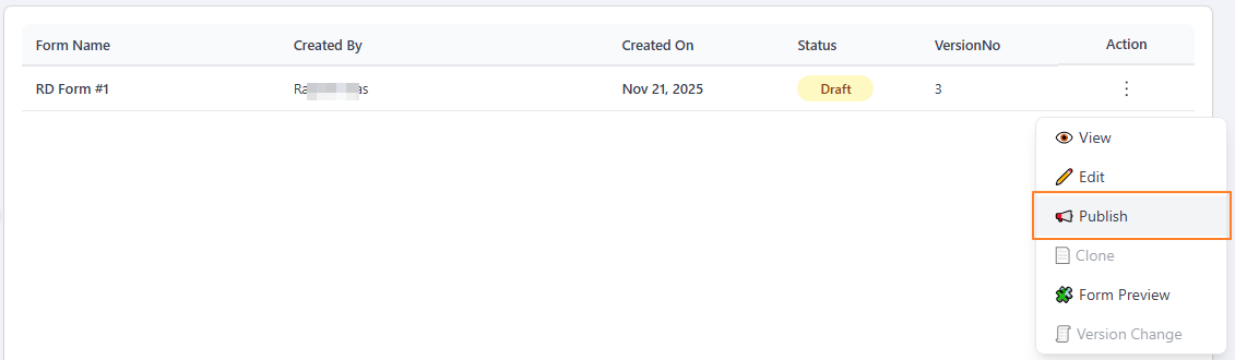 Fig: 56 - Clicking on the Publish menu option
NOTE: The action menu options Edit and Publish become greyed-out once a form is published. Hence, you cannot make modifications or re-publish an already published form (displayed with the status tag).
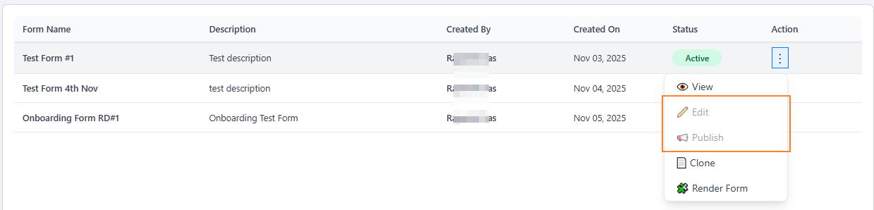
Fig: 58 - Inactive row-context menu options
2.4.4. Using the Clone menu option Feature currently disabled
The Clone feature enables users to quickly create copies of existing forms which are already created in the system.
2.4.5. Using the Form Preview menu option
The Form Preview feature enables users to quickly preview forms which are already created in the system.
- Click on the vertical ellipsis icon under the Action column, against any displayed row entry of the Forms Library page to toggle the row-context menu option labeled as Form Preview.
- After clicking on it, a rendered version of the chosen form loads and is visible in the full page view.
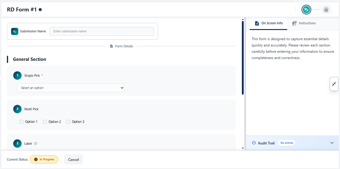 Fig: 62 - Rendered version of the chosen form
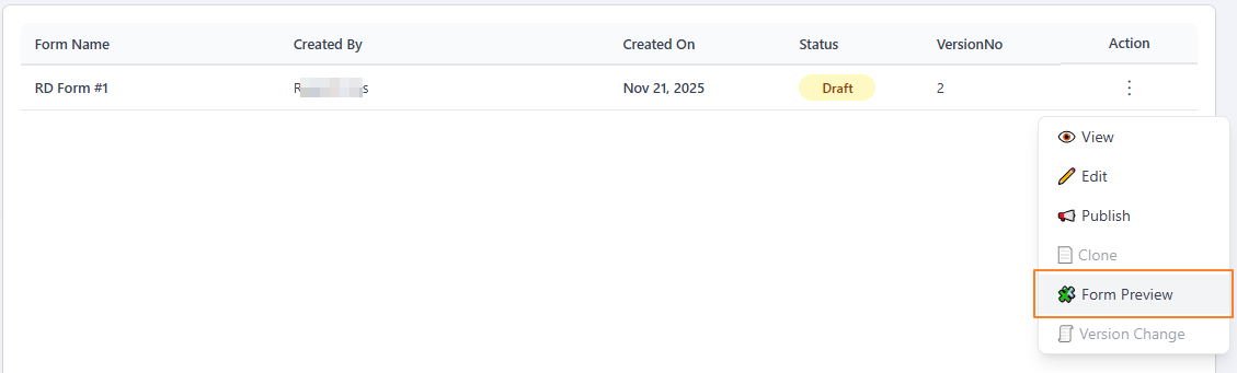 Fig: 61 - Clicking on the Form Preview menu option
Let us try to understand the various elements present in the rendered form.
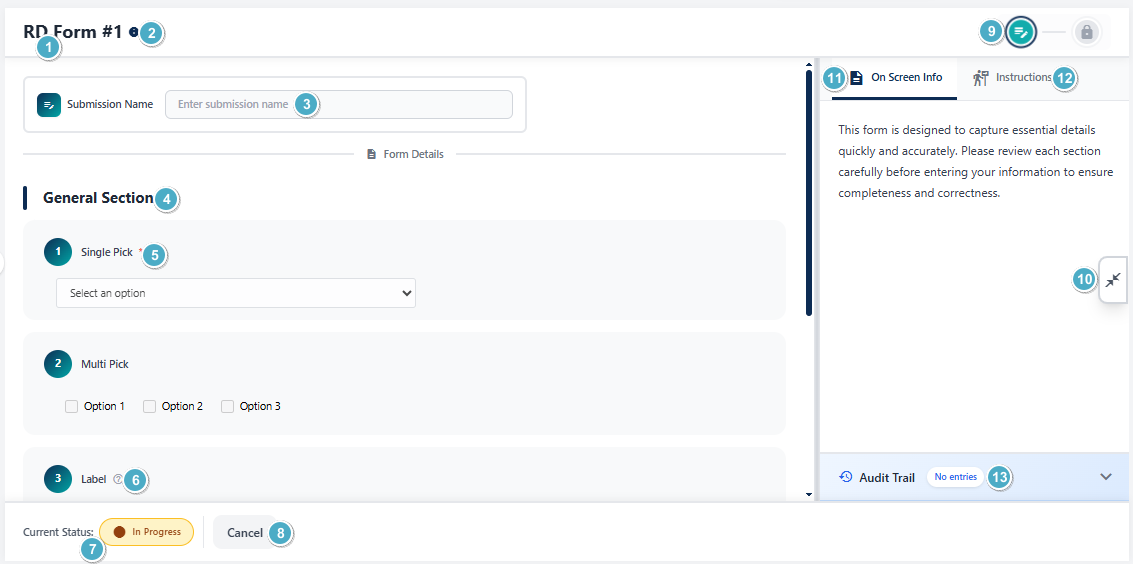 Fig: 63 - Elements of the rendered version of the chosen form
The above screenshot is indicated with numerical values which correspond with the stated points of the table below.
| Sl. No. | Page Element | Description and Benefit |
|---|---|---|
 |
The name of the form provided at the time of form creation or form update later on gets displayed at the top. Benefit: Helps the user quickly check the form he / she is previewing. |
|
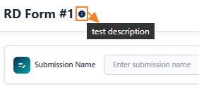 |
The form description gets displayed if you hover you mouse pointer over the info icon beside the form name at the header. It is displayed only if it is provided in the form. This icon is absent if there is no description provided for the form. Benefit: Provides quick glance of description, if present. |
|
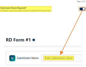 |
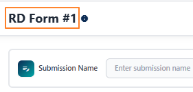
The Submission Name field is present in the form only if the Submission Name Required? slider was enabled during form creation or editing. If present, it is a mandatory field. Benefit: Ensures each submission is uniquely identifiable for tracking and reference. |
|
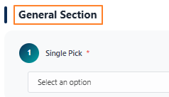 |
The section name is displayed at the top of the rendered form. If multiple sections are present in a designed form, multiple section names get displayed accordingly. Benefit: Helps users navigate complex forms by clearly separating content into sections. |
|
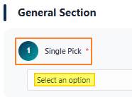 |
The field number of all answer types set in the form are indicated before the question label. Any other answer type of a new section continue the serial numbering. The question label is displayed. Any fields of the form which are mandatory have a red asterisk (*) mark against the field label / name. Also, any placeholder label provided earlier gets displayed within the field input area to assist any user who will fill up the form. Benefit: Provides clarity on mandatory inputs and guides users to fill forms correctly. |
|
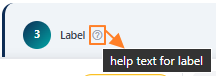 |
A question mark icon can be present beside the label if help text was set for the field during form creation or editing. You can hover your mouse pointer over the icon to the right of any form field to reveal the tooltip (help text) associated with it. Benefit: Provides instant guidance to reduce errors and improve user confidence while filling forms. |
|
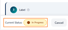 |
Current status of the form being viewed gets displayed at the bottom-left. The current status of the form is displayed as a color-coded status tag. The color-coded status tag is read-only and cannot be changed during preview of the form. The status tag label and color can vary depending on the form. Benefit: Keeps users informed of progress and form state at a glance. |
|
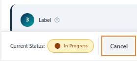 |
The Cancel button is present to close this rendered form page and get redirected to the Forms Library grid view. Benefit: Provides quick exit and return to the library without losing navigation context. |
|
 |
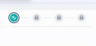
Displays icons for the stages of the form. This breadcrumb view displays the current and other stages of form processing during its preview. Benefit: Helps users track progress and understand where they are in the workflow. |
|
Additional Information: The stage-wise icons can vary depending on the configuration of the form.
| ||
NOTE: The following one-liners help you understand what each stage stands for.
| ||
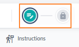
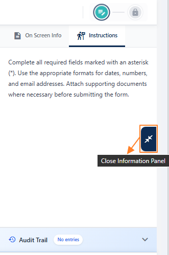 |
Option to toggle the expanded and collapsed view of the information panel area. The panel contains the following elements - On Screen Info, Instructions and Audit Trail. These have been explained in the following three rows below. Benefit: Allows flexible viewing of supporting details without cluttering the main form area. |
|
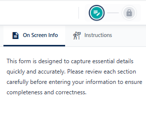 |
In the second stage of form creation or update, you can set a suitable information in the panel area which will be displayed here on screen to guide users with contextual details or instructions while they view, use or fill out the form. This section provides users with a concise overview of the form's purpose and requirements directly on the screen. Benefit: Clear upfront details reduce confusion and improve accuracy in submissions. |
|
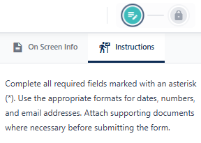 |
In the second stage of form creation or update, you may also set applicable instructions or logic that the form should follow during execution in the Form Instructions area. This section outlines step by step guidance for completing the form accurately. Instructions may include how to fill each field, acceptable formats for responses, and examples where applicable. Users are encouraged to review these directions carefully before submission to avoid errors or delays. Benefit: Dictated instructions help streamline the process and ensure consistency across all entries. |
|
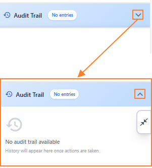 |
The form audit trail area is collapsed by default. Clicking on the down arrow icon at its right expands the panel area to reveal system recorded log details. These displayed records are useful because it provides a transparent record of every action taken on a form, including who created, edited, reviewed, or approved it and when those changes occurred. Benefit: Ensures accountability, supports compliance, and helps trace issues or discrepancies quickly. |
|

2.4.6. Using the Version Change menu option
The Version Change feature enables users to quickly make a new version of existing forms which are already created in the system.
- Click on the vertical ellipsis icon under the Action column, against any displayed row entry of the Forms Library page with Active status to toggle the row-context menu option labeled as Version Change. The menu option is also present for forms with Draft status, but is greyed-out for such forms.
- After clicking on it, a modal window gets triggered to display the version update success message. Click on the OK button to close this modal.
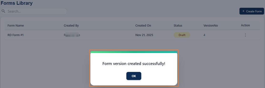 Fig: 68 - Version change success notification
- An updated version of the form gets created and is visible in the grid view. The previous version is not displayed. The version number value increments after version update and the status changes from Active to Draft. The Version Change menu option is still present but is greyed-out. It gets enabled only when this form is published.
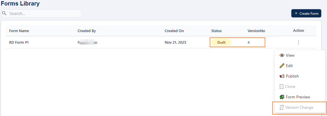 Fig: 69 - Version updated of chosen form
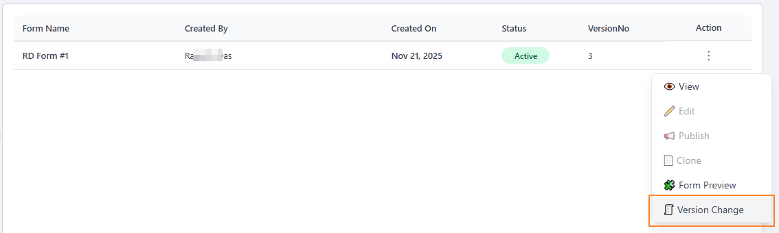 Fig: 67 - Clicking on the Version Change menu option
2.5. Pagination
Pagination controls are provided to help users navigate through multiple pages of form entries. This feature improves performance and usability by limiting the number of entries displayed at once, making it easier to browse and manage large datasets. Users can efficiently navigate to the exact set of entries they need without unnecessary scrolling by using the pagination options.
Pagination options are provided at the bottom-left, to navigate through multiple pages of entries, which populate the grid view as per the selected count of items per page. Selectable options are 10, 20 and 50, where the former is set by default.
Prev and Next buttons are also provided to navigate to the next and previous pages respectively, along with individual page numbers to navigate to a particular page.
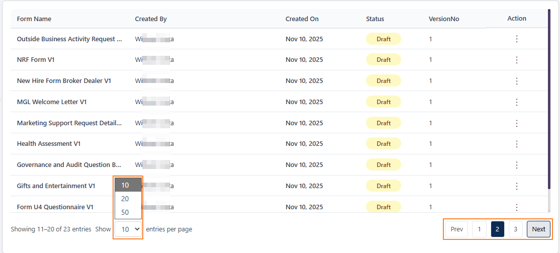 Fig: 70 - Pagination options