
 This online help page offers detailed guidance on the SurgeONE platform Forms interface and its capabilities.
The Forms page functions as a centralized interface where authorized users within your organization can interact with various business forms. This page enables users to perform key actions such as filling out new forms, submitting completed forms for review, and approving or rejecting submitted forms depending on their access permissions. By streamlining these tasks into a single, intuitive interface, the Forms page supports efficient workflow management and ensures that form-based processes are carried out consistently and securely.
All forms displayed on this page need to be first selected and sourced from among the published forms (in Settings > Manage Forms).
→ Click here to navigate to Manage Forms / Forms Library online help.
This ensures that only validated, up-to-date forms are made available for use. Any changes made in the Manage Forms section, such as updates to form design or configuration, are automatically reflected here, maintaining consistency and reducing administrative overhead.
Access to different functionalities of this Forms page depends on the logged-in user's pool-based permissions.
→ For more details refer to the Users Pool online help.
1. Navigating to the Forms page
To begin working with forms, permitted users must first access the Forms module. The Forms page acts as the central hub for all form-related activities within the system. From this single interface, users can initiate new form entries, submit completed forms, and depending on their role can review, approve, or reject submissions. This empowers users to manage form workflows efficiently, ensuring that business processes are carried out in a structured, transparent, and compliant manner.
Click on the Forms menu label of the left panel (by default below the My Items menu).
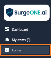 Fig: 1 - Forms menu option
Clicking on this menu option loads the Forms page showing a blank grid view.
 Fig: 2 - Grid view blank by default
All the published forms of your organization can be included here manually, one-by-one. Here is the view of one such entry populating the grid view. These custom forms can be filled up and submitted for review by assigned personnel.
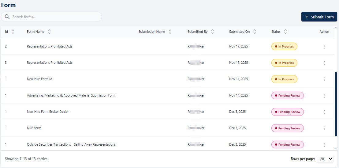 Fig: 3 - Forms page with added custom Forms
Key features of this Forms page
- Smarter and Dynamic Forms Workflows – The Forms module empowers consultancy/associate company administrators and client company administrators to seamlessly create, manage, and distribute forms, which can then be completed by employees of client organizations.
- Streamlined Submissions – Employees can easily fill out and submit forms, supported by built‑in notifications and reminders that ensure timely completion and reduce delays.
- End-to-End Tracking – Every action, whether reviewing, approving, filing, or logging, is recorded with a complete change history, providing full transparency and compliance assurance for any future-dated audit logs retrieval.
2. Understanding the Forms page elements
The Forms page interface includes several key components that support efficient form management. The search bar helps users quickly locate specific forms, while the grid view displays essential details in a structured layout. Action menus provide direct access to various activities, and pagination controls make it easy to navigate large sets of data. Together, these elements simplify interaction with the SurgeONE system and give users confidence in managing their form workflows.
Refer to the following screenshot which is marked with numerical values that correspond to the below stated points.
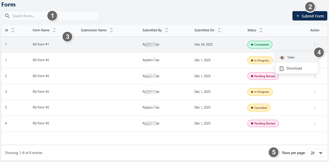 Fig: 4 - Understanding the various elements of the Forms page
-
1Search bar and filtersThe search bar allows users to quickly locate added / submitted form entries using keywords. The filter options provide more powerful search options such as search by status or date range.
Benefit: Enables users to quickly find specific form entries using keywords, status, or date ranges, saving time and effort.
 NOTE: The following sub-sections elaborate further the associated functionalities of the above-stated points.
2.1. Searching for Forms
The search functionality allows users to quickly locate specific form entries using keywords. This feature is particularly useful when managing a large number of forms, as it reduces time spent browsing and ensures accurate retrieval of relevant records.
You can use the search bar to enter text and find matching results.
 Fig: 5 - Search bar to quickly find added forms
Based on the text entered, matching results are listed out.
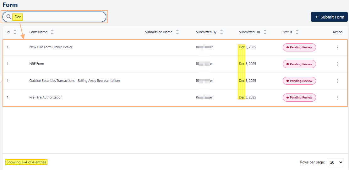 Fig: 6 - Filtered results
If no results are fetched by the executed search query, a No records found label in the grid view and a Showing 0 Records label is displayed below the grid view.
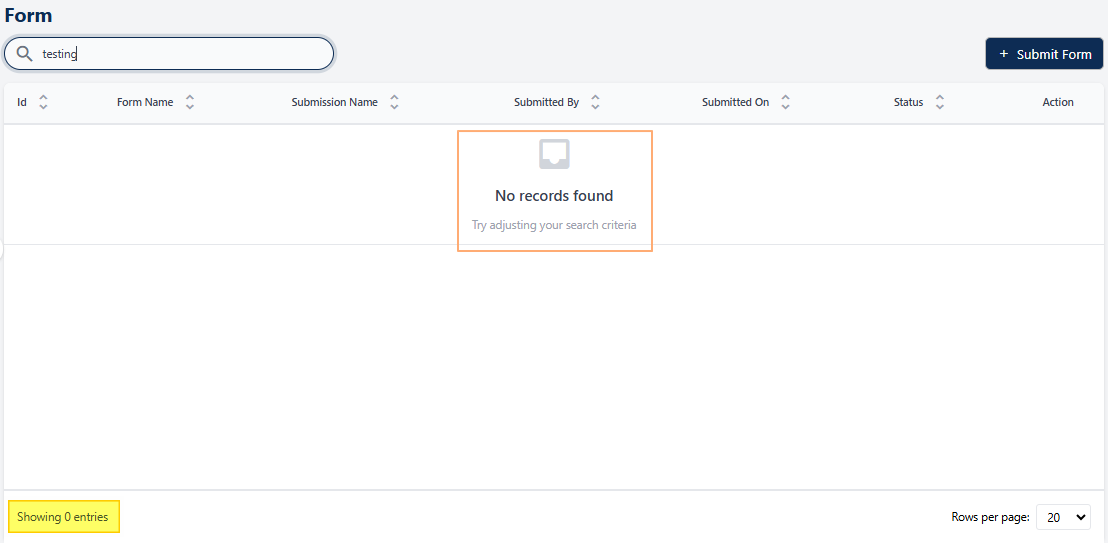 Fig: 7 - No matching records found
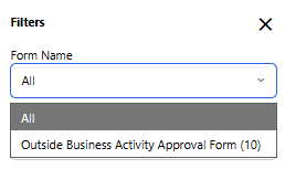
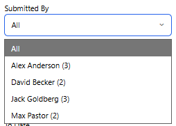
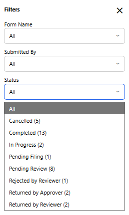
2.1.1. Using the Filters
The Filters feature helps users quickly narrow down form submissions by applying multiple criteria such as Form Name, Submitted By, Status, and Submission Date range. As filters are applied, they appear as visible chips above the grid, providing clear awareness of the active conditions and allowing easy removal or adjustment. Users can combine filters to precisely locate relevant records, refresh results to view the latest data, or reset filters to return to the default view, making it efficient to manage large volumes of form submissions with clarity and control.
Click on the filter  icon to reveal the filter panel.
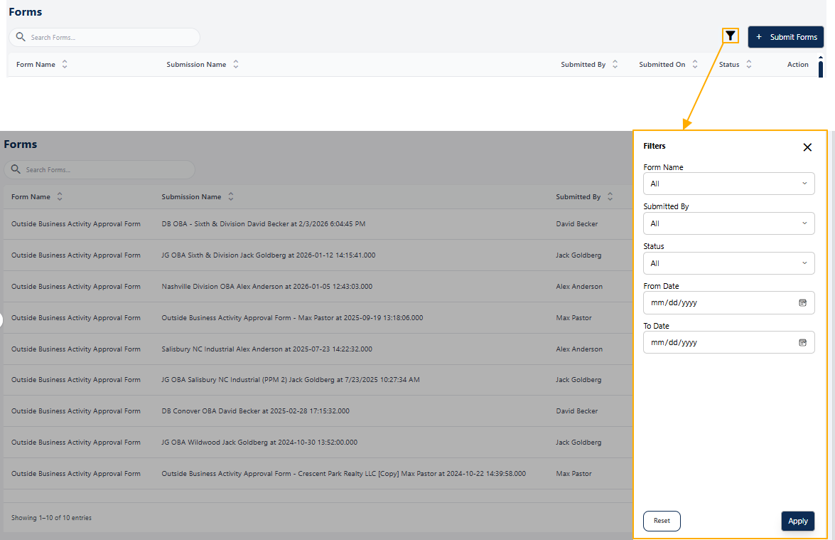 Fig: 8 - Filter panel expanded view
The below table illustrates the various filters which are available in the expanded Filters panel.
| Sl. No. | Filter Label | Description and Benefit |
|---|---|---|
| Form Name |
Allows users to filter form submissions by a specific form type. Each option displays the form name along with the number of submissions in brackets, providing immediate visibility into submission volume per form.
Benefit: Helps users quickly narrow results and understand workload distribution across different forms. |
|
 | ||
| Submitted By |
Filters submissions based on the individual who submitted them. The dropdown lists each submitter with a count of submissions shown in brackets, making it easy to identify contributors with higher activity.
Benefit: Improves accountability and enables quick isolation of submissions from specific users or teams. |
|
 | ||
| Status |
Enables filtering of form entries based on their current processing state (such as In Progress, Pending Review, or Completed). Each status option displays the number of matching records in brackets.
Benefit: Allows users to instantly assess progress and focus on items requiring attention. |
|
 | ||
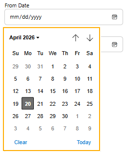
| From Date |
Specifies the start date for filtering submissions. Only forms submitted on or after the selected date are displayed in the grid.
Benefit: Helps users analyze submissions within a specific time window for reporting or review. |
|
 | ||
| To Date |
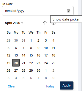
Specifies the end date for the submission date range. Only forms submitted on or before this date are included in the results.
Benefit: Enables precise date‑based filtering for audits, compliance checks, or trend analysis. |
|
 | ||
The Apply button the refreshes the grid view based on the selected filter criteria, while Reset clears all filters and restores the default view. This provides quick control over filtering actions, improving usability and efficiency.
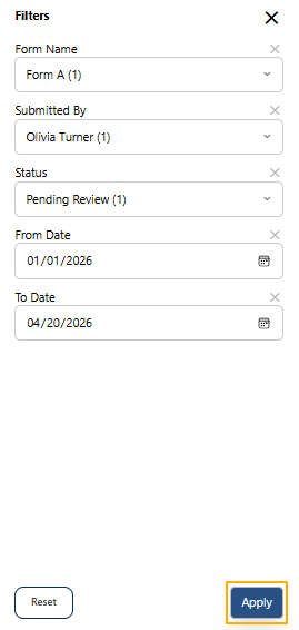 Fig: 9 - Apply button to set custom filters
The filter panel area collapses when you click on the Apply button. The following occur:
-
1Applied Filter ChipsDisplays the currently applied filters (Form Name, Submitted By, Status, Date Range) as removable chips, allowing users to quickly understand and modify active filters.
-
2Filter IconThe filter icon color updates to light blue. Clicking on it opens the Filters panel, enabling users to refine filters set. A number is displayed beside the
 icon to indicate the number of filter options set currently.
-
3Reset Filters IconThe
 icon can be seen beside the filter icon. Clicking on it refreshes the grid view to reload the grid view results, after removing the current filter state.
-
4Grid ViewLists the matched entries which satisfy the provided filter conditions.
The above-stated points correlate with the numerical values indicated in the following image.
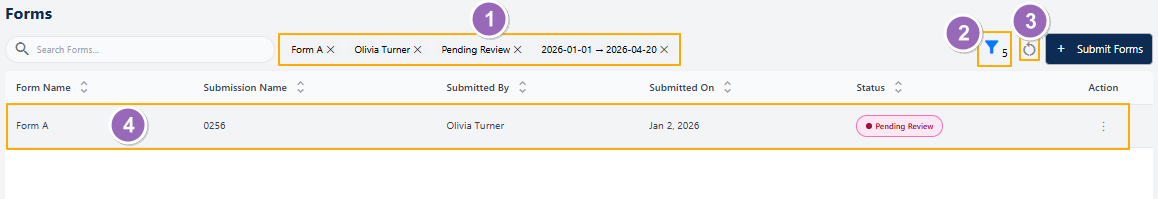 Fig: 10 - Elements of the page after setting the filters
NOTE:
- Clicking outside the Filters panel area closes it.
- A filter selection made prior to clicking outside of the panel area automatically sets the filter (without having to click on the Apply button).
- After setting the filters, a cross (X) icon appears above the field. Click on it to reset the field. The same can be done on an applied filter above the grid view of the Forms page.
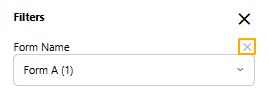 Fig: 11 - Cross icon to remove an applied filter option
2.2. Filling up & Submitting a Published Form
Once a form has been created, configured, and published, it becomes available for permitted users to access and complete. Published forms available to the employees of the client company under the Forms module. The Forms page serves as the central interface for this process, ensuring that users can easily provide the required information in a structured, consistent, and compliant manner. This functionality streamlines data collection, reduces manual effort, and ensures that every submission is properly tracked for accountability and audit readiness.
Steps to fill and submit a published Form:
| Sl. No. | Field / Section Label | Description and Benefit |
|---|---|---|
| Forms Page |
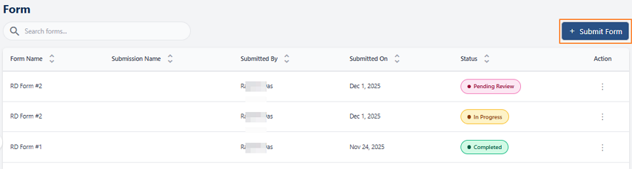
The Forms page displays all previously submitted forms along with their status (e.g., Pending Review, In Progress, Completed). It includes columns for Form Name, Submission Name, Submitted By, Submitted On, and Status.
Users can initiate a new submission by clicking the + Submit Forms button at the top-right corner. Benefit: Provides a centralized view of all submissions and their progress for easy tracking. |
|
 | ||
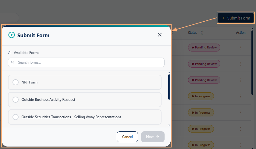
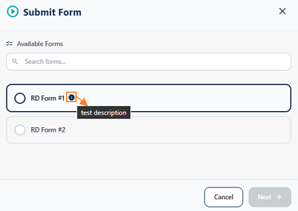
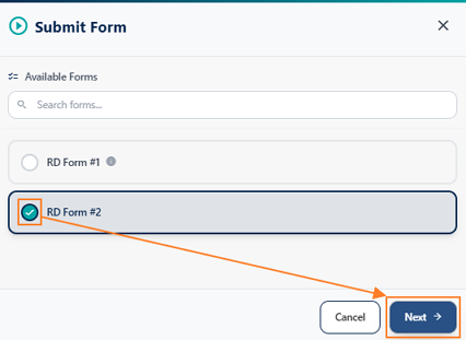
| Submit Forms Popup |
Clicking + Submit Forms opens a popup listing all available forms. The forms published in Settings > Manage Forms page get displayed in this modal window. Users can select the desired form by clicking the radio button next to its name.
A description icon (info tooltip) next to each form provides additional details about the form when hovered over. Benefit: Allows users to choose the correct form with clarity and access helpful descriptions before proceeding. |
|
 | ||
 | ||
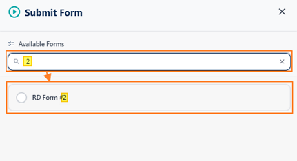
| Search Available Forms |
The search bar within the popup enables quick filtering of forms by typing keywords or numbers related to the form name.
Benefit: Saves time by narrowing down the list of forms, especially when multiple forms are available. |
|
 | ||
| Select and Proceed |
After selecting the desired form, click the Next button at the bottom-right corner to proceed to the form filling stage.
Benefit: Ensures users confirm their choice before moving forward, reducing errors. |
|
 | ||
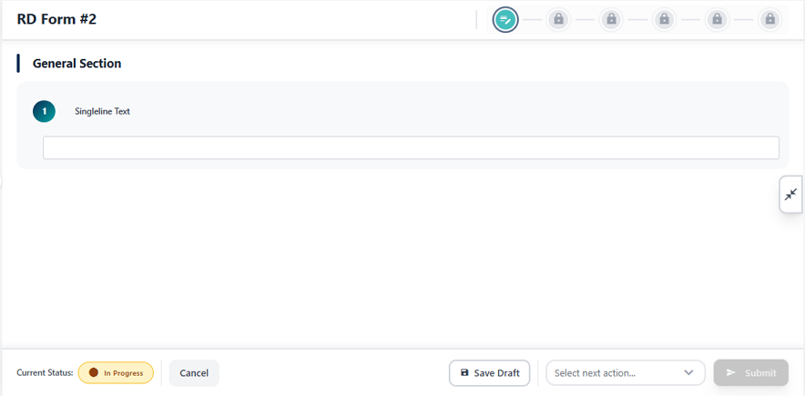
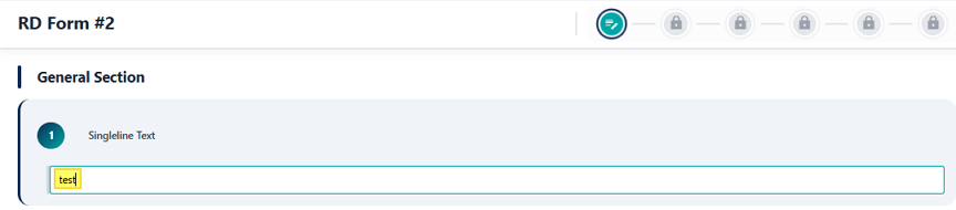
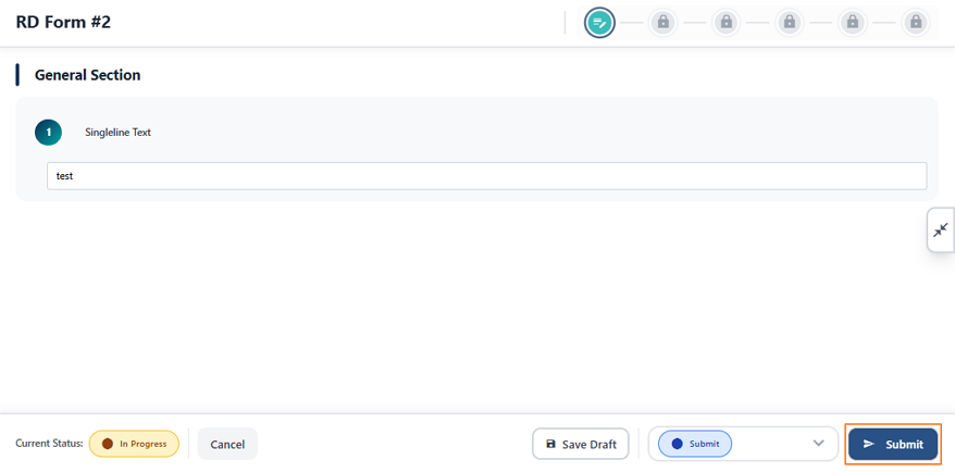
| Form Filling Screen |
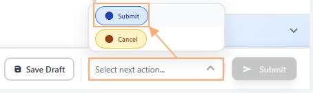
The selected form opens with its sections and fields. Users can enter data in the provided fields (e.g., Singleline Text, Dropdown, etc.). The current status is displayed as In Progress.
Options available: Cancel, Save Draft, and Select next action (e.g., Submit). Benefit: Provides flexibility to save work as a draft or finalize submission when ready. |
|
 | ||
 | ||
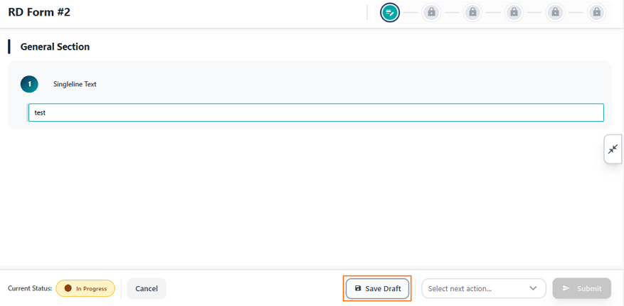
| Save Draft |
Clicking Save Draft stores the entered information without submitting the form, allowing users to return later for completion. The user gets redirected to the Forms page where the entry populates the grid view with its status displayed as In Progress.
Benefit: Prevents data loss and supports incremental progress for complex forms. |
|
 | ||
 | ||
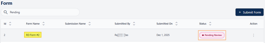
| Submit Action |
To finalize, select Submit from the dropdown under Select next action and click the Submit button. This changes the form status and sends it for review.
Benefit: Ensures proper workflow by confirming submission intent before processing. |
|
 | ||
 | ||
| Redirection to Forms page |
The form submission page closes and you get redirected to the Forms page. This entry populates the grid view and its status gets updated to Pending Review.
Benefit: Indicates the need for reviewing of the submitted form, as per the workflow configured earlier in the Manage Forms page. |
|
 | ||
By following these steps, users can confidently complete and submit published forms. The system ensures that every submission is properly logged, routed for review, and stored with a full audit trail. Published forms available to the employees of the client company under the Forms module.
NOTE:
- If you click on the Save Draft button, and later on you load the form, then instead of only the Submit option, you can find two options - Submit and Cancel, which can be selected and the form can be submitted with any of one option selected.
- If you click on the Cancel option and submit the form, then the page closes and on the redirected Forms page you can find this form populating the grid view with Cancelled status.
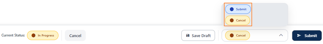 Fig: 12 - Cancel option
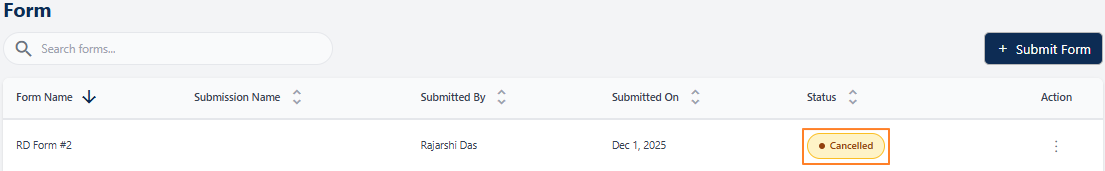 Fig: 13 - Cancelled Status
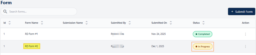
2.3. Understanding the grid view
The grid view organizes form entries into a clear, tabular format that makes information easy to scan and interpret. Each row corresponds to an individual form, while the columns display key attributes such as the form name, submitted date, etc. This structured layout not only provides users with a quick overview of all forms at a glance but also supports efficient monitoring, comparison, and management of form submissions within the SurgeONE system.
The grid view displays all form entries. The following columns are present:
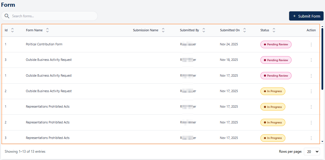 Fig: 14 - Forms grid view
-
1Form NameDisplays the official title of the form, entered in the Form Name field of the Create Form / Edit Form - Form Details tab during creation. Helps users instantly recognize which process or requirement the form relates to.
-
2Submission NameShows the description of the form entry, entered in the Description field of the Create Form / Edit Form - Form Details tab. Since this is optional, the value may or may not be present in the grid view. Provides a short summary of the form's purpose for quick context.
-
3Submitted ByDisplays the name of the individual who submitted the form, ensuring accountability and easy traceability.
-
4Submitted OnShows the exact date of submission, supporting timely reviews and compliance monitoring.
-
5StatusReflects the current state of the item (for example In Progress, Completed, etc.), enabling users to monitor progress across items.
-
6ActionContains a vertical ellipsis
 icon to toggle row-context menu options.
2.4. Using the Action column menu options
Each form entry in the grid view includes an Action column that provides quick access to form management options. This design ensures that users can perform relevant actions directly from the grid without navigating away from the page.
Click on the vertical ellipsis icon against any displayed row entry of the grid view to toggle the row-context menu options.
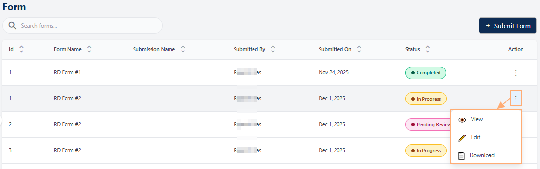 Fig: 15 - Action menu options
The following menu options are present:
-
1
 ViewUsed to view the submitted responses made to a form without the ability to make any modifications to the responses.
 -
2
 DownloadUsed to save a local copy of the submitted responses made to a form without the ability to make any modifications to the responses.
NOTE: The following sub-sections elaborate on the functionalities associated with these options.
2.4.1. Using the View menu option
Selecting the View option enables users to open and review an existing form in its entirety. This feature is particularly valuable when users need to understand the structure and purpose of the form, revisit the information it contains, or examine the responses that have already been submitted. By providing full visibility into both the form content and the recorded inputs, the View option supports better decision‑making.
- Click on the vertical ellipsis icon under the Action column, against any displayed row entry of the Form grid view to toggle the row-context menu option labeled as View.
- After clicking on it, the following page loads to display the form as per its layout and questions structure.
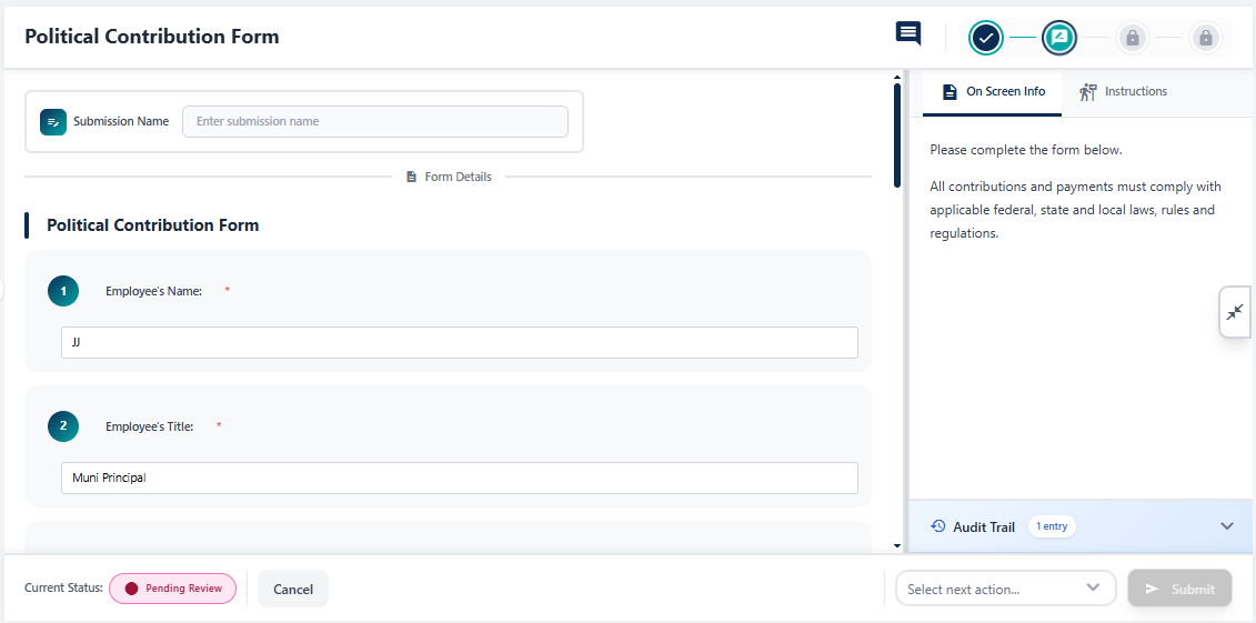 Fig: 17 - Form view page
- You can either choose the next action and submit it (by selecting an available option of the Select next action dropdown and clicking on the Submit button) or you can close the page using the Cancel button.
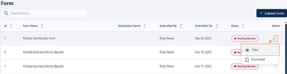 Fig: 16 - Clicking on the View menu option
NOTE: The action options can vary depending on the stage of the form. A completed or cancelled form will have no available actions.
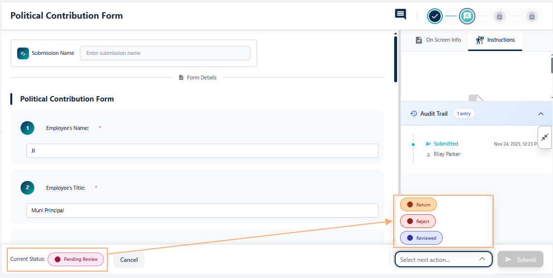 Fig: 18 - Different form actions
Refer to the following screenshot which is marked with numerical values that correspond to the below stated points about the various UI elements.
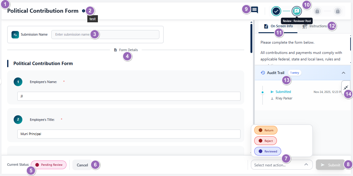 Fig: 19 - Form view page elements
-
1Form Title
- What it is: The name of the form (e.g., Political Contribution Form).
- Why it matters: Helps you check which form you're viewing or working on.
- Typical actions: Used for orientation and reference in usage.
-
2Info Icon (Tooltip on Hover)
- What it is: A small tooltip displayed on mouse pointer hover on the info icon. If present, the icon is adjacent to the displayed title.
- Why it matters: Enables a quick glance at the description of the form.
- Typical actions: Reveal a tooltip which displays the entire form description.
-
3Submission Name Field
- What it is: A text input to enter the full name of the user who is the form submitter.
- Why it matters: The Submission Name field gets added at the top of form when Submission Name Required? slider was enabled in Manage Forms module. If it was not enabled then this field is not present in the rendered form.
- Typical actions: Entering the submitter's name helps to understand who had submitted the form.
-
4Section Header
- What it is: Displays the form structure, sections and questions of each for user to view the entire form content.
- Why it matters: Organizes the page into meaningful sections (as designed) and improves readability.
- Typical actions: Scroll to view multiple form sections (if present) and questions present in a section, as well as understand the form layout.
-
5Current Status Tag
- What it is: A color-coded status indicator (e.g., Pending Review).
- Why it matters: Helps you plan your course of action by referencing to the current status.
- Typical actions: View it to check the current status of the form.
-
6Cancel Button
- What it is: A button to exit without committing changes.
- Why it matters: Prevents unintended edits or submissions.
- Typical actions: Click to close or return to the Form page. In some instances, a confirmation modal window gets prompted by the system to obtain your confirmation of exiting this page, since unsaved changes get discarded on exit.
-
7Next Action Selector
- What it is: A Select next action dropdown listing workflow options (Return, Cancel, Submit, etc.).
- Why it matters: Determines the next step in the approval or review process.
- Typical actions: It is blank by default. Choose the appropriate action based on review outcome. Some actions may require comments.
-
8Submit / Proceed Button
- What it is: Primary action button to execute the selected operation.
- Why it matters: Commits your choice (submit, return, approve, etc.).
- Typical actions: After selecting an action in above #7, click this to apply it. It is disabled until the above dropdown is set with a selection.
-
9Comment Icon
- What it is: An icon which allows users to post or view comments related to the form or workflow.
- Why it matters: Facilitates communication and collaboration by enabling submitters / reviewers / approvers / filers to provide context, clarifications, or feedback, without leaving this page.
- Typical actions: Click the icon to open the comment panel, type your message, and submit. Use it to share notes or respond to queries without leaving the form.
-
10Form Workflow Stage Indicator
- What it is: Current form stage label and other stage icons displayed as per the form configuration.
- Why it matters: Shows the current review stage and whether the form is configured to various form workflows, which may require a reviewer, approver or filer group's participation in the custom form's lifecycle.
- Typical actions: Read-only labels displayed on mouse hover over present icons as per the configured form stages and indicates the current one.
-
11On Screen Info Tab
- What it is: A tab that reveals guidance or instructions related to the form.
- Why it matters: Provides in context help as configured in Manage Forms module during creation or editing a form.
- Typical actions: Click to read tips while filling the form as it ensures entries meet policy.
-
12Instructions Tab
- What it is: A tab showing detailed instructions and rules (e.g., compliance, legal notes).
- Why it matters: Clarifies mandatory information, acceptable inputs, and constraints as configured in Manage Forms module during creation or editing a form.
- Typical actions: Review before submitting to avoid rework or rejection.
-
13Audit Trail Panel
- What it is: A chronological log or timestamp which is by default present as a collapsed section.
- Why it matters: Enables traceability as it reveals who did what and when.
- Typical actions: Expand panel area to see entry details as per form activity performed, for compliance checks, auditing and reporting.
-
14Close Information Panel
- What it is: A control that collapses the right-side information panel containing the On-Screen Info tab (#11), the Instructions tab (#12), and the Audit Trail section (#13) when they are open or expanded.
- Why it matters: Frees up workspace by hiding guidance and history panels, reducing visual clutter so you can focus on filling or reviewing the form. It also prevents accidental interactions with auxiliary content while performing primary tasks.
- Typical actions: Click to collapse the panel. Reopen as needed by clicking on the collapsed panel for contextual help, instructions, or to review audit logs when needed.
2.4.2. Using the Download menu option
The Download option provides quick access to a ready-to-use version of the form for offline use. This is particularly useful when internet connectivity is limited or when forms need to be printed and distributed physically. Downloading forms ensures flexibility, allowing users to fill them out at their convenience and share them easily with others. It streamlines workflows by making forms portable and accessible anytime, anywhere.
- Click on the vertical ellipsis icon under the Action column, against any displayed row entry of the Form grid view to toggle the row-context menu option labeled as Download.
- After clicking on it, the PDF file gets downloaded containing the form questions and responses provided.
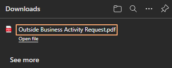 Fig: 21 - Form downloaded
- After clicking on it, the following page loads to display the form as per its layout and question responses.
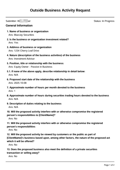 Fig: 22 - Downloaded Form PDF content
Workflow user comments (oldest first) and audit trails (latest first) may appear at the end of the report.
Fig: 22 - Downloaded Form PDF content
Workflow user comments (oldest first) and audit trails (latest first) may appear at the end of the report.
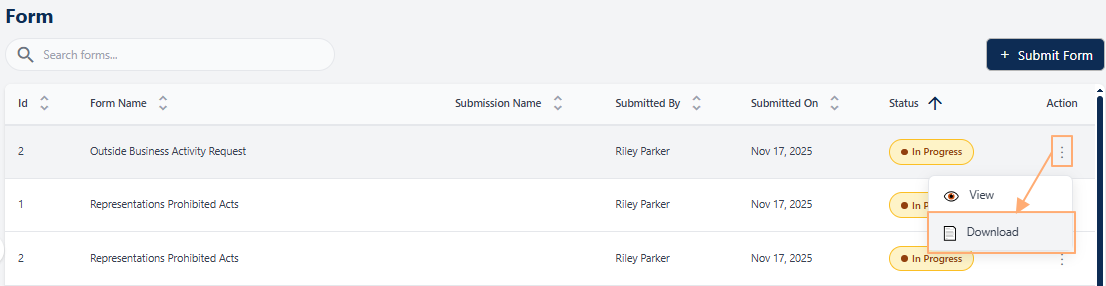 Fig: 20 - Clicking on the Download menu option
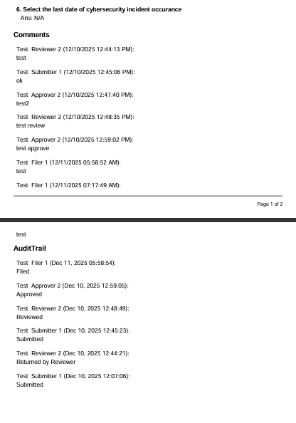 Fig: 23 - Visibility of comment and audit trail
2.5. Pagination
The pagination controls allow users to move through multiple pages of form entries in an organized way. Instead of displaying all records at once, which can slow down performance and overwhelm the interface, the system divides entries into manageable pages. This not only improves loading speed and overall usability but also makes it easier for users to browse, locate, and manage forms within large datasets. Users can efficiently navigate to the exact set of entries they need without unnecessary scrolling by using the pagination options.
Pagination options are provided at the bottom-left, to navigate through multiple pages of entries, which populate the grid view as per the selected count of items per page. Selectable options are 10, 20, 50 and 100.
Left are right arrow keys are also provided to navigate to the next and previous pages respectively.
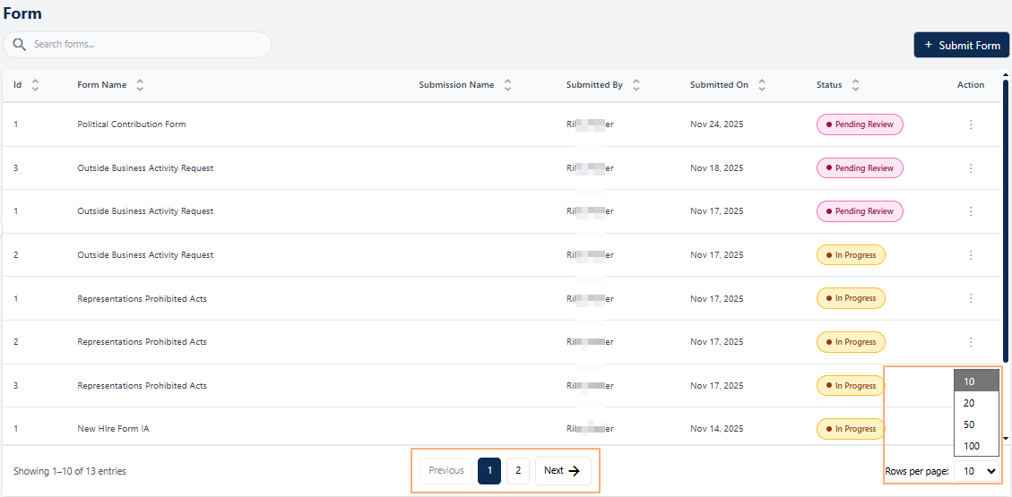 Fig: 24 - Pagination options
2.6. Forms Workflow & Lifecycle
Forms move through a lifecycle that starts in Manage Forms (Draft → Active) and continues through on-screen actions performed by specific pool users (Submitter, Reviewer, Approver, Filer).
Depending on how the workflow is configured for a form, different designated users can act at different stages. The workflow configuration determines which roles act at which stage. The final endpoint is either Completed (for no-filer workflows) or Completed after Regulatory Completion (for filer workflows). The form review process allows designated users to carefully examine a submitted form before it moves forward in the workflow. For example, submitted forms needing review appear in the Form module of all users in the selected Reviewers' Pool.
2.6.1. Form Lifecycle Stages (All Configurations)
A form created with workflow ensures a structured and transparent process for form handling. It promotes accountability by assigning clear responsibilities, reduces errors through systematic review, and accelerates approvals for faster execution.
1. Form Creation in Manage Forms (Draft)
A Company/Branch Admin (or user granted with similar permissions) creates the form in Manage Forms with initial status as Draft. During this form creation, the admin / permitted user decides whether to incorporate form workflow settings, that is, whether to include either one of the following supported workflows:
- No workflow stages for form lifecycle
- Only Reviewer and Approver stages for form lifecycle
- Only Filer stage for form lifecycle
- Reviewer, Approver and Filer stages for form lifecycle
2. Form Publication (Active)
Admin publishes the form and the status becomes Active in Manage Forms. The form can now be added within the Form page by choosing and submitting it. Once published, no changes to the form details or workflow configuration can be made.
Benefit: Guarantees only finalized forms are exposed for submission.2.6.2. Form Created with Reviewer, Approver and Filer Workflow
The workflow users belong to the following pools: Submitter → Reviewer → Approver → Filer. Multi-level governance ensures accuracy and compliance. Verified data moves through approval and filing stages.
1st Stage of Published Form Lifecycle → Submitter Step
- Form Selection: Submitter navigates to the Form page and selects the form.
- Form Fill-up: Submitter fills up the form by providing responses to all the mandatory fields of the chosen form. Submitter can Save Draft, Cancel, or Submit the form.
- Submitter adds Form to Grid View: Let us consider the Submitter chooses the Submit action from the Select next action dropdown and clicks on Submit button. The form status updates to Pending Review and the Reviewer workflow begins. If notification triggering was enabled during the form creation process, email gets triggered to the next stage user.
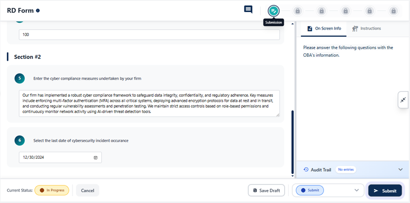 Fig: 25 - Submitter Step
2nd Stage of Published Form Lifecycle → Reviewer Step
The supported actions of the Reviewer are as follows:
- Return: Back to Submitter
- Reject: Ends workflow
- Reviewed: Routes to Approver
Reviewer opens this form, chooses Reviewed action from the Select next action dropdown and clicks on Submit button in the form for approval, after providing relevant information / notes via comments, to initiate the Approver workflow. If notification triggering was enabled during the form creation process, email gets triggered to the next stage user.
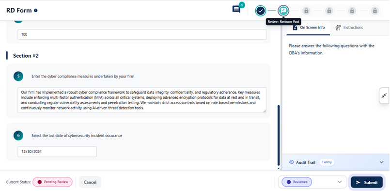 Fig: 26 - Reviewer Step
3rd Stage of Published Form Lifecycle → Approver Step
The supported actions of the Approver are as follows:
- Return: Back to Reviewer
- Reject: Ends workflow
- Approver: Routes to Filer
Approver opens this form, chooses Approved action from the Select next action dropdown and clicks on Submit button for filing, after providing relevant information / notes via comments, to initiate the Filer workflow. If notification triggering was enabled during the form creation process, email gets triggered to the next stage user.
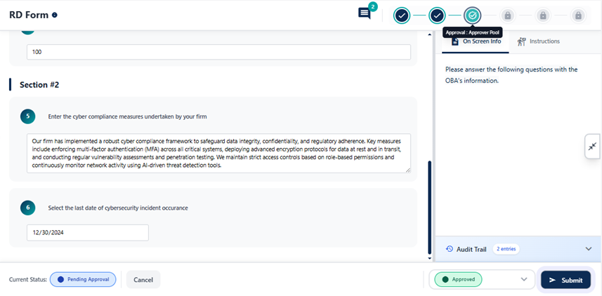 Fig: 27 - Approver Step
4th Stage of Published Form Lifecycle → Filer Filing Step
Filer opens this form and provides appropriate comment. After posting the comment, the Filer chooses the Filed action from the Select next action dropdown and clicks on Submit button to submit the form. The form status updates to Pending Regulatory Complete.
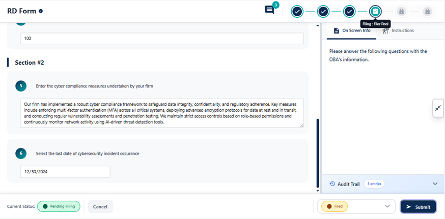 Fig: 28 - Filer Filing Step
5th Stage of Published Form Lifecycle → Filer Regulatory Completion Update Step
On approval from the regulatory body / authority, the Filer again opens this form, provides appropriate comment, selects Regulatory Complete action from the Select next action dropdown, and clicks on Submit button to end the form lifecycle. The page closes and the status gets updated to Completed.
Benefit: Regulatory confirmation provides a clear end state after form filing.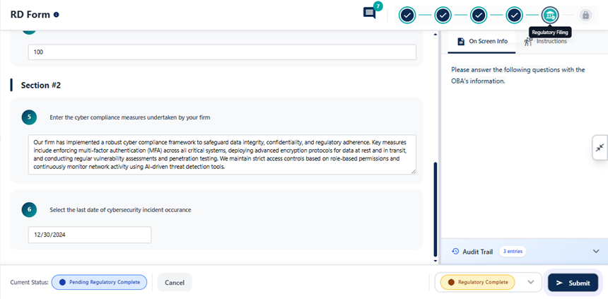 Fig: 29 - Filer Regulatory Completion Update Step
NOTE: Users can perform Form page actions mentioned above, only if they are included in the various applicable Pools in the Settings > Users Pool page.
2.6.3. Form Workflow Flowchart Depiction
Here is the view of entire form workflow flowchart.
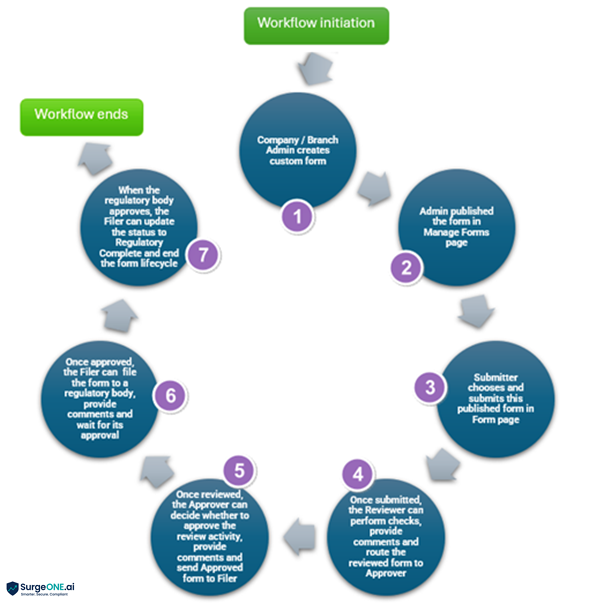 Fig: 30 - Form Workflow Flowchart
2.7. User-wise Form Workflow Use Cases
| Use Case / Scenario | Company / Branch Admin User | Form Submitter | Assigned Reviewer (from Reviewer Pool) | Assigned Approver (from Approver Pool) | Assigned Filer (from Filer Pool) | Notifier (from Notifier Pool) |
|---|---|---|---|---|---|---|
| Create a Form in Manage Forms | Yes | No | No | No | No | No |
| Form created in Manage Forms with Draft Status | User can publish form | No | No | No | No | No |
| Published Form visibility in Manage Forms | Yes visible with Active Status | No | No | No | No | No |
| Form addition to grid view of Form page using Submit Form button | User can choose form and submit it to add to grid view | User can choose form and submit it to add to grid view if granted admin user rights | User can choose form and submit it to add to grid view if granted admin user rights | User can choose form and submit it to add to grid view if granted admin user rights | User can choose form and submit it to add to grid view if granted admin user rights | User can choose form and submit it to add to grid view if granted admin user rights |
| Form action when having In Progress Status using Save Draft | N/A | User can submit to add to grid view with Cancelled or Pending Review status. When Cancel action is chosen the form workflow ends and when the Submit action is chosen the form is set for the next configured workflow stage. If no workflow is configured the form status is set to Completed and workflow ends. | N/A | N/A | N/A | N/A |
| Form action when having Pending Review Status | N/A | N/A |
User can update status via selecting an available action only after providing a comment regarding the action. Available actions are: Return Reject Reviewed On selection of Return and form submission, the status again gets updated to Returned by Reviewer and gets routed to the Submitter. On selection of Reject and form submission, the form workflow ends. On selection of Reviewed and form submission, the status gets updated to Pending Approval and gets routed to the Approver. |
N/A | N/A | N/A |
| Form action when having Cancelled Status | N/A | N/A | N/A | N/A | N/A | N/A |
| Form action when having Returned by Reviewer Status | N/A |
User can update form and set status via selecting an available action. Available actions are: Submit Cancel On selection of Submit and form submission, the status again gets updated to Pending Review and gets routed to the Reviewer. |
N/A | N/A | N/A | N/A |
| Form action when having Rejected Status | N/A | N/A | N/A | N/A | N/A | N/A |
| Form action when having Pending Approval Status | N/A | N/A | N/A |
User can update status via selecting an available action only after providing a comment regarding the action. Available actions are: Return Reject Approved On selection of Return and form submission, the status again gets updated to Pending Review and gets routed to the Reviewer. On selection of Reject and form submission, the form workflow ends. On selection of Approved and form submission, the status gets updated to Pending Filing and gets routed to the Filer. |
N/A | N/A |
| Form action when having Pending Filing Status | N/A | N/A | N/A | N/A |
User can update status via selecting an available action only after providing a comment regarding the action. Available action is: Filed On action selection and form submission, the status gets updated to Pending Regulatory Complete. |
N/A |
| Form action when having Pending Regulatory Complete Status | N/A | N/A | N/A | N/A |
User can update status via selecting an available action. Available action is: Regulatory Complete On action selection and form submission, the status gets updated to Completed. |
N/A |